Kiki Interiors - Decor and Staging

Wednesday, September 28, 2016

We Answer Wednesday - White Walls

"I love the look of white walls, it's so clean and bright but everyone keeps telling me that my home will look sterile and cold if I paint my walls white.  Any advise or suggestions?"

Paint can really transform a room - it can make it bright and bold, dark and sultry or light and airy....we love what paint can do for a room.  sometimes picking the right colour can be a BIG challenge.  The under tones of paint can really shine through depending on the light, time of day, and surrounding finishes.  So we never recommend falling in love with a paint colour in a store - you really need to see it in the space and over the course of a day.  We are huge fans of testing out swatches on a wall and not just looking at a small chip. Some paint companies do offer large (like 8x11) chips that you can tape to the wall - this is a great option to explore! Use the small chips to narrow down your choices but get the samples or large hips to really see what the colour will look like.

 Image result for rooms with white walls

When it comes to white - the choices are plentiful! You have warm whites, cool whites, blue whites, pink whites, grey whites etc.....Every white looks different in every space.  All white walls is a very clean look.  It can look sterile if you aren't careful.

Here are points to consider when it comes to painting your walls white:

1. Consider the natural light source. Before painting a room white, identify its orientation. Rooms that face away from the noonday sun receive gray-blue light, which is great for a summer bedroom, a gym or a studio where you want constancy. A clear white paint will optimize the light of these spaces while keeping things cool.

 The same white color, though, would not work in a north-facing family room in a cool, snowy climate. White’s visual relationship to the snow and ice outside the windows would be visually chilling. Instead, try tinting your white with red, yellow or orange or selecting a color from Benjamin Moore’s Off-White Collection for rooms where you plan to eat, socialize and linger.

 36-Cozy-Master-Bedrooms-winter-whites

2.  What’s outside affects what’s inside.
Rooms with a view of the ocean can be spectacular. For a summer residence, white walls can enhance the benefits of living by the sea, opening the house up and bringing the cool water view closer.

If you have already decided to paint your walls white and your home has a breathtaking view, consider painting the trim to match. Eliminating the delineation between the walls and woodwork with white paint will allow the landscape to remain frameless, expanding the view’s presence in your home. This strategy (painting both walls and trim the same), used to drop out the architecture obstructing the view, can be used with any color, but it is most effective with white because of its reflectivity.

 Minimal cottage style dining space:

3.  Reconsider the gallery look. There’s a reason galleries paint their walls and trim the same bright, white paint color: It drops out the architectural details and focuses attention on the artwork. The same method works for homes, too.

Remember white does show off imperfections - scuffs, nail pops and more...so be prepared for regular maintenance.  This is not the best option for families with young children and the pure and crisp colour is not very forgiving.

 Image result for rooms with white walls

4.  Pay attention to history. White is classic, formal, refined and restrained in style. For your Greek revival or federal interiors, white will be expected on trim and on walls in the kitchen and third-floor bedrooms. Make the mistake of painting everything white, and your home will look like a builder’s “flip.”

 An upholstered sofa is the ultimate necessity for a comfortable living room (and the best place to curl up with a good book). Pair with colorful pillows for a relaxed, chic space.:

5.  Use white to expand spaces. Rooms painted white appear larger due to the amplification of light. Shadows and edges also diminish in white spaces. When creating a palette for your home, try to keep in mind that cool white drops back in space and can be used to enlarge and open your smaller spaces.

 White #workspacegoals // via @workspacegoals on Instagram:

We recommend making selections that you love - you should be surrounded by the looks and styles that you love.  To keep white walls from looking sterile we suggest: keeping some art, wall decor or photos on the walls - they will pop off the walls.  Stick with a white that has a satin or semi-gloss finish so you have a reflective finish (a flat or eggshell finish in white never looks rich). Take the time to pick the right white. We also love to mix white walls with texture - so look at flooring, window dressings, plants, decor accessories even fireplace mantles to add some texture and character in the space.

White walls is a great look and perfect for anyone with a great view, great art pieces and lots of texture in their space. 

Labels: , , , , , , ,

Wednesday, September 14, 2016

We Answer Wednesday - Wall decor Ideas (other than artwork)

"I'm looking for some ideas to decorate my empty wall space.  I do love art but I would like to see if there are other options out there that could add a unique look to my home"

Art and other wall decor pieces are a great way to add some visual interest in your space but it's also a great way to add colour and texture plus you can really show off your style through art.

We are seeing a lot of options for wall decor besides a stretched canvas or framed print.

Here are ideas:

1.  Fabric or Wall paper - you can use these material as an accent wall but why not frame them and have some creative wall panels. You can make these panels are big as you like and the really customize the look plus this is a great way to add some unique flair to a rental without losing your damage deposit.

FOCAL POINT STYLING: DIY Indigo Wall Art With Framed Fabric:

2. Wood - wood is going to be a big trend for 2016.  It has great texture, character and warmth too.  We will see a lot of wood in furniture but also art.  We certainly did see accent walls in reclaimed and distressed wood planks and fun signs but we are seeing wood in art as well.


https://s-media-cache-ak0.pinimg.com/564x/0a/7a/b0/0a7ab00b2ff41604cae68c46b489df9b.jpg

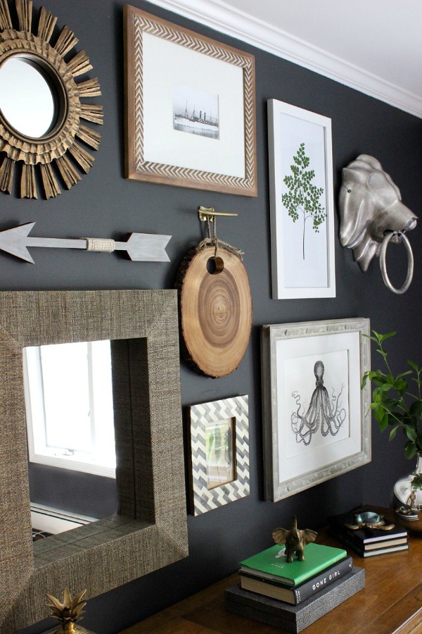
3. Mirrors - this is not a new idea but one way to add some light to a room is to add a mirror.  there are so many shapes and styles of mirrors, too.  A mirrors looks great layered over an accent wall or on it's own.  Mirror gallery walls - so mirrors in different shapes and frames is another unique touch to a room.


Mirrors make a wall stand out so well. Love this gallery wall design. HomeDecorators.com:

4. Floating shelves - this is a clean and easy way to display a series of pieces you want to show off.  On a floating shelf anything can really work - framed photos, candles, decor pieces etc...For the shelves themselves you have lots of options in terms of colours and materials.


21 Modern Living Room Decorating Ideas | Page 15 of 21 | Worthminer - but with some colour and timber accents:

5. An oversized wall clock - this is both function and fashion.  This fills up the space and is visually appealing but it is also very useful.  there are so many styles of clocks to choose from too.  We love the aged clock in this image flanked by the candle sconces.


Enjoy the feeling of being at a coastal retreat all the time by decorating your living room with beachy accents like pillows, coral sculptures and light, airy shades.:

 6. Animal heads - so we have seen this trend for a few years now and maybe it has reached it's peak but we are seeing different and unexpected animal heads.  People are using them in different places too like kids rooms and nurseries.  We have also seen them in a variety of materials - papier mache, resin, faux fur, wood, metal and wire. They are nice in an eclectic gallery wall, or just on their own.  Trend or not, if you like it - go for it!

Nursery with faux animal heads mounted on wall:

 7. Maps - so this can be purely decorative but also educational.  It's a great addition if you love to travel - it's a great way to show off your interests through decor.  Map come is all sorts of shapes and sizes - full wall paper or oversized framed maps.  The colours vary too - soft 'aged' beige tones to bright and vivid colours.

3. Use old maps in your decor! Create awesome wall murals using old maps, or just frame some of them and hang them on your walls. Another idea is to decorate the lampshades with maps. The older, the better! You’ll love the result!:

8. Wall decals - wall vinyls have come a long way - they are easy to stick on and peel off.  There are so many possibilities too - inspirational quotes to images and everything in between. So this is another great option for someone living in a rental that wants to add some 'pop' to their space or for someone that changes their mind often.

Small hazel green little vinyl heart wall decals on a biege wall with a white drape on the left. In front of the wall is a pastel green chair with a white pillow and a small table with a white lamp on top.:

Which wall treatments do you like? Which ones have you used? What ever you decide make sure it suits you and your space and don't ever feel like you have to follow the latest trends!
Labels: , , , , , , , , ,

Saturday, July 18, 2015

Top 10 Colours for Fall 2015 and How To decorate with them


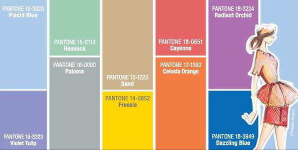
these 10 colours are the predictions from Pantone.  We have seen some of these tones in recent years or similar tones like Amethyst Orchid, Cadmium Orange and the Biscay Bay are very similar to Radiant Orchid, Tangerine and Emerald.  

This colour palette is a great blend of some summer hues and richer fall hues.  These colours (more or less) all work together but in some unexpected combinations.  For example mixing an earthy shade like Dried Herb with a soft pastel like Amethyst Orchid.  The possibilities of visually interesting combinations are endless.

So how can you use these #Fall2015 colours at home?

Well, most of us likely have one of these neutral tones in our current decor - maybe a large furniture piece like a sofa or a wall colour.  If that's the case, build on that neutral piece by adding art or accessories or even textiles like pillows, rugs or even drapery with some of the more colourful, punchy tones.  

Energize a straightforward sofa with bold cushions: an island-floral, linen-cotton pillow cover and a sophisticated, olive green suede rectangle.
Here's a very simple example of mixing the dried herb and the orange in accessories.  

Look for some statement pieces that combine the colours together!  We love this leaf motif area rug that blends - biscay bay and stormy weather. With some white and soft aqua for contrast balance.  But this would look great in a living room or bedroom with shades of grey and some pops of biscay bay (and other members of that 'teal' family)


Rugs USA Satara Leaves Blue Rug im sooooo in love with this rug! Would match my bedroom perfectly
We love what art can do to a room.  Especially over sized art!  It makes a room look expensive but also complete.  An art piece is a great way to pull a colour scheme together or even add an unexpected pop of colour! the image below is a great example of a neutral and class colour combination and adding a piece of art with colour - it totally changes the space! This combines the reflecting pond and the amethyst orchid and cashmere rose.

navy blue sofa Living Room Makover Decorating Ideas - Living Room Before and After Pictures - House Beautiful
When it comes to using colours that area trending you don't have to have the exact hue, but keep it in the family.  Use the trending colours as a guideline - it's a great way to come up with something new and fresh!

Labels: , , , , , , ,

Monday, April 20, 2015

House Rules: How to Hang Art Work

Sure anyone can bang a nail into a wall and hang their art but to get the perfect look in your space, these are the tips and numbers you want to remember next time you are hanging your art


What’s the best height to hang artwork?
  • Art should be hung at eye-level with the center of the picture positioned between 56 – 60″ from the floor.
  • When hanging one picture directly above another, treat the two art pieces as one large picture with the center point between them being 56 – 60″ from the floor.


Height to hang art

How many inches apart should I place pictures in a gallery wall?

  When hanging multiple pieces of art in a grouping, use a spacing of 1 – 3″ between pictures. Smaller pieces of art can be hung a little closer together (1 –  1½”) than larger pieces.


Home Office Gallery Wall

 How high should I place pictures and other art when hanging it above furniture?

 When hanging artwork above a piece of furniture, leave 5 – 9″ of space between the top of the furniture piece and the bottom of the frame. This rule of thumb can be used for hanging art over a console or chest of drawers as well as a sofa or headboard.


Williams-Sonoma

 How high should I hang other wall decor?

 Whether it’s a decorative plate wall or a wall display of a favorite collection, a good rule of thumb is to treat the grouping of wall decor as one item and center it at 56 – 60″ off the floor.


Our Dining Room

 Of course, the most important rule of all is to not be afraid to break the rules! These rule of thumb measurements are great to use as starting points and will help you develop your own eye for hanging artwork at a height that’s perfect in your space. But if something looks and feels right to you but doesn’t fit with these rules, by all means go with your gut and try it out!
Labels: , , , , , , , ,

Wednesday, March 25, 2015

Home Decor: What to do when something's off....

If you've ever had a room hovering at "almost there," you know how frustrating of a situation it can be. The room doesn't look bad, it just doesn't quite sing. It's missing something, and you can't put your finger on it. You might find these six things to try helpful when a room just isn't coming together like you thought it would!

 The best thing about this photograph is those brass shelves. I garbage-picked them two weeks ago. Rug, pillows and stool are all Nate Berkus from Target.

1. Compare it to your inspiration
Whether you tried to copy a room you saw on Pinterest piece by piece, have always just wanted a room that feels like Nate Berkus designed it or looked to a piece of art for color palette inspiration, go back to that inspiration and compare. What do you have in your room that's not in the inspiration? What don't you have? It might be a case of you trying an extra element that's fighting the harmony of the original inspiration, or you may have forgotten to include a vital element that makes your inspiration work. We are all naturally drawn to symmetry and balance, so see if that is the issue. We recommend an element of pattern, colour, texture and shine in every space.

 Retro still rocks! Freshen it up with an unexpected background shade--here a light blue (wall, accent items) keeps it from getting too earthy and becoming murky.

2. Try taking things out
Take out a big element. Yes, even something big like curtains or art. Now step back and look at the room again. Even if the room feels a little emptier, you might be able to see the potential of where the design needs to go . You might not be able to see what your room is missing because there's something that doesn't belong in there already, blocking your ability to see the room's potential.  A lot of interior decor is trial and error so it's normal to not get it perfect the first time.  Often you need to play around to see what you are 'feeling' for the space.

 South Shore Decorating Blog: Sunday Dreaming With Lots of Beautiful Rooms
3. Focus in on a spot, corner or wall that you do love
Why do you feel like that spot is working? What is it that you love? Take what's working and spread it out around the room a little more. Maybe it's a color you only used a touch of that could be maximized more in the space. Maybe it's a style of furniture you played around with on a small scale that the room could use more of. See what adding more of what you love in the room does to the feel of it. Take inspiration from what you love even if it is right in front of your nose!

 European Collection Letterpress Prints, 3 prints 16x20" $95

 4. Shake up your style
Grab something from another part of the home, from a friend's home or find a free thing — just make it something that seems surprising to add to the space. As we've mentioned before, sometimes bringing something that you think obviously doesn't go can produce one of two equally favorable outcomes: either it surprises the heck out of you by working in the space, or it points you in the right direction to go in by being so mismatched! Can't find an item that catches your eye? Grab a scarf in an unexpected colour (or grab a few) maybe the room needs a real pop.  Do something interesting - display your most prized and beautiful pieces (even shoes or jewelry)


5. Take a picture (or two or three)
And then leave the room you're trying to figure out. Like, go to a coffee shop or somewhere else. Look at the photos you took on your phone and scroll through them. Look at the photos on a small scale; small thumbnails that let you see the whole space. Put some mental distance between the fact that this is a room you live in and see every day and instead view it like a room you'd be spotting on a blog somewhere. And then immediately listen to your gut on what you think the room might need (or need taken out).


Lots of ideas for arranging furniture around a fireplace in the corner of a room
6. Doodle
Those pictures you took earlier? Print them out if you can (or turn to a digital photo manipulating tool) and start doodling. Drawing patterns. Drawing furniture pieces. Squares where you think more art could go. Doodle stuff you wouldn't do in your right mind with actual items. That you can't do financially. Play. And when you hit on something that feels like it clicks, figure out how to make it work on your budget and in your space!

Labels: , , , , , , ,

Saturday, March 22, 2014

Ombre - A Cool and Fresh Look for Your Walls and more

So we are still seeing lots of people decorating with accent walls.  We have all seen the bold colour accent walls (red walls were hugely popular) and then the neutral colour accent walls (like a chocolate brown or a charcoal) and then wall paper accent walls ...if you love an accent wall take a look at what is trending this season - Ombre Accent Walls.  The Ombre look is something we have seen a lot in fashion in both hair and clothing and now we are seeing it in home decor.  The Ombre wall is a fresh look and the colour choices are endless you can opt for a bold colour option or a neutral shade or blending two different shades like pink and grey or blue and grey.


Laurie-March-pink-ombre-bedroom-wall_s4x3

Here's what you need:

Paint Colors (for a grey and pink ombre wall like the image above)
  • One gallon of gray
  • One gallon of salmon pink
  • One gallon of light gray
Supplies
  • Tape measure
  • Paint roller
  • Paint tray and liners
  • Wide paintbrush


Get Started: Paint and Blend


Paint a Base Coat
For best results, wipe down or dust the wall you are going to paint. Choose the lightest shade of paint and begin by painting the entire wall this color. Don't skip this step: This will give your other colors a fresh base of paint to go over, making a smooth, even surface for blending. Let it dry.
Divide the Wall Into Sections
To achieve an ombre look, measure three equal sections on your wall and mark lightly in pencil. The top section will be the lightest color. The darkest color goes at the bottom, leaving the third color for the center.
Start With Medium in the Middle
Paint the middle section with the second-lightest color, leaving 6" of room between the edges of each section. In a timely manner, hold a dry brush at a 45 degree angle to blend.
Apply the Darkest Hue at the Bottom
Paint the darkest hue at the bottom of the wall, leaving a foot between color sections.
Mix the First New Color
In a fresh paint liner, mix your lightest color and your middle shade at a ratio of half and half. Use this first new color blend to paint the 6" gap between the lightest and middle color. Taking a dry brush and holding it at an angle, quickly blend up until you meet the next color section.


Laurie-March-ODOC-gray-ombre-wall-blend-no-resize_s4x3


Mix the Second New Color
In a fresh paint liner, mix your darkest color and your middle shade at a ratio of half and half. Use this second new color blend to paint the 6" gap between the darkest and middle color. Taking a dry brush and holding it at an angle, quickly blend up until you meet the next color section. Continue to brush the three sections together until you achieve the level ombre you desire.

Your new ombre look can be on furniture too, like this great dresser

best ikea hacks. Take a paint swatch, ask for samples of each shade. Paint cheap Ikea dresser.


You could do this colour blocking look in a ombre palette on a wall too, you wouldn't need to blend the paints but you would need to tape the portions before hand, so you will need good painter's tape and a level for straight lines.


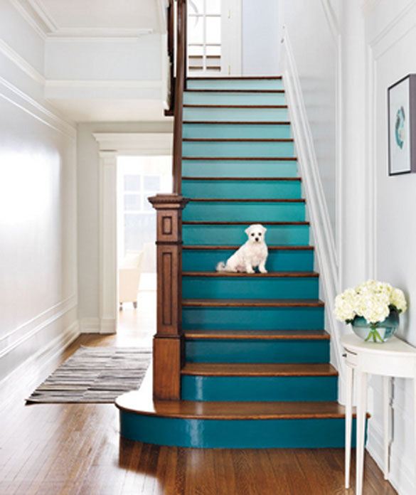
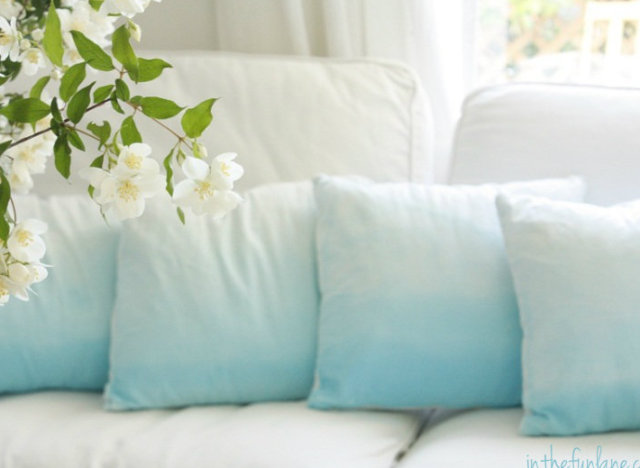
 With ombre the possibilities are endless - furniture, walls, art, bedding, rise of the stairs, pillows and even the spindles.


Labels: , , , , , , , , ,

Wednesday, February 19, 2014

Mellow Yellow

With the spring season slowly approaching...it might be time for you to consider bringing a little sunshine inside of your home!  Try introducing some of these shades of yellow into your current decor style. 

Yellow can work with any style - country, traditional, contemporary and more....and it can be used in many different ways.....

Paint:

For a splash of yellow in your space try SUNBEAM A12-3 by Olympic - it mimics the rays of sun but without being overwhelming.  Pair it with other nature inspired tones like sky blue or grass green or go more contemporary with greys. This is a yellow tone but a neutral colour with some warmth


For a bit more of a glow in your bathroom or breakfast room, try OPTIMISTIC YELLOW SW6900 by Sherwin Williams.  this colour will definitely banish those winter blues.


Go Gold with Ace Hardware's GOLDEN PATH A23-7 this is a great golden yellow that would work beautifully in a more traditional space or for wood furniture that is in need of a pop.


A classic yellow tone that works well with other neutrals like grey and brown BUTTERY 14-5 by Pratt and Lambert is for someone looking to brighten up their space with a perfect yellow.


Other ways to bring some yellow in to your space.....

Try some simple accessories like a vase, pillows and other decor items like....


Miko Collection - Yellow

This great set of dishes available at Urban barn


This bedding collection available at West elm is a stunning colour combination with grey and off white and the pop of yellow adds some warmth

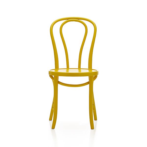
Vienna Yellow Side Chair

This cafe style chair available at Crate and Barrel is a fun pop for any kitchen, paired with a glass table, white table, grey or a reclaimed wood table.

STOCKHOLM Cushion cover IKEA Cotton sateen has a soft, smooth finish with a subtle sheen. The zipper makes the cover easy to remove.

This stripe pillow available at IKEA  is a perfect pop of colour but I love how there are other colours and neutrals in this stripe fabric.  It would look great with any neutral and you can bring in some other accent colours too.

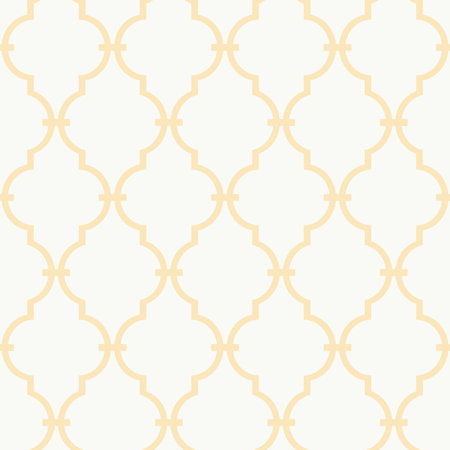
Trellis Wallpaper

Wallpaper!  Why not?  A bit of a traditional look but if you apply it in an unexpected spot like the back of a bookcase or as an accent wall it has a more current look.  The white and yellow trellis  pattern is bright and fresh available at Joss & Main

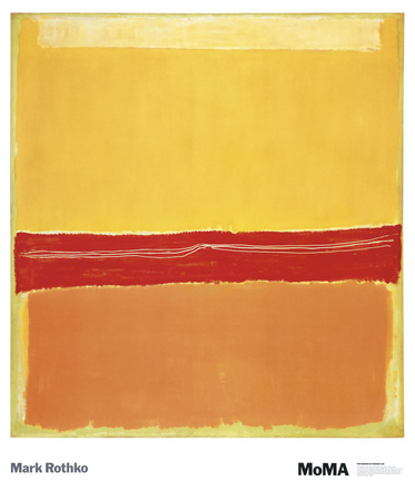
Art is an easy way and affordable way to add colour to your space.  Art.com is super easy, affordable and they have an enormous selection for all styles and tastes.

Add caption


Labels: , , , , , , , ,

Tuesday, October 8, 2013

Looking Ahead - Trends we can expect in 2014

So if you are someone who likes to be ahead of the curb (or at least in touch with the curb)  this post is for you.

What are the upcoming trends for Home Decor in 2014? 

Well, we will definitely continue to see these 'hybrid styles' where two or more design styles are meshed together to create a cohesive look.  This is happened very organically and we will continue to see this happen as couples become 'serious' after they have made individual home purchases.  So 'modern vintage', 'rustic elegance' and 'urban farmhouse' are looks that we will be seeing more of and the possibilities are endless.

Home Fashion gets a lot of inspiration from designers on the runways.  We were seeing a lot of monochromatic fashion looks so we will likely see monochromatic home looks this coming year.  So a mix of various textures - wood, glass, wool, cotton, velvet etc...in a tone on tone look.  Very chic and classic and very easy to modify.


In 2014 Colour will be making a come back.  Right from the runways - we will see colour in accent furniture, pillows, throws, and even paint. Expect to see shades of blues (like 2013) and purples but also oranges (like 2012) and yellow.  Bold and bright or soft pastels?  - you will see it all !


Feminine touches like lace, eyelet, sheer and embroidery are ultra soft and sweet especially in white.  We will see these types of feminine touches in the home paired with over sized chandeliers but also with masculine wall colours like navy and charcoal.


We will also be seeing a lot of pattern (again another trend from the various fashion houses)  and a lot of mixing patterns.  Stripes, florals, geometric patterns, hand sketched prints, abstract and ethnic too, in drapes, rugs, pillows and even wall paper in colour - it's going to be wild!


 We will still see a lot of natural and soft materials like knitted pillows and wood but again mixed with harder and sleeker textures to give a lot of depth to each space. 


Labels: , , , , , ,

<data:blog.pageTitle/>

This Page

has moved to a new address:

http://kikiinteriors.com

Sorry for the inconvenience…

Redirection provided by Blogger to WordPress Migration Service