Kiki Interiors - Decor and Staging

Monday, August 31, 2015

Pillow Talk - let's Talk Pillow Arranging

Whether you are decorating your home or staging it for sale, pillows are a great way to add some visual interest to your space, a pop of color and/or pattern and some soft texture.  Pillows are also a great way to tie up your concept.

We love pillows and they seem like such a small element but do they ever make a difference in a room.

We are often asked for ideas on how to arrange pillows on a sofa.  Here are some great tricks and tips to arrange your pillows like a pro.

When it comes to pillow arranging there is no set rule but they are a few standard arrangements that work.

 If You Want a Modern Look: Go for an odd number, like three or five, rather than more traditional pairs. A few big pillows look cleaner than a jumble of smaller ones, which can seem like too much punctuation.


Labels: , , , , ,

Wednesday, May 27, 2015

We Answer Wednesday - How To Mix Patterns

"I love my home but slowly I have been making decor updates.  In Interior Decorating magazines and TV shows, I always see designers mix different patterns and prints.  I love the look but I have no idea how to mix patterns, can you help me get that "designer" look?'

Great question and yes, designers and decorators are always mixing different prints, patterns, textures and colours - by doing that you completely elevate the look of any room but it can be tricky! Adding pattern and print to your space is also a great way to add personality to your space.  Pattern is so versatile and can be added to any room - bedrooms, living room, dining room and more.  Pattern can be brought into a room using drapery, pillows, chairs and rugs but don't forget about wallpaper accent walls, head boards, bedding and even dishware!

Follow our simple steps, you be be able to mix patterns like a pro!

1.  Work with an odd number of patterns
Odd numbers tend to look best, so if you’re going to play with patterns, start with three different patterns in three different scales.  Once you’ve mastered the key to mixing patterns, try for five!

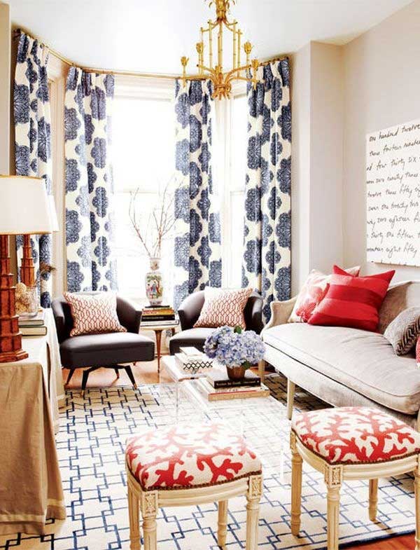
 Sophisticated Family Room Seating Area    Achieve a polished look with symmetry.      A skillful mix of patterns infuses this family room by Sarah Richardson Design with shades of blue, from soft to cerulean. A pair of printed armchairs face the main seating area, while two wing chairs upholstered in menswear-inspired fabric flank a games table.

2.  Use varying scales of pattern.
 Incorporate varying scales to the space so that the prints don’t compete with one another.  Sticking with the rule of three, pick one large, one medium and one small pattern to work with.  For example, try one large floral/organic pattern, plus one medium geometric, plus one small classic pattern.
 Pattern Scale Tidbits&Twine

3.   Large patterns work best on large pieces, small patterns work best on small pieces
When choosing the location of your patterns, keep in mind the space in which you are working.  A large pattern works best on a large item, such as a wall, window treatment or area rug. because the space is large enough to accommodate the pattern in its entirety.  A medium pattern is better suited to furniture and a small pattern to accent pieces.  (Note: Sometimes, small patterns can look busy when used in large amounts.)

 DIY for the Lazy: 6 Cute Projects That Don't Take A Lot of Work | Apartment Therapy

4.  Look for a large pattern that incorporates all of your colours.
 One approach to begin building your mix of patterns if your space has several colors in it, is to think of the large pattern as your anchor.  It should be the biggest, boldest and incorporate ALL of your colors in your color scheme.  From there, pick a different, medium-sized pattern (about half the size of your large pattern) that utilizes SOME of the colors.  Lastly, the small pattern can use just TWO or THREE of your colors.  One easy way to do this is to look for a fabric that has coordinating patterns available.
 Central Color Pattern Tidbits&Twine

5.  You can use pattern, even if you have a monochromatic room.
Alternatively, if you have a single color, play with different shades of the color.  So long as you still vary the scale and type of pattern, you can create a very cohesive look of mixed patterns this way.

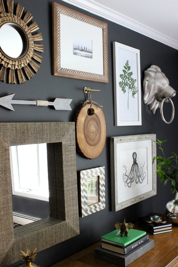
 Gallery Wall

6. Consider adding a solid to the mix.
 Don’t be afraid to throw in a solid to soften and ground the look! A solid can also help anchor the whole room which will allow the eye to focus.

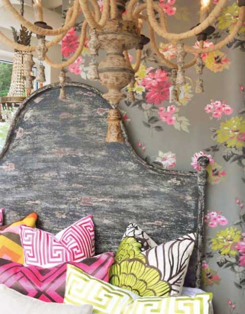
 Beautiful bedroom styling. Such a fun and unique color palette. Plus I'm loving all of these great patterns and textures!

7.  Group together patterns that have similar qualities
If you have a defined style in your home, also give some thought as to the types of patterns that you mix together.  Traditional patterns tend to mix easier with other traditional patterns, versus mixing them with bold, contemporary prints.  So for example, traditional prints such as florals, plaids, and damask don’t always blend easily with chevron or ikat.  This doesn’t mean you can’t mix patterns across styles – in fact, sometimes, an unexpected print gives a pop to the room – but if you’re just starting to experiment with pattern, it is often easier to stick within a style.

 .Carriage House Living Room by Brittany Zachos- love the use of yellow and turquoise with gray & the patterned curtains and pillows.

8. Be sure to balance your patterns in the space.
 Balance is key!  This includes not only balancing the scale of your patterns, but balancing them equally throughout the space to avoid a lop-sided feeling.

 Living room color scheme ideas

9. Stick with a consistent hue.
 Within your color palette, use colors with consistent intensities.  If your palette is pastel, don’t mix in a bold jewel tone and vice-versa.
 Pattern Hue 2 Tidbits&Twine

10.  Don't be afraid to break the rules!
Beauty is in the eye of the beholder, so break the rules if it looks good to you!  Sometimes, complementary patterns and motifs come together in an organic and unplanned fashion, so if it looks good to you, go for it and have fun!

 dining rooms | We can't get enough of these mismatched dining chairs with colorfully ...


Labels: , , , , , , ,

Monday, May 25, 2015

Why I love my job....one year later


One Year Later….. A reflection post-grad by Maddie Clarke

This time last year I was ready to graduate and get started on my career. It was such an exciting transition from decorating student to an interior decorator with a fabulous company, KIKI Interiors. My first day consisted of helping new clients design their dream home by choosing the finishes. I can remember how excited I was for that first project and wondering if everyday would be like this…. To my surprise, it is. I’m excited by my job every single day, and that’s a pretty cool feeling.


Every single day has been different. I’ve had the opportunity to experience so many different projects, clients, and situations, I never expected to have such a wide range of work and learn so much. Everyday I go to work, I am experiencing something different which furthers my knowledge. And I’m very grateful for that.

 We loved mixing both colour, styles and textures in this space - the aqua, the tangerine, the prints and graphics and the wood, brick and glass all work together to create a perfect balance in this condo space


Working as a decorator has taught me so many things in such a short time. No one teaches you how to deal with difficult clients, how to handle situations that have gone terribly awry, or how hard it is to build furniture for a model. (I can’t remember ever being so emotional over a chair.) These are life experiences I will carry with me and be able to apply to my everyday life,
The various projects and clients I’ve been involved with is quite a wide range. 


I was fortunate to be able to do a lot of new things in a short period of time. 

Last November, we had the opportunity to style a photo shoot and stage the background for a new product campaign, I worked with so many different clients and their different styles (some wackier than others), I was involved in furnishing a model condo, staging and de-staging homes, advising clients on how to prep their home for the real estate market, as well as learning about blogging, updating pages and the importance of having a strong social media presence. I worked on my first commercial space and reaped the benefits of a blank canvas. I’ve learned that the best feeling in the world is seeing something you’ve worked so hard on come together in a beautiful space. Having a client LOVE what you’ve helped them to achieve in their home is so rewarding. I’ve learned to deal with suppliers who aren’t as organized as me, when it’s time to be “ruthless” and when to take a step back. 

 yes, you can having a real dining space in a smaller condo.  Just consider scale, size and placement - don't be afraid to get creative

I’ve learned that not everyone is rational and often tensions can run high. I’ve learned that “not today” is a phrase Kristi and I toss around quite often when we get frustrated, and when its time for us to just sit back and laugh at this crazy job. I’ve also learned how good a glass of wine can be after a bizarre day. (and those days do happen!) I have been lucky to experience working with someone you truly have a great time with. Enjoying the company that your in is a wonderful and rewarding way to spend your days.. I'm lucky to work with people who are like-minded and so much fun!!

 finding the right mix of accessories that won't compete with the product is incredibly important

This is the most fun career I could ever imagine doing. This year has been a lot of things, boring is not one of them.

Labels: , , , , , ,

Wednesday, May 6, 2015

We Answer Wednesday - Colour Combos with Grey

"I jumped on the grey trend last year for my new place and I do love it but I'm feeling like tone on tone shades of grey is a bit bland and bordering on depressing.  How can I spruce up my grey condo? Are there colours you would recommend?"

Grey has been a trend for a few years and is becoming more popular especially in tiles, flooring and kitchens and baths.  You are in luck! Grey is a neutral so it can pair beautifully with just about every colour.  Here are some examples of what you can do with grey in your space.  There's no wrong answer, it's all about preference

The other great thing about Grey is that is works with all styles - rustic country, sleek modern and everything in between.  But when it comes to choosing an accent colour think about the mood you would like to set.  You can have a 'moody' house with a few different accents, maybe soft purples in the bedroom and blues in the main living space

Here are some of our favourite colour palettes with greys

Yellow - This image is an example of some contemporary with an eclectic vibe using a touch of yellow.  This look has a sophisticated vibe because it has introduced some brass touches in the coffee table and the lighting (so another element of yellow) and some bold graphic elements in art and pillows. We also see splashes of a mustard tone in the rug, This classic colour combo can work in a living room, dining room, bedroom anywhere in the house.

Yoko Ono est dans la cuisine - PLANETE DECO a homes world


Pink - Add some bright, bold and girly glam to your space.  This colour combo is perfect for a bedroom. Again using bold pink accessories in the bedroom makes a statement.  But you could opt for softer and lighter pinks paired with grey for a more romantic feel to your space.

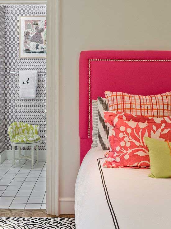
pretty, preppy bedroom. home decor and interior decorating ideas. pops of pink and orange #habitación para dos con color


Blue - any shade will do!  You can opt for soft aqua tones for a more rustic country look, bold and deep turquoise tones with shades of grey for a more modern and contemporary feel.  But for something a bit more sophisticated try deep indigo with greys and fresh white. So clean and simple.....

Grey, black, white and blue.  I would warm it up with some wood, bronze, gold, copper accents

Green - lime green is fun and bright and paired with deep greys is it beautiful and not too serious.  But a deeper truer Kelly green with soft greys is also a great match.  Like yellow it works in any space


22 Living Room Furniture Placement Ideas Creating Functional Modern Home Interiors


Orange - love orange and grey, sophisticated and a bit sporty!  It works with all shades of grey - try layering your grey and add bold pops of orange like in this bedroom.  Don't forget to play with patterns and prints in this orange tone. A great colour combo and a new classic.


NEW! Upholstered in a Feather Gray fabric, this tailored bed’s slim silhouette, angled solid wood legs and welted details along the corners give it grace and polish at a great price.

Purple -  Try pairing soft lavender and soft greys with a few pops of deeper grey and purple (like charcoal and eggplant) for a romantic room - love this combo in a bedroom.  Layering different textures will also add to a romantic space.  But if you opt for bolder, brighter and deeper tones of purple you will get a modern and edgy vibe

Nordstrom at Home 'River Pleat - Grey Silk' Collection #Nordstrom #NSale ~ Great job Nordstrom.  I just saw this and HAD to have it.  So I ordered the whole thing.

 Don't forget to add a secondary accent colour just to keep that designer look.  This image is a great example of adding a secondary accent colour for additional pop.  Here we have a basic and neutral palette with the off-white sofa, light grey carpet and dark wood stain.  Adding the lemonade yellow and the deep teal is a slight spin on a classic combo of yellow and blue.


 1950s Living Room with Yellows and Grays


By layering your shades of grey adding a bit of white and/or black and a pop of colour (or two)...you will have a sophisticated and designer look in your space.

Labels: , , , , , ,

Monday, April 20, 2015

House Rules: How to Hang Art Work

Sure anyone can bang a nail into a wall and hang their art but to get the perfect look in your space, these are the tips and numbers you want to remember next time you are hanging your art


What’s the best height to hang artwork?
  • Art should be hung at eye-level with the center of the picture positioned between 56 – 60″ from the floor.
  • When hanging one picture directly above another, treat the two art pieces as one large picture with the center point between them being 56 – 60″ from the floor.


Height to hang art

How many inches apart should I place pictures in a gallery wall?

  When hanging multiple pieces of art in a grouping, use a spacing of 1 – 3″ between pictures. Smaller pieces of art can be hung a little closer together (1 –  1½”) than larger pieces.


Home Office Gallery Wall

 How high should I place pictures and other art when hanging it above furniture?

 When hanging artwork above a piece of furniture, leave 5 – 9″ of space between the top of the furniture piece and the bottom of the frame. This rule of thumb can be used for hanging art over a console or chest of drawers as well as a sofa or headboard.


Williams-Sonoma

 How high should I hang other wall decor?

 Whether it’s a decorative plate wall or a wall display of a favorite collection, a good rule of thumb is to treat the grouping of wall decor as one item and center it at 56 – 60″ off the floor.


Our Dining Room

 Of course, the most important rule of all is to not be afraid to break the rules! These rule of thumb measurements are great to use as starting points and will help you develop your own eye for hanging artwork at a height that’s perfect in your space. But if something looks and feels right to you but doesn’t fit with these rules, by all means go with your gut and try it out!

Labels: , , , , , , , ,

Sunday, April 12, 2015

10 Things Every Living room Needs

The living room is where you entertain, relax, read, maybe watch TV but it is the most 'public' space in your home and sure, you can count on the sofa, the coffee table, and a few additional seating options. But the room needs to be personalized through decorative touches. Here's some inspiration on how to add those personal style items to your space to give it a polished look

1 - A place for your books -  Your collection of first editions aside, designate an area to feature a few choice titles that complement your style. If your space is small, try blending the book case colour with the wall colour - it will look luxurious (like built-ins) and it will look streamlined

 30 Ways to Make Every Room in Your House Prettier

2 - Window treatments -  An empty window space is an incomplete one. Dress the frames with a set of drapes to maximize the height of the room, providing it with a simple yet elegant finish. Drapes also add softness to a room and they frame a window beautifully.  If you have blinds already add the drapes they really add a touch of style

 Sister’s Living Room Before & After (NOTE: "The window treatments are probably my favorite update to the space. I wanted to make them lush, but still feel casual. We achieved the “lush effect” by using lots of layers. Each window has a double rod that carries a sheer and a heavyweight cotton panel, plus a bamboo roller shade on each side. The casualness comes in with the types of materials we chose—the simple bamboo and the woven white cotton.")

3 - A styled coffee table -  A well-curated table keeps essentials on hand - minus the clutter. Stick to things that make like favorite books, vases, or trays. No, the remote control does not count as an essential or an accessory.

 Bungalow living room AFTER 2. shorten the breakfast table to be a coffee table @The Rustic Acre Furniture- Texas

4 -  Something on the walls - We're all about the walls. Gallery of frames. One eye-catching print. An over sized mirror. Choose to decorate with pieces that will make the space totally your style.

 BIG ANNOUNCEMENT: Our Sofa Collaboration with Interior Define Now Available! #theeverygirl

5 - Pop(s) of colour -  Offset a neutral palette with hints of an eye-catching hue. It's the key to an instant uplift. Accent pillows, art, accessories and even an area rug are easy ways to add some colour to your space.

Cheap Decorating Tricks from Cozy Little House Mix plates with framed art for an eclectic look...

6 - Painted walls -  A can of paint really is the easiest way to add personality to a room. As for the color, well, that's up to you.

Don’t be afraid to play with color! See the rest of this bold & colorful condo: http://www.bhg.com/decorating/small-spaces/apartments/bold-colorful-condo/?socsrc=bhgpin081513popsofred=2

7 - A side table - A simple accent piece doubles as a geographically-convenient (and temporary) spot for all the necessities for a little lounge time.Plus these come in very handy when entertaining

Suzie: The Elegant Abode - So pretty! Off-white pale gray linen sofa with caster legs,  ...

8 - Personal touches - Dedicate some shelf space for an edited assortment of pieces that reflect your personality. Throw some favorite framed photos to the mix as well.

 feng shui family room | ... decorating with family photographs for Feng Shui a living room design

9 - Light fixtures -  A little lighting goes a long way. If you don't have a ton of natural light, then bring in table lamps to set the right mood for your space.

 Open Floor Plan    Interact with family and guests while putting the finishing touches on your meal. With an open floor plan there’s room for everyone to sit comfortably around the kitchen and in the surrounding living spaces.

10 - The right seating arrangement - Small space. Large space. We can't stress this enough. It's important to think about the shape of your room and its function. Arrange for how you will be using this area.

Love this. The black side boards would be where the double doors are

Labels: , , , , , , ,

Wednesday, March 25, 2015

Home Decor: What to do when something's off....

If you've ever had a room hovering at "almost there," you know how frustrating of a situation it can be. The room doesn't look bad, it just doesn't quite sing. It's missing something, and you can't put your finger on it. You might find these six things to try helpful when a room just isn't coming together like you thought it would!

 The best thing about this photograph is those brass shelves. I garbage-picked them two weeks ago. Rug, pillows and stool are all Nate Berkus from Target.

1. Compare it to your inspiration
Whether you tried to copy a room you saw on Pinterest piece by piece, have always just wanted a room that feels like Nate Berkus designed it or looked to a piece of art for color palette inspiration, go back to that inspiration and compare. What do you have in your room that's not in the inspiration? What don't you have? It might be a case of you trying an extra element that's fighting the harmony of the original inspiration, or you may have forgotten to include a vital element that makes your inspiration work. We are all naturally drawn to symmetry and balance, so see if that is the issue. We recommend an element of pattern, colour, texture and shine in every space.

 Retro still rocks! Freshen it up with an unexpected background shade--here a light blue (wall, accent items) keeps it from getting too earthy and becoming murky.

2. Try taking things out
Take out a big element. Yes, even something big like curtains or art. Now step back and look at the room again. Even if the room feels a little emptier, you might be able to see the potential of where the design needs to go . You might not be able to see what your room is missing because there's something that doesn't belong in there already, blocking your ability to see the room's potential.  A lot of interior decor is trial and error so it's normal to not get it perfect the first time.  Often you need to play around to see what you are 'feeling' for the space.

 South Shore Decorating Blog: Sunday Dreaming With Lots of Beautiful Rooms

3. Focus in on a spot, corner or wall that you do love
Why do you feel like that spot is working? What is it that you love? Take what's working and spread it out around the room a little more. Maybe it's a color you only used a touch of that could be maximized more in the space. Maybe it's a style of furniture you played around with on a small scale that the room could use more of. See what adding more of what you love in the room does to the feel of it. Take inspiration from what you love even if it is right in front of your nose!

 European Collection Letterpress Prints, 3 prints 16x20" $95

 4. Shake up your style
Grab something from another part of the home, from a friend's home or find a free thing — just make it something that seems surprising to add to the space. As we've mentioned before, sometimes bringing something that you think obviously doesn't go can produce one of two equally favorable outcomes: either it surprises the heck out of you by working in the space, or it points you in the right direction to go in by being so mismatched! Can't find an item that catches your eye? Grab a scarf in an unexpected colour (or grab a few) maybe the room needs a real pop.  Do something interesting - display your most prized and beautiful pieces (even shoes or jewelry)


5. Take a picture (or two or three)
And then leave the room you're trying to figure out. Like, go to a coffee shop or somewhere else. Look at the photos you took on your phone and scroll through them. Look at the photos on a small scale; small thumbnails that let you see the whole space. Put some mental distance between the fact that this is a room you live in and see every day and instead view it like a room you'd be spotting on a blog somewhere. And then immediately listen to your gut on what you think the room might need (or need taken out).


Lots of ideas for arranging furniture around a fireplace in the corner of a room
6. Doodle
Those pictures you took earlier? Print them out if you can (or turn to a digital photo manipulating tool) and start doodling. Drawing patterns. Drawing furniture pieces. Squares where you think more art could go. Doodle stuff you wouldn't do in your right mind with actual items. That you can't do financially. Play. And when you hit on something that feels like it clicks, figure out how to make it work on your budget and in your space!

Labels: , , , , , , ,

<data:blog.pageTitle/>

This Page

has moved to a new address:

http://kikiinteriors.com

Sorry for the inconvenience…

Redirection provided by Blogger to WordPress Migration Service