Kiki Interiors - Decor and Staging

Sunday, November 1, 2015

7 Easy Ways to add a little Colour to your world

It's officially November and we can all see it, not just on the calendar but outside, too!  The days are shorter, the leaves have fallen off of the trees and those beautiful fall colours have turned to grey....everything is just a little dreary.  So maybe it's time for a change, a dash of colour and some fun at home.

The easiest way to make a change to your space to liven it up is with colour.  Here are some of favourite (and easy) ideas to add some pop to your decor.

1 - Florals.  This is perfect for anyone non-committal, fresh flowers don't last for after about 10 days - they will need replacing. Or try some silk flowers, these keep, they are low maintenance and you can bring them out when ever our home needs an extra boost! They look great in bedrooms, bathrooms, on coffee tables and more....

Calling all color lovers: here are 8 color inspiring centerpiece ideas perfect for your home! #HomeGoodsHappy

2 - Art.  such an easy way to add as much or as little colour as you like.  Any style of art piece can have colour from abstract to landscapes - go with what you love.  You can use the colours in that piece as an inspiration for adding even more colour in that room, so not, it's up to you!


Modern art and mid-century furniture...yummy.:

3 - Area rugs.  Think of them as art on the floor.  This is a great way to make a statement in any room.  Mixing colour and pattern can really transform a room.  The options are endless!

Neutral gray is a great base for adding colorful accessories! More ways to decorate using gray: http://www.bhg.com/decorating/color/schemes/gray/:

4 - Drapery.  A fun way to add colour, pattern and texture to your space.  This can really wake up a neutral space.  Like area rugs - the choices are plentiful...


Color, Please:: The large-scale pattern on the draperies in the living room inspired the palette of Kelly green and neutrals that was carried throughout the home. Playful colors and punchy patterns were used strategically throughout the home to create a pleasing feminine/masculine balance and to reflect the family's fun personality.:

 5 - Small furniture pieces.  Keep your main furniture pieces neutral but try adding an accent chair, side table or stool in a colour.  This is unique and it's a great way to show off your personality.  We love this kitchen with orange stools - it really adds some fun to a mostly white on white space.

Poppy is a great accent color for an all white kitchen, but we particularly love the additions of red and teal in this particular kitchen design. We love the unexpected combination and think displaying these bold colors on open shelves is a great idea. It’s an easy way to add an unintentional artistic touch to your kitchen design.:

6 - Decor pillows.  This is probably the easiest way to give your room a colourful update.  We love to mix bold colours, patterns and complimentary colours against a neutral sofa or bed.

Style At Home: Devon Dyer | theglitterguide.com:

7 - Accent wall.  If you feel you need a bigger change, consider a painting accent wall in a fun colour or splashy wallpaper.


  Tangerine: The perfect orange paint color Benjamin Moore Carrot Stick 2016-30. If you aren't bold enough to try it on your walls, try one of these paint projects: http://www.realsimple.com/home-organizing/home-improvement/painting/update-decor-easy-paint-projects-10000001666202/index.html

Labels: , , , , , , , , ,

Monday, June 29, 2015

Bedroom Makeover: Easy tips to change your space


We love a makeover! Many times small changes make a huge impact in your home. Changing some accessories, or a coat of paint can make a space feel brand new. Many people hesitate when redecorating because they think it is going to cost a lot. There are so many simple changes that can make a difference in your space.
Here is an example of a bedroom we recently made some changes too. For a minimal budget, we were able to overhaul this room into a more contemporary space with a few different accent colours and accessories.
BEFORE:
Beiges and warm tones weren't really the style we were looking for anymore. By changing the wall colour and removing the red, the look is more contemporary and fresh.
AFTER:
Changing the paint on the walls to a pure white and adding an abstract art piece in cooler tones really make the space feel lighter. The addition of new drapery and a few pillows in complementary colours adds some depth. The lamp is an interesting shape and in a colour found in the art. These small changes make a huge impact!


Labels: , , , , , , , ,

Wednesday, March 25, 2015

Home Decor: What to do when something's off....

If you've ever had a room hovering at "almost there," you know how frustrating of a situation it can be. The room doesn't look bad, it just doesn't quite sing. It's missing something, and you can't put your finger on it. You might find these six things to try helpful when a room just isn't coming together like you thought it would!

 The best thing about this photograph is those brass shelves. I garbage-picked them two weeks ago. Rug, pillows and stool are all Nate Berkus from Target.

1. Compare it to your inspiration
Whether you tried to copy a room you saw on Pinterest piece by piece, have always just wanted a room that feels like Nate Berkus designed it or looked to a piece of art for color palette inspiration, go back to that inspiration and compare. What do you have in your room that's not in the inspiration? What don't you have? It might be a case of you trying an extra element that's fighting the harmony of the original inspiration, or you may have forgotten to include a vital element that makes your inspiration work. We are all naturally drawn to symmetry and balance, so see if that is the issue. We recommend an element of pattern, colour, texture and shine in every space.

 Retro still rocks! Freshen it up with an unexpected background shade--here a light blue (wall, accent items) keeps it from getting too earthy and becoming murky.

2. Try taking things out
Take out a big element. Yes, even something big like curtains or art. Now step back and look at the room again. Even if the room feels a little emptier, you might be able to see the potential of where the design needs to go . You might not be able to see what your room is missing because there's something that doesn't belong in there already, blocking your ability to see the room's potential.  A lot of interior decor is trial and error so it's normal to not get it perfect the first time.  Often you need to play around to see what you are 'feeling' for the space.

 South Shore Decorating Blog: Sunday Dreaming With Lots of Beautiful Rooms

3. Focus in on a spot, corner or wall that you do love
Why do you feel like that spot is working? What is it that you love? Take what's working and spread it out around the room a little more. Maybe it's a color you only used a touch of that could be maximized more in the space. Maybe it's a style of furniture you played around with on a small scale that the room could use more of. See what adding more of what you love in the room does to the feel of it. Take inspiration from what you love even if it is right in front of your nose!

 European Collection Letterpress Prints, 3 prints 16x20" $95

 4. Shake up your style
Grab something from another part of the home, from a friend's home or find a free thing — just make it something that seems surprising to add to the space. As we've mentioned before, sometimes bringing something that you think obviously doesn't go can produce one of two equally favorable outcomes: either it surprises the heck out of you by working in the space, or it points you in the right direction to go in by being so mismatched! Can't find an item that catches your eye? Grab a scarf in an unexpected colour (or grab a few) maybe the room needs a real pop.  Do something interesting - display your most prized and beautiful pieces (even shoes or jewelry)


5. Take a picture (or two or three)
And then leave the room you're trying to figure out. Like, go to a coffee shop or somewhere else. Look at the photos you took on your phone and scroll through them. Look at the photos on a small scale; small thumbnails that let you see the whole space. Put some mental distance between the fact that this is a room you live in and see every day and instead view it like a room you'd be spotting on a blog somewhere. And then immediately listen to your gut on what you think the room might need (or need taken out).


Lots of ideas for arranging furniture around a fireplace in the corner of a room
6. Doodle
Those pictures you took earlier? Print them out if you can (or turn to a digital photo manipulating tool) and start doodling. Drawing patterns. Drawing furniture pieces. Squares where you think more art could go. Doodle stuff you wouldn't do in your right mind with actual items. That you can't do financially. Play. And when you hit on something that feels like it clicks, figure out how to make it work on your budget and in your space!

Labels: , , , , , , ,

Thursday, April 17, 2014

Spring Change Up

Spring is finally here!  And it's time to refresh your space and you can do just that without blowing the bank.

For an easy bouquet try a few clippings of leafy branches in a clear vase.


For a quick update for your sofa, try adding some new pillows, mix colour and pattern.  And for a total refresh try a slipcover especially if your current sofa is dark try a light slipcover

Looking for a new coffee table, swap out a traditional coffee table for an upholstered bench or ottoman.  the fabric is a great pop of colour or an injection of print in the space.  for a flat surface just add a tray for serving drinks and snacks


Change up your wall decor with a simple gallery; mix up one large piece, two medium and two small - you can mix up your frames: black, white or metallic just have a theme with your artwork

Refresh those dining chairs with some new upholstery with some colour and print.  and if it is the type of seat that can pop off this is an easy DIY project

Change up your main light fixtures like in the eat-in kitchen or dining room.  There are tons of great options - farm house, industrial, chandelier or modern


Refresh your bed, a make over in minutes - turn down the coverlet, add a contrasting colour with a throw and add a few small pillows or a bolster in a colour or print

Rearranging your furniture is an easy and cost effective way to refresh your space.  Move furniture around or even try it in different rooms

Refresh your 'old' pieces by adding some new ones.  Your older items will look new again or at least they will stand out more due to the contrast


Have a statement piece in each room - it could be art, a furniture item, a rug really anything!  That piece can really set the tone of your space and make a huge impact

Freshen up those windows with some new pre-made curtain panels.  Easy to install, affordable and wow what a difference. 

Update that fireplace with paint!  Yes paint!  If you have a dated brick fireplace and need a quick and easy makeover, try painting it.  Lighter is better - it looks clean and chic!

Labels: , , , , , ,

Friday, October 4, 2013

Perfect Pairing: Hot new designs for three very different dream teams

MIAC and WEST ELM

The curators at Santa Fe's Museum of Indian Arts and Culture (MIAC) are working with West Elm to create prints and palette normally found on baskets and textiles in MIAC's permanent collection into geometric, hand-loomed wool and cotton rugs.  Looking to make a bold yet organic statement? These rugs are the perfect fit.


DIESEL and SCAVOLINI

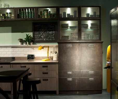
Think modular kitchens as comfortable as your favourite jeans.  This pair unites the Italian flair of kitchen design with an industrial edge that Diesel is know for.  Blending social kitchen design to accommodate space for working, cooking and entertaining with materials like oak and steel with a vintage feel. The result: a modern yet lived-in kitchen.


PAOLA NAVONE and CRATE & BARREL

Italian designer Paola Navone brings her Mediterranean influence and sea side inspiration to Crate & Barrel..  With a cool blue, crisp white and bright red colour palette, we are seeing a variety of accessories from lighting to dishes, rugs and furniture.  This is the first of three collections planned for the pair. check out what could be the future classics - the tall-back Windsor chair, caged pendant lights and indigo splattered dinnerware.

Labels: , , , , , , , , , , ,

<data:blog.pageTitle/>

This Page

has moved to a new address:

http://kikiinteriors.com

Sorry for the inconvenience…

Redirection provided by Blogger to WordPress Migration Service