Mellow Yellow
With the spring season slowly approaching...it might be time for you to consider bringing a little sunshine inside of your home! Try introducing some of these shades of yellow into your current decor style.
Yellow can work with any style - country, traditional, contemporary and more....and it can be used in many different ways.....
Paint:
For a splash of yellow in your space try SUNBEAM A12-3 by Olympic - it mimics the rays of sun but without being overwhelming. Pair it with other nature inspired tones like sky blue or grass green or go more contemporary with greys. This is a yellow tone but a neutral colour with some warmth

For a bit more of a glow in your bathroom or breakfast room, try OPTIMISTIC YELLOW SW6900 by Sherwin Williams. this colour will definitely banish those winter blues.

Go Gold with Ace Hardware's GOLDEN PATH A23-7 this is a great golden yellow that would work beautifully in a more traditional space or for wood furniture that is in need of a pop.
A classic yellow tone that works well with other neutrals like grey and brown BUTTERY 14-5 by Pratt and Lambert is for someone looking to brighten up their space with a perfect yellow.

Other ways to bring some yellow in to your space.....
Try some simple accessories like a vase, pillows and other decor items like....

This great set of dishes available at Urban barn

This bedding collection available at West elm is a stunning colour combination with grey and off white and the pop of yellow adds some warmth
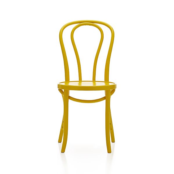
This cafe style chair available at Crate and Barrel is a fun pop for any kitchen, paired with a glass table, white table, grey or a reclaimed wood table.

This stripe pillow available at IKEA is a perfect pop of colour but I love how there are other colours and neutrals in this stripe fabric. It would look great with any neutral and you can bring in some other accent colours too.
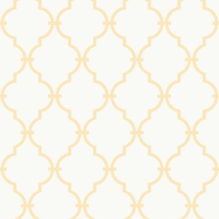
Wallpaper! Why not? A bit of a traditional look but if you apply it in an unexpected spot like the back of a bookcase or as an accent wall it has a more current look. The white and yellow trellis pattern is bright and fresh available at Joss & Main
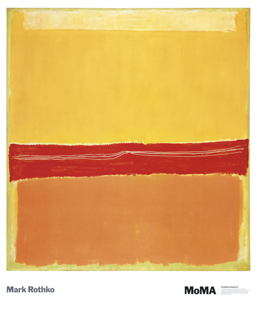
Art is an easy way and affordable way to add colour to your space. Art.com is super easy, affordable and they have an enormous selection for all styles and tastes.
 |
| Add caption |
Labels: adding colour to your home, decorating with colour, decorating with yellow, home decor ideas, ideas to brighten up your space, kiki interiors, yellow accessories, yellow in the home, yellow paint
posted by Unknown @ 6:12 PM
0 Comments


