Kiki Interiors - Decor and Staging

Friday, September 4, 2015

How to Pick an Accent colour for Your Home

We think most people get hung up on choosing and playing with color, because they think they have to choose a lot of colors for a colorful result.  Totally untrue.

Would you agree that this living room is colorful?  Excluding the neutrals, like the gray couch, off white rug and cream chairs, how many colors do you see?


beautiful lived-in home with midcentury pieces and mixed textures: beautiful lived-in home with midcentury pieces and mixed textures

 That’s right, two.  Yellow and Blue.  It is the amount of color and the number of times it appears throughout the room that makes the room colorful, not the number of colors used.

 Okay, let’s do another one.  Here another living room.  How many accent colors do you see which are used in 3 or more places?

 Bri Emery's living room designed by Emily Henderson || Photos by Laure Joilet: Bri Emery's living room designed by Emily Henderson || Photos by Laure Joilet

In this image, we see 3 repeating colours - aqua blue (sofa and lamp), fuchsia (in the art, skinny vase and flowers) and yellow (in the art and flowers)  Again, it is the number of times the colors are used throughout a room that makes it colorful, not the number of different colors.
  You don’t have to choose a lot of accent colors or bold accent colors to make your space colorful.

Accent colors are used throughout a room on art, decor, textiles, and sometimes furniture.  A well-defined accent color palette can help your home feel cohesive.
There are 3 must-know principles about using accent colors for maximum effect, minimum effort (and minimum color decision-making angst).


3 Accent Color Principles:

  1. Use a small palette of accent colors throughout your home. You don’t need a lot of different colors to make a space colorful.  Unifying accent colors across rooms helps your home flow. It also makes redecorating easy because you can move accessories between rooms. With this principle in mind, when considering new accents make sure they can be used in at least 3 different rooms. Choosing accents that work in more than one place gives them staying power in your home.
  2. The main accent color in a room should appear at least 3 times in different areas of the room to look intentional and draw the eye around the room. The accent color isn’t limited to small accessories, it can also be used on upholstery, painted furniture, and art.
  3. When choosing different colors that go well together, it is easiest to stick to all clean colors or all grayed out colors.  Clean colors are crisp and clear (the inner circle below).  Grayed out colors are muted and played down (the outer circle below).  Mixing clean colors with grayed out colors is harder to pull off, so stick to one or the other.


JSIM-Color-Chart-2-A


Once you have your entire home colour concept planned, you can move onto choosing your accent color palette. When you choose accessories for your home, you will draw from this color palette along with your wall color palette.

Accent colors are a whole different ball game than wall color. Your wall colors need to be livable and relatively neutral because they cover a large surface area and are more permanent, but your accent colors can be less rigid. You can have more fun and take more risks with small accents.

A few questions to consider when you are choosing your accent colours: 
- What are your favorite accent pieces you already own?
-  How do you want your accents to show up in your home? stand out or blend in?

Monochromatic (Blend in)

Choose a tint or shade that is only one or two steps off of your bold wall color.  For blue-green, that would look like this:  How to Choose Your Decorating Accent Color Palette | tealandlime.com
Choose one of the analogous colors to your wall color, that is one of the colors right next to your wall color on the color wheel.  Analogous colors have less contrast and are more restful.  Because they are so close to each other on the color wheel, the accent color will be a subtle difference.  For blue-green, an analogous option would be blue or green.

 Make those accents pop or stand out

 For a single accent colour try one of these 2 ideas : Choose a complementary color to your bold wall color.  For blue-green, the complement is red-orange


How to Choose Your Decorating Accent Color Palette | tealandlime.com 

 Or,
Choose a monochromatic color that contrasts with your bold wall color.  Choose a tint or shade several steps lighter or darker that stands out against your wall color.  For blue-green, that would look like this: 


How to Choose Your Decorating Accent Color Palette | tealandlime.com 

Example of a room with one accent colour:
 Varied tints of orange add dashes of fun to an otherwise neutral-toned bedroom. | Photo: Emily J Followill/Collinstock | thisoldhouse.com: Varied tints of orange add dashes of fun to an otherwise neutral-toned bedroom. | Photo: Emily J Followill/Collinstock | thisoldhouse.com


For two accent colors that pop, try one of these methods:
    • Choose split complementary colors to your bold wall color.  For blue-green, the complement is red-orange.  The split complementary colors are red and orange.
How to Choose Your Decorating Accent Color Palette | tealandlime.com
    How to Choose Your Decorating Accent Color Palette | tealandlime.com
  • Try creating a color triad starting with your bold wall color.  Here you are choosing colors at the corners of an equilateral triangle on the color wheel.  For blue-green, the two colors that complete the triad are red-violet and yellow-orange.   How to Choose Your Decorating Accent Color Palette | tealandlime.com
  • Choose an analogous palette of the 2 colors in a row next to one of your wall colors on color wheel.  For blue-green, here’s what the options look like:How to Choose Your Decorating Accent Color Palette | tealandlime.com 
  •  Example of a room with 2 accent colours (analogous palette) Red and orange are side by side on the colour wheel: 
easy, bright, wall art
  • For three accent colors, try one of these methods:
  • Choose a tetradic color combo.  Imagine you are choosing 4 corners of a rectangle on the color wheel.  Notice a tetradic combo includes the complement of your starting color.  And, the two colors forming the rest of the rectangle are complements to each other.  For blue-green, the tetradic combo includes red-violet, red-orange, and yellow-green. How to Choose Your Decorating Accent Color Palette | tealandlime.com 
  • Try an analogous palette, meaning three colours that are side by each on the colour wheel
  • How to Choose Your Decorating Accent Color Palette | tealandlime.com 
 Example of a room with 3 accent colours:

 Patterned pillows in sunny yellow, royal blue and soft blue-gray add warmth. A mix of rustic textures, such as unfinished woods, wicker, and wrought iron, add visual weight to the light, bright spaces. In the living room, a pair of timeworn wooden tables work together to function as a central coffee table. This  is my bedroom colors and theme...: Patterned pillows in sunny yellow, royal blue and soft blue-gray add warmth. A mix of rustic textures, such as unfinished woods, wicker, and wrought iron, add visual weight to the light, bright spaces. In the living room, a pair of timeworn wooden tables work together to function as a central coffee table. This  is my bedroom colors and theme...

Labels: , , , , , , ,

Tuesday, February 24, 2015

Bold Meet Traditional....

Many of our projects revolve around clients who have existing pieces (either passed down from family members or the blending of households or just past purchases that they don't want to replace) that they would like to modernize.  Some clients are open to total overhauls of items but others want to maintain the integrity of those pieces and incorporate them into a more modern overall design.  So what are some easy tips to make a traditional living room more playful and bold?

Try adding bold colour, graphic patterns and drama in terms of scale.  These three elements will easily update your space.


This image is a great example of traditional with a twist.


You see all 3 of the above mentioned elements in this room.  The daring orange accents to the over sized floral and geometric prints. 

Mixing several patterns in a room gives a sophisticated layered look and adds whimsy to the space, the key to mixing prints is to use a variety of scales bringing in visual interest and depth into the space. 

If you are nervous about a bold bright colour like orange, just try it in accessories like pillows, lamps and other decorative details - that way you can ease yourself into the colour without making a big commitment.
Make a statement with a bold , big and colourful art piece - that instantly updates a space with a twist.

When traditional pieces are paired with unexpected elements like bold colour, prints and patterns, and big pieces - you make an impact without having to compromise the integrity of your traditional items


Labels: , , , , ,

Thursday, September 4, 2014

Pillows makes Perfect!

We have to say it. We love styling homes with pillows!

Pillows are inexpensive, yet amazing in giving a room extra touch of softness, color and attitude. We’ve seen so many spaces transformed beautifully with simple additions of pillows of all sorts of shapes and sizes and it’s something you can do on your own to stage your home for the resale market or just to update your space.


So, in this post, we gathered photo inspirations for you as well as 5 decorating tips using pillows.

#1 Because they are happy!  

 
Imagine this room without pillows. Boring, yeah? It’s like snatching all the energy and life in this space. Colorful pillows, especially those with geometric prints, can instantly make a room look more alive. If you think your living room is too bland and lacking energy, throws and pillows are one of your best choices.


#2  Going colourless can still be dramatic

 Sometimes, it doesn’t have to be all colourful and playful. If for example, you want to keep your bedroom toned down and want a prospective buyer to notice important architectural details instead of focusing on the bed, adding black and white or neutral-colored pillows will help create a dramatic effect.


 #3 An easy (and cheap) way to make the room look on trend and updated

Look for colours and prints that are on-trend and you can use them to enhance the artistic ambiance of any room. In the case of this family room, the sofa is pretty basic and maybe a bit older, to make the room look more up to date the stager played with the hanging arrangements of the art but also added some colour to the room (dark blue and coral - orange) giving the room an updated look


#4 Mixing makes it fun!

" Matchy matchy” is out of date. Have fun and get a little crazy! There are certain elements in the house that should be matched in order to achieve symmetry and calmness, but pillows are an exception. Especially if you have a white bed or sofa, bright-colored pillows can instantly lift the boredom away!


 #5 Make pillows the focus

Can’t afford that bejewelled lamp at the store for your centrepiece? Throw and pillows can substitute for that. Ribbon pillows, sequined pillows, fur pillows and any funky-looking pillow in a bright hue can serve as a focal point.


Labels: , , , , , , ,

Wednesday, June 18, 2014

Quiet Colour

If the thought of inviting colour into your space makes you head spin, follow these easy ideas to bring a bit of  life into your world.

A neutral space is easy to work with because it is basically a blank canvas, the possibilities are endless.

Options:

1- play with texture, instead of colour, this is a great option for those undecided folks.  So think about adding - stone, wood, metal, plastic, leather, wool, other fabrics (both light and heavy) and plants.  This will give you variety without having to commit to colour

2 - play with pattern.  This will bring more visual interest along with some contrast to your space.  This about pairing warm tones against cool tones for some contrast.  Neutrals work with neutrals, so don't be afraid to layer - caramel with beige and charcoal and silver

3 - play with metallics.  Metallics can really add an element of depth to a space without feeling too bold or dramatic.  Gold and copper can add some warmth and sophistication to a space and silver can cool down a space that has a lot of warmth.  Metallics can be seen in lighting, occasional tables, accessories and even some fabrics.


This image is a perfect example of using all 3 of the above suggestions.   There is a variety of texture, some great silver metallic accents and some pattern.  So if you are shy about colour these suggestions can really help you create a visually interesting space. 

When it comes to colour, start small.....

especially if you are new to colour.  Don't feel like you have to go "all in". 

- Choose a favourite colour, instead of following the latest colour trend and add little touches in the home

- Choose a colour that feels integrated in the existing look and style instead of stick out like a sore thumb.  And work with that family of colour, for example a navy throw blanket, with some colbalt pattern pillows and a steel grey-blue lamp.

- Opt for noncommittal items like pillows and throws (you do not have to go with custom) to add colour to the space, other great ideas : try lamp shades, candles, vases, glasses, plates, linens and books

- New art is another easy way to inject some colour.  Again you don't need to spend or splurge, try going to a local decor store like HomeSense or try taking on a DIY project to add art in the home, you could frame paint chips or paint a simple canvas in stripes or squares, try framing scrap booking paper

.


 Expand your palette.  so now that you are a bit more comfortable with colour, it's time to introduce a second accent colour.  So where to start?

- Green and blue are colours we see in nature, so they almost act as neutrals.  If you are stumped as to which colour to bring in as a secondary hue try one of those, they are a pretty safe bet with just about any scheme

- Fabrics are a great guide!  Check out fabrics at a local store and take a look at fabrics that have your existing colour and see what combinations they have. 

- A sophisticated colour palette has depth so do not choose hues in only that exact colour match.  A bit darker and a bit lighter will give the full spectrum in the space and add some richness, and don't forget to add a touch of white and a touch of black to the room - simple photos frames and candles are easy ways to do just that. 


 Go Bold, Not crazy!


You can go a little over the top with colour if you are not careful, so please pay attention!


You won't look crazy if ....

- your palette is mostly colours from the same family, for examples stick with either primary colours, or pastels, or jewel tones

- you inject too much black, it is needed to anchor the room but too much is harsh, stick to greys, taupes, whites and other softer neutrals, like your walls and major pieces

Don't be afraid, be brave and apply that colour!  It can always be toned down with neutrals and textures.

Labels: , , , , ,

Wednesday, February 19, 2014

Mellow Yellow

With the spring season slowly approaching...it might be time for you to consider bringing a little sunshine inside of your home!  Try introducing some of these shades of yellow into your current decor style. 

Yellow can work with any style - country, traditional, contemporary and more....and it can be used in many different ways.....

Paint:

For a splash of yellow in your space try SUNBEAM A12-3 by Olympic - it mimics the rays of sun but without being overwhelming.  Pair it with other nature inspired tones like sky blue or grass green or go more contemporary with greys. This is a yellow tone but a neutral colour with some warmth


For a bit more of a glow in your bathroom or breakfast room, try OPTIMISTIC YELLOW SW6900 by Sherwin Williams.  this colour will definitely banish those winter blues.


Go Gold with Ace Hardware's GOLDEN PATH A23-7 this is a great golden yellow that would work beautifully in a more traditional space or for wood furniture that is in need of a pop.


A classic yellow tone that works well with other neutrals like grey and brown BUTTERY 14-5 by Pratt and Lambert is for someone looking to brighten up their space with a perfect yellow.


Other ways to bring some yellow in to your space.....

Try some simple accessories like a vase, pillows and other decor items like....


Miko Collection - Yellow

This great set of dishes available at Urban barn


This bedding collection available at West elm is a stunning colour combination with grey and off white and the pop of yellow adds some warmth

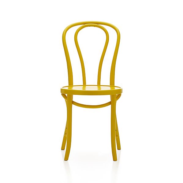
Vienna Yellow Side Chair

This cafe style chair available at Crate and Barrel is a fun pop for any kitchen, paired with a glass table, white table, grey or a reclaimed wood table.

STOCKHOLM Cushion cover IKEA Cotton sateen has a soft, smooth finish with a subtle sheen. The zipper makes the cover easy to remove.

This stripe pillow available at IKEA  is a perfect pop of colour but I love how there are other colours and neutrals in this stripe fabric.  It would look great with any neutral and you can bring in some other accent colours too.

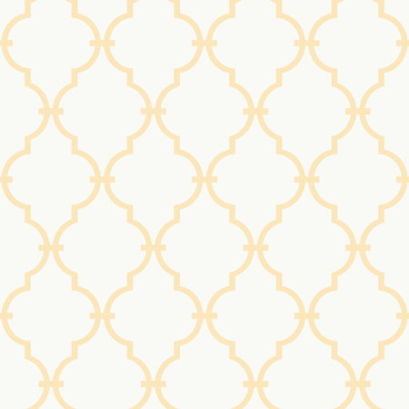
Trellis Wallpaper

Wallpaper!  Why not?  A bit of a traditional look but if you apply it in an unexpected spot like the back of a bookcase or as an accent wall it has a more current look.  The white and yellow trellis  pattern is bright and fresh available at Joss & Main

Art is an easy way and affordable way to add colour to your space.  Art.com is super easy, affordable and they have an enormous selection for all styles and tastes.

Add caption


Labels: , , , , , , , ,

Thursday, January 17, 2013

2013 Trendy Colour : Monaco Blue

Yes, this year's hottest colour is Monaco Blue

Everyone is in on the trend and you can find all styles embracing this new colour

Take a look at Pier One's nod to the hue.  I love how they mix it with pattern and print plus teamming it up with a fresh white is so clean looking.  The glassware accents add some sparkle, too. What a calming colour for any space...

http://www.pier1.ca/Let color and pattern give you a nice, warm feeling inside.

Labels: , , , ,

Friday, July 27, 2012

Signature style ideas for your home

So you've looking EVERYWHERE for those perfect pieces to finalize the look and feel of your home.  But everything out there just seems so common, but you are not common - what do you do?

http://denydesigns.com/

You go to Deny Design online and you take a look at their amazing line of products. 
Every item helps an artist from somewhere around the globe. 
These pieces are colourful, fun, bright, bold and so special. 


There are so many styles to choose from it's really hard to decide - shower curtains, duvet set, throw pillows and more...
Some really fun animal pillows are great for a playroom, children's bedroom or any space needing some whimsy! 
Then there are some watercolour inspired pieces thtat are soft and romantic.  There is info on all of the artists, too!


I love these pieces and will definitely be adding some of these to my model condo and home projects and certainly in my children's playroom at home
Now which to ones to choose....

Labels: , , , , , , , , ,

<data:blog.pageTitle/>

This Page

has moved to a new address:

http://kikiinteriors.com

Sorry for the inconvenience…

Redirection provided by Blogger to WordPress Migration Service