Kiki Interiors - Decor and Staging

Saturday, July 18, 2015

Top 10 Colours for Fall 2015 and How To decorate with them


these 10 colours are the predictions from Pantone.  We have seen some of these tones in recent years or similar tones like Amethyst Orchid, Cadmium Orange and the Biscay Bay are very similar to Radiant Orchid, Tangerine and Emerald.  

This colour palette is a great blend of some summer hues and richer fall hues.  These colours (more or less) all work together but in some unexpected combinations.  For example mixing an earthy shade like Dried Herb with a soft pastel like Amethyst Orchid.  The possibilities of visually interesting combinations are endless.

So how can you use these #Fall2015 colours at home?

Well, most of us likely have one of these neutral tones in our current decor - maybe a large furniture piece like a sofa or a wall colour.  If that's the case, build on that neutral piece by adding art or accessories or even textiles like pillows, rugs or even drapery with some of the more colourful, punchy tones.  

Energize a straightforward sofa with bold cushions: an island-floral, linen-cotton pillow cover and a sophisticated, olive green suede rectangle.
Here's a very simple example of mixing the dried herb and the orange in accessories.  

Look for some statement pieces that combine the colours together!  We love this leaf motif area rug that blends - biscay bay and stormy weather. With some white and soft aqua for contrast balance.  But this would look great in a living room or bedroom with shades of grey and some pops of biscay bay (and other members of that 'teal' family)


Rugs USA Satara Leaves Blue Rug im sooooo in love with this rug! Would match my bedroom perfectly
We love what art can do to a room.  Especially over sized art!  It makes a room look expensive but also complete.  An art piece is a great way to pull a colour scheme together or even add an unexpected pop of colour! the image below is a great example of a neutral and class colour combination and adding a piece of art with colour - it totally changes the space! This combines the reflecting pond and the amethyst orchid and cashmere rose.

navy blue sofa Living Room Makover Decorating Ideas - Living Room Before and After Pictures - House Beautiful
When it comes to using colours that area trending you don't have to have the exact hue, but keep it in the family.  Use the trending colours as a guideline - it's a great way to come up with something new and fresh!

Labels: , , , , , , ,

Wednesday, June 18, 2014

Quiet Colour

If the thought of inviting colour into your space makes you head spin, follow these easy ideas to bring a bit of  life into your world.

A neutral space is easy to work with because it is basically a blank canvas, the possibilities are endless.

Options:

1- play with texture, instead of colour, this is a great option for those undecided folks.  So think about adding - stone, wood, metal, plastic, leather, wool, other fabrics (both light and heavy) and plants.  This will give you variety without having to commit to colour

2 - play with pattern.  This will bring more visual interest along with some contrast to your space.  This about pairing warm tones against cool tones for some contrast.  Neutrals work with neutrals, so don't be afraid to layer - caramel with beige and charcoal and silver

3 - play with metallics.  Metallics can really add an element of depth to a space without feeling too bold or dramatic.  Gold and copper can add some warmth and sophistication to a space and silver can cool down a space that has a lot of warmth.  Metallics can be seen in lighting, occasional tables, accessories and even some fabrics.


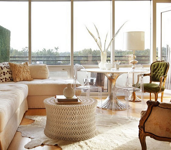
This image is a perfect example of using all 3 of the above suggestions.   There is a variety of texture, some great silver metallic accents and some pattern.  So if you are shy about colour these suggestions can really help you create a visually interesting space. 

When it comes to colour, start small.....

especially if you are new to colour.  Don't feel like you have to go "all in". 

- Choose a favourite colour, instead of following the latest colour trend and add little touches in the home

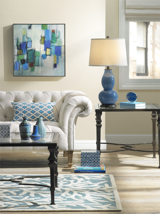
- Choose a colour that feels integrated in the existing look and style instead of stick out like a sore thumb.  And work with that family of colour, for example a navy throw blanket, with some colbalt pattern pillows and a steel grey-blue lamp.

- Opt for noncommittal items like pillows and throws (you do not have to go with custom) to add colour to the space, other great ideas : try lamp shades, candles, vases, glasses, plates, linens and books

- New art is another easy way to inject some colour.  Again you don't need to spend or splurge, try going to a local decor store like HomeSense or try taking on a DIY project to add art in the home, you could frame paint chips or paint a simple canvas in stripes or squares, try framing scrap booking paper

.


 Expand your palette.  so now that you are a bit more comfortable with colour, it's time to introduce a second accent colour.  So where to start?

- Green and blue are colours we see in nature, so they almost act as neutrals.  If you are stumped as to which colour to bring in as a secondary hue try one of those, they are a pretty safe bet with just about any scheme

- Fabrics are a great guide!  Check out fabrics at a local store and take a look at fabrics that have your existing colour and see what combinations they have. 

- A sophisticated colour palette has depth so do not choose hues in only that exact colour match.  A bit darker and a bit lighter will give the full spectrum in the space and add some richness, and don't forget to add a touch of white and a touch of black to the room - simple photos frames and candles are easy ways to do just that. 


 Go Bold, Not crazy!


You can go a little over the top with colour if you are not careful, so please pay attention!


You won't look crazy if ....

- your palette is mostly colours from the same family, for examples stick with either primary colours, or pastels, or jewel tones

- you inject too much black, it is needed to anchor the room but too much is harsh, stick to greys, taupes, whites and other softer neutrals, like your walls and major pieces

Don't be afraid, be brave and apply that colour!  It can always be toned down with neutrals and textures.

Labels: , , , , ,

Thursday, September 30, 2010

Shades of Greige...


You have probably been hearing the term 'greige' a lot lately...so what does it mean?


Well, greige actually refers to fabric that has not been fully processed, dyed or bleached.


But griege has been used lately to describe a colour that we are seeing everywhere. It is a colour that combines both grey and beige. A true neutral that is extremely versatile. We are seeing it in fabrics, paints, bedroom linens, towels etc...it is classic, elegant, contemporary,timeless and right now - very chic!


Go Greige!!

Labels: , , , ,

<data:blog.pageTitle/>

This Page

has moved to a new address:

http://kikiinteriors.com

Sorry for the inconvenience…

Redirection provided by Blogger to WordPress Migration Service