Kiki Interiors - Decor and Staging

Monday, August 3, 2015

Current Project - SOHO Condo Decorating Job

We don't often post about our current jobs but this one has really 'caught our eye'. This was an interesting project and a bit of a challenge because we were hired to purchase furniture for one home but we had to use that same furniture to stage another - both properties are owned by the same client but they are selling one and moving into the other. 

The clients (a couple) both like an industrial style - she also likes a touch of retro and vintage and he likes some 'cabin' or country elements.  At first we weren't sure how to pull this off.  The challenge of buying furniture for one home and using it in a condo (seen here) and then the blending of tastes and styles.

So we started with the main furniture pieces - the sofa, the chair(s) and the bed frame.  We were also very realistic with the clients - not all of your pieces for the house will fit in the condo so find a bit of temporary storage! Once the major furniture pieces arrived and put into place, we then started to work with the rugs and then smaller furniture like the coffee table, and end tables.  We had some accessories including pillows and some art to start styling with but we often place our big pieces and then make a shopping list.  Once you see furniture in a space you can then see what's needed and you can see what the problems are!  We quickly realized that light was necessary so we had lamps at the top of our list.  We also wanted a way to add some femininity - we had a lot of dark colours and hard surfaces (wood end tables, metal coffee table and leather head board).  Accessories really help add personality and another dimension in a space plus they can really change up the look of a room.  Art is always the last thing we install.  We have pieces in mind but hang it up last.


The clients don't like a lot of bright colours, so to add visual interest in this room we played with contrasting textures. We have a mix of wood, glass, leather, cow hide, flannel, wool and layers of linen and cotton. To add femininity to this room we used a white duvet with pin tuck detail, layered lots of plush pillows and these lamps with glass and curves add a feminine touch, too!


This corner of the living room has a different energy than the bedroom - which is what we wanted.  Again, the clients didn't want bright colour but the muted mustard tone adds just enough.  We also used lots of texture like leather (chair), chenille (rug), metal (cabinet and coffee table) and faux sheep skin (on the chair).  When you style a property you need to layer and a lot of getting it right is trial-and-error.  Working with odd numbers is best - look at the top of the cabinet we have 3 items in varying heights - a lamp (tall), art (medium) and a decorating plane (short).  We also added an over sized art piece on the wall and a smaller one above the chair.  The clients have a relaxed style and a great sense of humor so we added in some quirky and fun pieces like the 'hipster' bunny art and the pig.

The image below is the other side of the living room.  Again we used some muted colour - greys, mustard and a grey-blue.  We also found a really cool art piece to hang on the small amount of wall space.

When it comes to home decor have some fun and don't be afraid to try some thing new - maybe a rug on an angle will add a new look to the space, try styling the coffee table a bit differently, layer your art or hang something unexpected.  We had a lot of fun decorating and styling this condo. We found some great items at local stores and we didn't have to spend a fortune. 


Labels: , , , ,

Saturday, July 18, 2015

Top 10 Colours for Fall 2015 and How To decorate with them


these 10 colours are the predictions from Pantone.  We have seen some of these tones in recent years or similar tones like Amethyst Orchid, Cadmium Orange and the Biscay Bay are very similar to Radiant Orchid, Tangerine and Emerald.  

This colour palette is a great blend of some summer hues and richer fall hues.  These colours (more or less) all work together but in some unexpected combinations.  For example mixing an earthy shade like Dried Herb with a soft pastel like Amethyst Orchid.  The possibilities of visually interesting combinations are endless.

So how can you use these #Fall2015 colours at home?

Well, most of us likely have one of these neutral tones in our current decor - maybe a large furniture piece like a sofa or a wall colour.  If that's the case, build on that neutral piece by adding art or accessories or even textiles like pillows, rugs or even drapery with some of the more colourful, punchy tones.  

Energize a straightforward sofa with bold cushions: an island-floral, linen-cotton pillow cover and a sophisticated, olive green suede rectangle.
Here's a very simple example of mixing the dried herb and the orange in accessories.  

Look for some statement pieces that combine the colours together!  We love this leaf motif area rug that blends - biscay bay and stormy weather. With some white and soft aqua for contrast balance.  But this would look great in a living room or bedroom with shades of grey and some pops of biscay bay (and other members of that 'teal' family)


Rugs USA Satara Leaves Blue Rug im sooooo in love with this rug! Would match my bedroom perfectly
We love what art can do to a room.  Especially over sized art!  It makes a room look expensive but also complete.  An art piece is a great way to pull a colour scheme together or even add an unexpected pop of colour! the image below is a great example of a neutral and class colour combination and adding a piece of art with colour - it totally changes the space! This combines the reflecting pond and the amethyst orchid and cashmere rose.

navy blue sofa Living Room Makover Decorating Ideas - Living Room Before and After Pictures - House Beautiful
When it comes to using colours that area trending you don't have to have the exact hue, but keep it in the family.  Use the trending colours as a guideline - it's a great way to come up with something new and fresh!

Labels: , , , , , , ,

Wednesday, June 24, 2015

We Answer Wednesday - How To Update My Dining room

"I know my dining room is in need of an update.  I do have a beautiful wood table with matching chairs that my husband would just die if I threw out or painted!!  Any ideas how I could update my dining room and include my furniture?"

A great question for a common dilemma.  Many down sizers go through this exact same issue.  What to keep, what to toss, what to donate....you want a current look in your space but your existing pieces were expensive, high quality, in good condition - what to do?

Well, you do have a number of options that won't involve altering your wood furniture.

An all wood furniture set can make a room feel dark and heavy especially if you do not have much light in the room.  So how about brightening up the space with colour and light? Try updating your chandelier for a more current look and more light.  A great, versatile option is a lantern style - it works with traditional furniture and farmhouse styles but it can also transtion well with other styles too.
 

You can also add light with table lamps on your buffet piece.  Look for shades that will allow light through - white, cream or beige are best.  We also like these table lamps that have a traditional vase shape but in glass so they don't add bulk.

Serene grey dining room with thrift store lantern chandelier (spray painted), floor to ceiling Ikea Ritva curtains, @Cost Plus World Market dining chairs, @Wisteria shelf and mirror. Paint color: Revere Pewter by Benjamin Moore
Crazy Wonderful: living room changes

If you have a china cabinet that you don't want to part with or separate - try wall sconces for additional light.  They won't add an abundance of light but they will help with mood lighting for dinner parties. This images shows off sconces with multiple heads flanking the china cabinet. 

 I love the dark wood floors, the table, and the light fixture. Definitely have to consider this in my future dining room redo.

Mirrors are also great because they allow light to bounce around the room making the room feel brighter and larger.  Mirrored furniture or accessories like decorative bowls, frames or vases can add some brightness to the room too. This image shows how the combination of mirrors and glass make a bulky piece look lighter

The mirrored furniture I have fallen in love with such a classy look in such a simple piece...would totally put this in our bedroom

Try switching up your wall paint.  The colour on the walls could also make the room feel dark and heavy.
Wood furniture has a weight to it already so if it is in a smaller room without much light, the room will look dark so try lighter tones on the wall for a fresh update. Soft creams, beiges and greys are timeless and won't take away from your furniture or art. 

Traditional Dining Room - Dining Room Decorating Ideas - Lonny

If that isn't adventurous enough for you - you can certainly add colour on the walls just be sure to balance it out with some other lighter items.  This dining room is a mix of classic traditional and contemporary elements.  The dark wood furniture and floors and the navy wall paint together would normally be too dark but paired with the light beige upholstery and textiles, white trim and wainscoting, lighting and the decorative plate wall - there is the right amount of balance in this dramatic dining room.

Go for a dark tone. Dining rooms are usually enjoyed with low lighting, and hues like this gray add moody elegance. Note the way the light w...

 Many wood furniture sets are lacking in 'punch' meaning they are very tone on tone.  Lots of browns in the stains but often in the upholstery.  Why not re-upholster your chairs for a fresh look? The possibilities are endless and it makes a huge impact without even touching the wood!  We have done this with a number of clients and they love the look and the price point.  It is way more cost effective and your set will look new!

You can opt for something neutral with a subtle pattern for some visual interest.

Upholstered head of the table chairs, shaded chandelier, mirror over buffet.

You can stay pretty neutral but then go bolder with captain's chairs


period style red dining room with crown molding, wainscoting and salvaged windows, room by room neoclassical whole house remodel

Or make a statement with colour and pattern


Pleated to the Stripe Home with Classic Blue and White Interiors

If you are really looking to make a big leap outside of the box, try some new chairs all together and opt for something modern to really update your space. This farmhouse dining room looks updated with these Eifflel dining chairs in cream - they fit with the colour scheme but they are totally unexpected.  By adding modern chairs to a traditional table you get a more casual feel.

 Subdued Dining Room - Neutrals, Modern and Traditional Mix

Other updates.....

Try adding some bold art - something big, bold and graphic really updates any space plus it is an easy addition. Look at arranging your current art collection in a modern gallery style

Orange

Try an accent wall with wall paper.  Another way to add visual interest to the room using pattern.  We used to see rooms with wall to wall wallpaper and that can be overwhelming and even stuffy but just one wall is fabulous.  We also love to see another statement piece like art, photography or a mirror hung on that accent wall.

Beautiful wallpaper - House of Turquoise

Try a bold area rug.  Make a statement on your floor with a bold area rug - it's like art on the floor.  This image shows how the area rug can be the centerpiece of a room - the colour scheme revolves around this rug.  A classic colour combo but a big statement.

Loving the action on the console!  Pretty smitten with the console itself and the way it works with the more traditional and masculine furniture.

What ever you do make a plan.  For instance if you decide you want to paint, re-upholster and add a new light fixture be sure those elements work cohesively that way the whole room update will look spectacular!

Labels: , , , , , ,

Wednesday, December 3, 2014

We Answer Wednesday - Pendant Predicament

"What size and how many pendants should I hang over my kitchen island?"

The ideal number of lights depends on the style and scale of fixtures you choose, and how hardworking your island is.  Here's a guide to help you decide which solution is best for your kitchen.

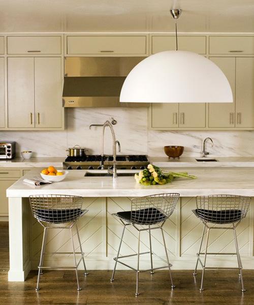
One Large Pendant
Make a modern move by centering one over sized fixture above the island.  A large pendant with a translucent shade can offer both ambient and task lighting. This works very well if your kitchen island is also your dining space, which is something we have seen in recent years in condos.  This light fixture would act as your island lighting and dining fixture


 Two Medium Pendants
Hang a pair of lights evenly spaced over the island to illuminate the workspace.  These lantern style pendants add great light to the whole space and have a timeless look that work with the kitchen.  This is a more current look that we are seeing a lot of in single family homes with large kitchens but also in smaller condo or apartment size kitchens.  It's a clean balanced look and works with any style of decor.


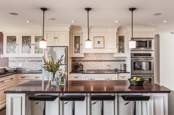
Three Small Pendants
A trip of shapely lights will work together to brighten three different areas along the island.  Clear glass fixtures are visually light and mix well with the other style sin the home.  This is probably the most common kitchen island pendant arrangement, light the 2 medium pendant arrangement it works with all styles of decor.


 Other important points with kitchen island lighting...
1. Size and Scale. One thing to really, really take into consideration is scale and proportion of lighting to island. Over sized lighting has been very on trend for the past few years but it is possible to be too big, so watch out!  Not sure what to do, start with the size of your island, we are seeing over sized (and super handy) kitchen island in homes of all sizes. For example, we had a client would installed a 10 ft island so we were able to install 3 medium sized pendants (equally spaced) and it looks perfect.

2. Mood lighting. As with any lighting fixture, think about putting these pendants on a dimmer switch.  It is a really nice effect when you are entertaining and using the island for serving drinks and appetizers it really creates a warm and cozy vibe

3. Right height.  The bottom rims of your pendant lights should hang about 30 inches above the surface of your kitchen island counter. An alternate way to determine the proper height is to measure from the floor upward. With this method, the bottom rims of the lighting fixtures should be positioned 60 to 66 inches above the floor. If the ceilings in your kitchen are higher than 8 feet, light from the fixtures will be dispersed more evenly if you increase the height of the pendant lights 3 inches for every extra foot of ceiling height. In addition, if you have tall family members, it's a good idea to raise the lights a couple of extra inches to allow more head room.
Ideally, the bottom rims of your pendant lights should hang about 30 inches above the surface of your kitchen island counter. An alternate way to determine the proper height is to measure from the floor upward. With this method, the bottom rims of the lighting fixtures should be positioned 60 to 66 inches above the floor. If the ceilings in your kitchen are higher than 8 feet, light from the fixtures will be dispersed more evenly if you increase the height of the pendant lights 3 inches for every extra foot of ceiling height. In addition, if you have tall family members, it's a good idea to raise the lights a couple of extra inches to allow more head room.

Read more : http://www.ehow.com/way_5842703_high-lights-above-kitchen-island.html

 Model condo suite -A kitchen in various shades of grey with some over sized task lighting above the island and some great pops of colour
Ideally, the bottom rims of your pendant lights should hang about 30 inches above the surface of your kitchen island counter. An alternate way to determine the proper height is to measure from the floor upward. With this method, the bottom rims of the lighting fixtures should be positioned 60 to 66 inches above the floor. If the ceilings in your kitchen are higher than 8 feet, light from the fixtures will be dispersed more evenly if you increase the height of the pendant lights 3 inches for every extra foot of ceiling height. In addition, if you have tall family members, it's a good idea to raise the lights a couple of extra inches to allow more head room.

Read more : http://www.ehow.com/way_5842703_high-lights-above-kitchen-island.html

Labels: , , , , , , , ,

<data:blog.pageTitle/>

This Page

has moved to a new address:

http://kikiinteriors.com

Sorry for the inconvenience…

Redirection provided by Blogger to WordPress Migration Service