Kiki Interiors - Decor and Staging

Wednesday, October 26, 2016

We Answer Wednesday - Mixing Metallics without going over board

"I love the sparkle and shine of metallics but I'm worried about going over board with the look.  Any tips?"

The sparkle, shine and texture of metallics gives any room an instant boost of luxury and glamour but you are correct, you need to find the right balance.

1.  Softness.  So metallics have a distinct shiny quality and they have a hard and smooth texture, so balance that out with some softer textures.  Try adding some cashmere knits, velvet, and wool to counter balance the hard quality of metallics.

 Bring home big-city #style with metallic gold and black #decor!:

2. Neutral.  Metallics can really add a punch to a room and they are timeless so don't get too crazy with your palette.  a few pops of colour is a nice touch but we really love pairing metallics (one metallic or a mix) with a neutral back drop and don't forget those soft textures!

 mixed metals home decor_large:

3. Classic.  Keep it classic when it comes to metallics - brass, silver and gold are totally chic and timeless.  Sure, copper is cool right now but it tends to float in and out of fashion.

4. Mix.  Keep it modern by mixing your metallics.  Like wood, metallics go with metallics.  So play around with  the finishes. But we really recommend sticking with the same colour metal but we like to see chrome mixed with brushed nickle and satin nickle same goes for the golden tones.

5. Small. New to metallics? Start with small steps - some smaller decor pieces on a tray or bookcase and build it from there.

 Non-woven metallic glitter wallpaper modern background wall wallpaper white and silver classic stripe wall papers home decor

Metallics are a great addition to add some sophistication to a space and they can also make a room look and feel larger and brighter.  That reflective surface allows the light to bounce around the whole room plus it adds sophistication and glamour to a room.


Labels: , , , , , , , ,

Wednesday, February 3, 2016

We Answer Wednesday - Rose Quartz Trend

"I want to update my space.  I know light pink is a trending colour for 2016.  How can I use it in a modern way, I don't want my place to look too girly or old lady."

Yes, Rose quartz is one of the two hot colours this year! Rose Quartz is a soft, light pink hue with a touch of a mauve quality.  For some, they had already seen this trend and are not hopping back on the band wagon but for others this is a fun and fresh colour that can add a touch of feminine whimsy to a space. 

 The+21+Most+Beautiful+Rooms+in+Pantone's+Colors+of+the+Year+via+@MyDomaine:

With any trend, we do not suggest NOT diving in head first unless it is something you absolutely LOVE and MUST HAVE! So before you commit, just make sure it is a trend for you.  Trends come and go, so we also recommend not going full out!  When it comes to a trending colour (especially) use accessories to embrace that trend.  So consider art, pillows, throw blanket and some knick-knacks, too.  But if you really want to dive in consider an accent wall, area rug and bedding.

 "This is like that fleeting blush of pink in the sky before the sun sets. It's not what instantly comes to mind for a library, but I wanted to counter the room's inherent masculinity. Pink is warm and atmospheric, and it makes dark antique furniture look ravishingly beautiful. It's not an assertive color. It's demure, which gives it longevity." —Jeffrey Bilhuber - HouseBeautiful.com

To avoid looking too girly or old lady, think about what you are combining rose quartz with and how you are using it.  For instance, layering multiple pastel tones looks dated instead layer rose quartz with a more masculine hue like navy or charcoal even black.  Balance out the pink hues with more masculine elements.  We also suggest layering the rose quartz tone with some bolder colours like fuchsia, magenta, eggplant, jade green and teal - fun and punchy and not dated at all!

 TRENDS | 15 interiors mastering Pantone 2016 color of the year | Here are 15 inspiring interiors that take pink to the next level, from a pink hued room accessory to a whole pink room for a full “la vie en rose” effect. No, rose quartz is not just a baby girl room color, it can also add softness, style, and panache to a grown-up interior | via French By Design:

Here are some of our favourite ways to use rose quartz and some of our favourite combinations.

When it comes to colour you don't need a lot to make a statement. We love this mostly neutral motif with a slight touch of pink in the trellis pattern on this area rug.  Keep the main furniture pieces neutral and add a few more splashes of colour in your throw pillows and you are set!

How to Decorate with Pantone's Rose Quartz and Serenity - Homespun Moroccan Trellis Rug; $24–$711; at Rugs USA:

 Try adding a fun accent chair in the living room, kitchen or dining room - it's a fun splash of colour and not a huge expense! This also makes a great desk chair in a home office!

Chaise Tolix, couleur pantone 2016 rose quartz:

Really want to embrace the rose quartz trend? Try these incredible table lamps - they make a real statement with shape and texture and add that pop of pink with a simple white shade!


Rose quartz, often used to symbolize love, peace, or happiness, is believed to stimulate the imagination.:

 Grey continues to be a big trend (we would say it is a timeless classic) so add some softness to the neutral tone with some rose quartz pillows with texture. We also love the light pink floral arrangement, simple and feminine.

2016 Trends for Living Room:

Make a statement on your wall that isn't a painted wall! Everyone looks great in pink and we love an over sized and bold art piece. Remember art doesn't need to match your room, in fact it shouldn't! So take a risk and add something fun and splashy!

In the Melbourne apartment of artist Miranda Skoczek, a candy-colored painting by Rhys Lee is situated above a sofa from Aero Designs.:

Not ready to commit to an accent wall? Try painting the interior side of your door.  This makes a statement and we love this one in particular because of the details and character of this door.


Classic entryway with black and white tiled floors and a pink door:

Keep the colour modern looking by pairing it with streamlined furniture pieces and add it to a tone on tone room.  This room has many shades of grey adding the small pops of pink just adds some femininity to the space.


Loving the colour combinations that Tarina had used to style her new media room @oh.eight.oh.nine our pink button cushion looks pretty amazing on this couch too I think | ImmyandIndi:

We love mixing soft pastels with bolder tones.  We love the mix of softer and lighter hues with the darker tones.  We also love the water colour effect of this pillow.  It's a perfect pop for any room!


Bluebellgray® Untitled 3 Pillow

Get creative, be bold but don't make too much of a commitment!  Let's face it painting an entire room or even and entire wall in pink sounds a bit over the top and intimidating but why not the inner part of your bookcase? You get that big pop of colour but not too big of a pop! We love how it looks in this image against the white bookcases and than paired with some dark accents in the room like navy and black!

bookshelf:

Only you can determine what the right amount of pink in your decor is. Start small and keep adding until you are happy with what you have achieved.

Labels: , , , , , , , , , , ,

Sunday, September 27, 2015

2016 Trends for the Home

Believe it or not 2016 is around the corner! And the home fashion trends are already in the works!

What can we expect to see in the new year?

FUR (mixing textures) - Fur (faux) is hot! I find we see this year after year especially in the cooler months but this year it will be everywhere - pillows and throws of course, but rugs and furniture too!

54 rooms with gray sofas (http://stylecarrot.com/2012/06/07/montage-54-living-rooms-with-gray-sofas/):

GOLD - We saw a bit of a comeback of gold in 2015 but we will see even more in 2016.  Lighting, plumbing, furniture - Gold is back!

glamorous room ideas | my personal “wishlist” collection of glamorous living room ideas ...:


SHINY DETAILS- think edging of furniture and hardware.  Little details that shine! So if you can't hop on the 'solid' gold train try this trend instead.  a little bit of shine can go a long way!

101 Amazing Pieces You'd Never Guess Were From HomeGoods: If you're anything like us, you've aimlessly entered HomeGoods only to walk out with 12 new decor items that you "just had to have.":


PINK (think pastels)- soft and feminine pink in art, furniture and accessories.  In paint we will see beige-pink walls, too! Often we think pale pink is only for little girls' rooms but it is branching out! It is a great soft feminine touch and it works with neutrals like beige, cream, navy, grey and more.  We love the subtle pastel pink touches in this living room.

transitional decor living room fireplace photos | Transitional Living Room with Fireplace Mantel | My House - Color a...:

BLACK - Black is never out of style but we will see a lot of black across the board this coming year.  furniture, wall paint, accessories, wall paper....oh my!

Cate's Cozy San Francisco Nest:

BLUE (especially navy)- We definitely saw a lot of navy in 2015 but it will remain in the 'trending' category in 2016.  Furniture, accessories and certainly paint - we will see a lot of painted furniture in navy blue and even kitchens. The image below is a great example of painted navy furniture combined with some shiny details

Navy Blazer Chest - Designer Looks Dad Will Love>> http://www.hgtv.com/holidays-and-entertaining/designer-looks-dad-will-love/pictures/page-6.html?soc=pinterest:

FLORALS (big and bold)- Think oversize big florals in art and accessories.  Still feminine but with a modern twist.

why couldn't I do this with a fave pix?  it's all about scale ... the pix dwarfs the sofa ... the drama!:


What's great with these up coming trends is that many of them work well together.  Try black and gold, gold and fur, fur and black, navy and gold, gold and pink, pink and navy.....the possibilities are endless

How do you feel about these trends?
Do you see yourself embracing any of them in your rooms?

Labels: , , , , , , , ,

Monday, March 30, 2015

Home Staging and Decor Trends

A big part of staging your home is making it look current.  In the final steps of prepping your home for the real estate market you want to make it pretty, buyer ready and photo ready.  One way to do that is knowing what decor trends are out there and bring them into your home.  Since 95% of buyers are online first trying to find the home of the dreams…you need to make your photos stand out and attract those buyers!

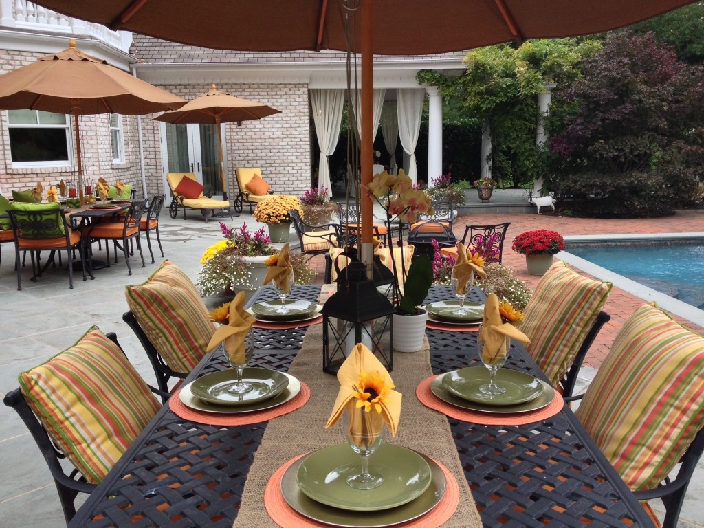
1.  Outdoor spaces.  Assuming the weather is working in your favour - stage your outside.  Staging is about creating the vision of what life in the home would look like and including the outdoor living areas is critical! This staging trend is probably one of the most essential and we see so many sellers not have their outdoor areas staged. Remember a photo is worth a thousand words.  Clean up the outside - rake, cut the grass, plant some colourful flowers, set up the patio and prepare it as though you have guests arriving any minute!


2014-4-23- stagingmagic2

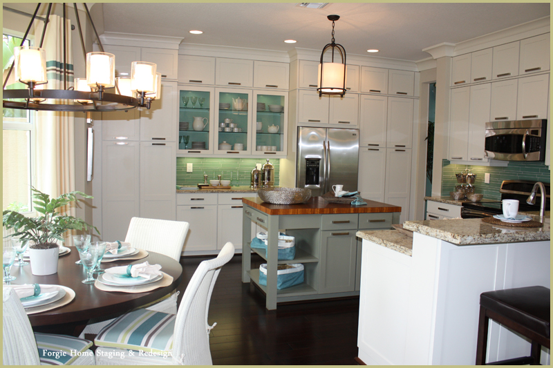
 2.White Kitchens – Huge trend now for home owners is light, white, bright kitchens! In a recent Houzz survey an overwhelming amount of respondents desired a white kitchen in their home. When the kitchen comprises almost 30% of the buyer’s decision (according to NAR - National Association of Realtors) a little more expense in this main area makes a world of difference in price!Can't replace the entire kitchen or paint the cabinets? Look at updating the back splash (or adding one) in a light tone, update the kitchen lighting to make the kitchen light and bright, paint the walls in a lighter tone and/or update the hardware.

2014-4-23-Forgiehomestaging1

3. Birds On Display – The bird in the pillow is just a taste of what we will see more of in the future. Whereas last year’s trend was the white porcelain deer head on the wall and horses, this year’s trend is sweet, little birds.Right now, birds are hot for spring and every spring we tend to see animals and florals pop into all decor.  If you home is going on the market in the spring - think about adding some 'nods' to spring like floral, birds or any botanical elements. Currently, the hot trend is peacock but any bird in spring is up to date


I don't like everything in this, but I like the idea of combining dark wood furniture with white, light blues  browns, and the combination of different styles (modern, retro, classic, straight line with some frilly pillows  flowers to make it more cozy...)

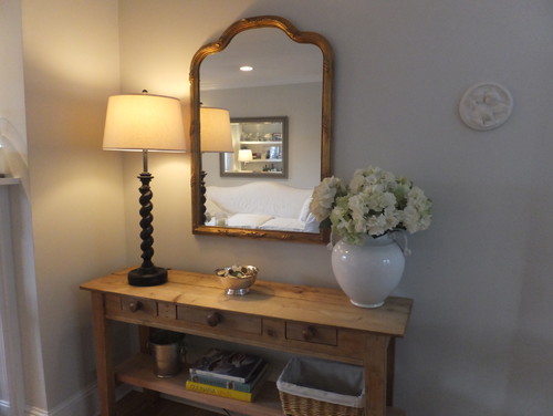
 4. Metallic accents. Framed mirrors, art or brass bar carts add warmth and sophistication in any room. Metal accents add an element of shine to any room and they add some sophistication too.  Right now warm metals are hot like gold, brass and copper.  so think about adding a few touches of those in decor pieces, frames of mirrors, lamp bases even occasional tables.


5. Pops of colour. Colour can help you stand out from the crowd.  Even a neutral space could benefit from a floral arrangement in bright yellow or orange.  If your home decor style can handle it, try adding some colourful pillows to the sofa or bed and a throw blanket.  Colours like yellow, orange and bright green are perfect for spring but coral, aqua and purple can also make a big impact when used in small doses.


Neutral tones and pops of colour make for a pretty lounge area :-) Get the look with the Normann Copenhagen Tablo Table http://www.nest.co.uk/product/normann-copenhagen-tablo-table-large and the BestLite BL6 Wall Light http://www.nest.co.uk/browse/brand/bestlite/bestlite-bl6-wall-lamp Image via The Design Chaser.

6.Dual Coffee Tables – placing two coffee tables next to each other to scale a larger space is a much better staging solution than just one. This is also a great way to add surface space to a small room.  Look for side tables, benches even stools (as long as they are the right height, 16" to 21") to be used as a coffee table


Cartoloji map-art pillows contemporary living room

7.  Clear Tables, Chairs, Lamps and More – Glass has always been an excellent staging tool because of it’s reflective nature and ability to create more light in what would probably be a dark space. Glass is great becasue it gives the surface space without the bulk.  If you are selling a condo or a smaller space - try a glass dining table and pair any style of chair you like.  It makes the room look nice and big and you still are showing off how to live in the space. Glass furniture comes in a variety of styles too, and price points!  You can use the 'buddy system' too so if you have a glass dining table add some glass elsewhere maybe a side table or in a lamp....


Contemporary dining room with an elegant and modern feel thanks to the white furniture, blue modern art, glass dining table and a long crystal chandelier. #modern #glass #diningroom

8. The Navy Comeback – Navy blue is making a come back in a huge way!  Navy just stole our hearts originally via patterns like chevron, ikat (see below) and floral  but now it’s really making it’s presence known as a “new neutral” that pairs well with yellow, turquoise, coral, chartreuse, wheat …almost all of the spring 2015 hues   that add pop to a space. Navy is one of those versatile colors that can work with bright or earth tone accents (just open your latest Pottery Barn catalog to see it with earth tones). If your space has a lot of neutral beige, cream or sand tones add navy for a rich contrast and timeless combination.

White bedding with blue accents.  Easy to change out and update.

Labels: , , , , , , , , , ,

Tuesday, October 8, 2013

Looking Ahead - Trends we can expect in 2014

So if you are someone who likes to be ahead of the curb (or at least in touch with the curb)  this post is for you.

What are the upcoming trends for Home Decor in 2014? 

Well, we will definitely continue to see these 'hybrid styles' where two or more design styles are meshed together to create a cohesive look.  This is happened very organically and we will continue to see this happen as couples become 'serious' after they have made individual home purchases.  So 'modern vintage', 'rustic elegance' and 'urban farmhouse' are looks that we will be seeing more of and the possibilities are endless.

Home Fashion gets a lot of inspiration from designers on the runways.  We were seeing a lot of monochromatic fashion looks so we will likely see monochromatic home looks this coming year.  So a mix of various textures - wood, glass, wool, cotton, velvet etc...in a tone on tone look.  Very chic and classic and very easy to modify.


In 2014 Colour will be making a come back.  Right from the runways - we will see colour in accent furniture, pillows, throws, and even paint. Expect to see shades of blues (like 2013) and purples but also oranges (like 2012) and yellow.  Bold and bright or soft pastels?  - you will see it all !


Feminine touches like lace, eyelet, sheer and embroidery are ultra soft and sweet especially in white.  We will see these types of feminine touches in the home paired with over sized chandeliers but also with masculine wall colours like navy and charcoal.


We will also be seeing a lot of pattern (again another trend from the various fashion houses)  and a lot of mixing patterns.  Stripes, florals, geometric patterns, hand sketched prints, abstract and ethnic too, in drapes, rugs, pillows and even wall paper in colour - it's going to be wild!


 We will still see a lot of natural and soft materials like knitted pillows and wood but again mixed with harder and sleeker textures to give a lot of depth to each space. 


Labels: , , , , , ,

Friday, August 10, 2012

Fall Fashion to Home Fashion

So the Fashion runways are on fire these days.  Designers from all around the world are showing us what's hot for the fall season.  If you are a follower of fashion you might be wondering how to really maximize the fashion trends and how to incorporate them into your everyday life.

Well here are some of the 2012 Fall Fashion Trends as seen on the runway and here's how you can bring some of the fashion runways in your home hallways

TREND: RED
It's hot and in any shade.  Red is bold, bright and hot.  This colour goes well with any neutral and you can get any look you like.  Red and chocolate has an ethnic feel, Red and Navy very New England nautical and Red and Grey is so urban. Use it as an accent in your accessories or maybe in some of your art.


TREND: PALE GREY
Grey has been in for a while but the trend now is a softer and paler shade.  This is a great and timeless colour for furniture or for a wall paint colour.  Some of my favourite shades of Grey are: Benjamin Moore's 'Pashmina AF-100', Benjamin Moore's 'Wish AF-680', Benjamin Moore's 'thunder AF-685' and Benjamin Moore's 'eternity AF-695'.  If you are thinking of resurfacing kitchen or bathroom cabinets, a pale grey is another fabulous option - unexpected but still neutral and classic.

TREND: BLACK AND WHITE
A classic combination and it's tough to call it a trend as it's never ever out.  On the runways there was a lot of black and white and in different ways.  there was of course the very mod-influenced black and white colour blocking this is a very urban look - great for bold and graphic art pieces to make a statement in any room.  There was also a lot of black and white patterns (floral and curvy) perfect for textiles - bed linens, pillows even drapes.  A very dramatic and glamorous look with a lot of femininity.


TREND: KNITS
Who doesn't love a cozy over sized knit sweater? We all do.  so incorporating knits into your home decor is going to make you want to cozy up and cuddle.  Texture adds richness to any room.  Knitwear is perfect for throw blankets and pillows in a living room, family room or bedroom. 

TREND: PLAID
Plaid always makes a comeback in the fall - it's so collegiate and varsity.  So how to use it? It's great as an accent in a boy's room - custom roman shades are sharp and clean, or an upholstered accent chair.  There are so many tartans to choose from, too - but if you can't decide here's a fun and fresh idea -  get some 10x10 samples from a fabric shop and frame them with a white matting and black frame.  Create a gallery look with these different plaid samples - for an easy and unique art display perfect for a rec room or guest room.


TREND: HIPPIE CHIC
The Boho hippie chic look is back - I'm NOT suggesting you bring hemp candles and beaded curtains into your home - yikes!!  But if you like an easy and laid back hippie look try using lots of earth tones and layering different fabrics and pieces in a space.  so think throw pillows in earth tones and vary up/mix-match with lots of texture. 

TREND : UNEXPECTED QUIRKY DETAILS
This is the fun side of fashion - odd little elements that really personalize the space and make it yours!  Check out thrift or antique shops for interesting items and re-purpose them.  An old door hanging on a wall is an interesting piece or art or a door can easily be transformed into a table top.  Not crafty? No problem - local decor shops have lots of fun ideas.  One of my favourite piece now is from Urban Barn.  Check out this Owl Stool.  Even a coffee table book can add some unexpected flair to a room, I love photography books like the one of Lady Gaga by Terry Richardson

Labels: , , , , , , , , , ,

<data:blog.pageTitle/>

This Page

has moved to a new address:

http://kikiinteriors.com

Sorry for the inconvenience…

Redirection provided by Blogger to WordPress Migration Service