Kiki Interiors - Decor and Staging

Wednesday, January 11, 2017

We Answer Wednesday - 6 Best Trim Paint Colours

"My house needs a fresh paint job.  I feel good about picking a wall colour but do you have any suggestions for the perfect white trim paint colour?"

You are so right, picking the right white can be tricky.  The look of a fresh coat of paint is spectacular and painting that trim really completes the feel. But like every other colour - there are many qhites to choose from.  Not knowing which paint colour you will choose, your safest best is you use a pure and true white tone, you can't go wrong with that. We have a few favourites to share with you.

1. Simply White by Benjamin Moore - this was BM colour of the year for 2016. 

Simply White by Benjamin Moore.  Crisp, clean, but not too stark a white.  No surprise undertones.:

2. Cloud White by Benjamin Moore - this is a designer (and painter) go-to.

Benjamin Moore paint by Candice Olson CLOUD WHITE OC-130.  This is my go-to neutral wall color. #paint #cream:

3. Decorator's White by Benjamin Moore -just like the name, it is a decorator's (and painter's) favourite.  It's clean and crisp.
Best White Paint Who: Jeff Andrews What: Decorator’s White, CC-20, Benjamin Moore Why: “I love this white for ceilings and woodwork, or in any room where I want a bright, clean white. It works well in all applications and with every kind of light source. Some whites can be cold and slightly blue, while others can have a creamy, yellow tone, but Decorator’s White is a true white that is both warm and modern. It’s been my go-to paint for years.”:


4. Ultra Pure White by BEHR - so clean and so crisp -this is one of the purest whites you will see.

Behr Ultra Pure White:

5. Extra White by Sherwin-Williams - a great white trim choice, bright white!

sherwin williams extra white - trim & ceiling paint color:

6. All White by Farrow & Ball - a perfect white

Farrow & Ball Modern No.2005 All White - Emulsion Paint - 2.5L


 Other trim painting tips:

Caulking - be sure that before you start painting that trim to caulk any gaps

Order - paint the trim first and then the walls

Finish - be sure to use a semi-gloss  when it comes to choosing a finish for your trim. A semi-gloss adds even more brightness but also when it comes to cleaning, the dust doesn't stick!


Labels: , , , , , ,

Friday, April 8, 2016

In the Navy! 11 ways to decorate a room with Navy Blue

Navy blue is a classic and lately it has been trending in both fashion and home decor.  Navy is a great option is you want depth but aren't willing to go as deep and dark as black.  Navy is a great way to stay timeless in your decor but you can also make your space look fresh using pops of navy. 

We love working with Navy blue because of the possibilities, here are our 11 favourite ways to decorate with navy

1.  Try a NAVY sofa.  We always recommend a neutral toned sofa so why not navy? Navy is a classic tone and it works with all colours.  If you like the idea of a darker sofa, navy is a great option.  Add some texture with pillows and a throw blanket, mix some pattern and print and we love the modern floor lamp in gold finish - it all works so beautifully together and it has a cool style in classic tones.

 Layered patterned pillows adorn the sofa in this living room, creating texture and a stylish sense of coziness. Above, a world map in beautiful shades of blue adds interest and color.:

2. NAVY in the bedroom. doesn't this bedroom look crisp and clean? The contrast of the white and navy is so fresh and still warm.  Navy can have a glamorous vibe too, it doesn't have to be nautical.  Look at the shape of the headboard and finished in navy velvet very chic and then paired with glass lamps and the geo print shams and duvet with just a pop of orange - it's perfect!


geometric duvet cover and shams http://rstyle.me/n/qj545r9te:

3.  Accent wall in NAVY.  Accent walls are still 'a thing' but we are seeing them more in deeper and darker neutrals.  We actually did a commercial office and painted some accent walls in Hale Navy by Benjamin Moore - it's amazing!! We love the classic colour yet the bold statement it makes on the wall.  Add an over sized piece of art and instant chic!

Bar cart & also that base trim is epic.:

4. One furniture piece in NAVY.  Since navy is a neutral it works with everything, so if you are on the hunt for a new furniture piece why not look for something in navy? This navy tufted over sized ottoman is the life of the party in this soft neutral room.  We love it's function but also how it pops in the space (to bridge it all together, a few pillows with some navy would be perfect)


The 5 most important things to focus on when expecting company:

 5. NAVY kitchen.  The kitchen is the heart of the home so make sure it looks it's best!  Try using navy to freshen up those kitchen cabinets.  We love the navy blue lower cabinets in this kitchen - again a great alternative to black or espresso stain.  It looks amazing with the over sized stainless steel pulls and against the white - the whole kitchen looks so bright. Colour in the kitchen can be a risk but not in a classic colour like navy.

white and navy kitchen with white upper cabinets and navy lower cabinets accented with nickel hardware along with sleek white counters and a traditional subway tiled backsplash framing stainless steel Viking Range under tapered white wood range hood.:

6. Pattern drapery in NAVY.  We love patterned drapery it has such a 'designer' look and it's like art framing your windows.  We love this fresh look - the pattern isn't too busy and the contrast isn't too harsh.  It adds some fun to the room but it still feels classic. 


Ogden from Imperial Garden Collection:

7.  NAVY blue wallpaper.  A wallpaper accent wall is a great way to make a statement.  But we are also loving all walls in wallpaper in a small space like a powder room.  It's fun and if you get bored it's an easy room to update and switch up but if you have fabulous wallpaper why would you want to? This navy and white zebra print wallpaper is not for the faint at heart but for those who love to be noticed this is for you! We love it but caution this isn't for everyone!

Most effectively drawing a zebra print room ideas in the interior will look like, where neutral colors and shades. Description from interldecor.blogspot.co.uk. I searched for this on bing.com/images:

8. NAVY blue Boys Bedroom.  I know we sound like a broken record but with navy as a classic it just doesn't age.  So it is a great option for a boys' bedroom - it is a neutral tone that he can grow up with even as his tastes change. we are big fans of light colours on bedroom walls but we do love this room - the navy with nail head bed looks great with the white and beige bedding but it would also look great with Kelly Green or Candy Apple Red, too.  So it is a great piece in a classic colour.  We also love the navy and white rugby stripe rug, so fresh! The pops of orange and the natural wood tones in the room make it stylish and perfect for a boy!


Posts you've liked | Websta:

9. NAVY on the floor.  We are huge fans of a pattern rug - it's like art on the floor.  We do love colour but we know that many are hesitant to invest in colour and pattern for their floor coverings, so a navy pattern rug is a great compromise.  We absolutely love how this navy trellis pattern gives life to this soft neutral room.  We also love using a glass coffee table on a pattern rug - you get to see more of it! The rug colour and print is echoed with an accent lumbar pillow in same tones but slightly different pattern - but it's all chic!!

 Pattered rug in a neutral room:

10. NAVY and the unexpected.  We started to see the mix of navy and pastels last year but mainly on the racks and runways - unexpected colour combos with navy blue.  We have all seen the typical combos - navy and white, navy and red, navy and yellow, navy and gold but what about navy and mint green, navy and soft pink (rose quartz, maybe?), navy and lilac but one of our favourite combos right now is navy and coral - it's bold and bright but fun and still warm, we love it!

Funny to see this as I painted my girls nursery navy blue... I loved The way it created a rich background for the corals, yellows and turquoise accents.:


11. NAVY accent pieces.  Anytime you are introducing the idea of colour to your space, start slow...starting with accents is the easiest way and most affordable way to know if you are ready to commit.  So have an 'audition' and introduce some small accent pieces like pillows, candles, art, table lamps and just decor accent to the space and let it all sink it.  If you like it and want more see the list above.....

 This elegant blue lamp breaks up a neutral bedside table:


Labels: , , , , , , ,

Saturday, July 26, 2014

Update with Paint!

The smartest, quickest, and most convenient way to give any room a new look is through the use of color. The ‘right color’ can instantly revitalize an interior, camouflage cosmetic imperfections, and minimize architectural flaws. Paint can dramatically change the ambiance of a room, create harmony within a décor, build illusion, and accent an interior with personal taste.
In this week’s blog post, we would like to share our 16 favorite Benjamin Moore paint colors. From the best whites, grey, taupes, yellows, reds and more!
Now, why Benjamin Moore? Some of you may like other brands that are affordable but we personally prefer BM paints. It’s what we normally use for our clients and believes that they are a good investment.
Here are our top picks:

#1 Chantily Lace

chantilly lace ben moore Top 16 Benjamin Moore Paint Colors  
image source: homebunch.com
This white has a light hint of grey. It is crisp, clean and bright. It looks fresh against grey and is perfect for trim and cabinets.

# 2 White Dove

white dove Top 16 Benjamin Moore Paint Colors  
image source: theinspiredroom.net
White dove has a faint yellow undertone and works so well with traditional furniture and gives off a beautiful gloss for trim. The warm and soft color is perfect for the bedroom, living room, kitchen and bath.

#3 Linen White

linen white Top 16 Benjamin Moore Paint Colors  
image source: thewriterandresidence.com
Linen white can make a room feel so clean yet cozy. It has a bit of warmness to it and not overly crisp. So classic!

#4 Edgecomb Gray

image source: postcardsfromtheridge.com
This soft, barely there type of grey is perfect for any room with lots of natural light. It compliments everything and works well with almost any color.

#5 Coventry Grey

coventry gray Top 16 Benjamin Moore Paint Colors   
image source: www.houzz.com

Coventry Gray can be used as a shy neutral or for a pop of color. It has blue undertones and the atmosphere it creates is incredibly relaxing. It is so modern and fresh.
Must read: Make Use of Creative Color Schemes

#6 Yarmouth Blue

yarmouth blue Top 16 Benjamin Moore Paint Colors   
image source: amidesign.com
Yarmouth blue is one of the best light blues out there. Paint your bathroom with it for that extra calming effect.

#7 Mannequin Cream

mannequin cream Top 16 Benjamin Moore Paint Colors   
image source: myoldcountryhouse.com
This light, creamy yellow is ideal for spring. It’s not too yellow nor too pale to our liking. It feels so inviting and comforting.

#8 Mesquite

mesquite Top 16 Benjamin Moore Paint Colors  
image source: housebeautiful.com
Mesquite is a gray green color that works well in a country bedroom or modern when paired with darker shades of green or gray.

Check out: Should You Paint Your Wood Kitchen Cabinets?

#9 Narragansett Green

narragansett green Top 16 Benjamin Moore Paint Colors

 image source: housebeautiful.com
This is a color we are so in love with. Look how beautiful that cottage is! Nothing is more perfect than Narragansett Green for that lakeside cottage.

#10 Clay Beige

clay beige Top 16 Benjamin Moore Paint Colors

image source: houzz.com
This neutral beige has green and red undertones to it. Clay Beige looks perfect with browns and blues.

#11 Greenbrier Beige

greenbrier beige Top 16 Benjamin Moore Paint Colors

image source: janelockhart.com
If you want to work on a room with dark, wooden floor, try Greenbrier beige. We just love the warmth and gorgeousness it creates.

#12 Soft Marigold

soft marigold Top 16 Benjamin Moore Paint Colors
image source: spicerandbank.blogspot.com

Orange doesn’t have to be ‘popsicle orange’. Soft Marigold is that type of orange that can make any room looks romantic and sexy.

#13 Exotic Red

exotic red Top 16 Benjamin Moore Paint Colors

image source: homebunch.com
This is a deep, saturated red. Paint your kitchen chairs and cabinet with it for a playful vibe.

#14 Million Dollar Red


million dollar red e1403083826662 Top 16 Benjamin Moore Paint Colors
  image source: restylinghomebykellyblog.com
Another rich red variant that we adore is Million Dollar Red. It brings a sharp, sophisticated look and exudes a bold and a million-dollar-look to any room, hence the name.

#15 Razzle Dazzle

razzle dazzle Top 16 Benjamin Moore Paint Colors

image source:  jbidny.com
Oh, we love pink! And Razzle Dazzle is a show stopper. It can make any room fabulous, flirty and feminine.

#16 Blushing Bride

blushing pink Top 16 Benjamin Moore Paint Colors
image source:  decorpad.com
This Ben Moore pink, on the other hand, is so subtle and so soft on the eyes. Perfect for your crafts room, home office or nursery.
Disclaimer: This is not an advertorial for Benjamin Moore paint products.
If you wish to learn more about Benjamin Moore paints, visit www.benjaminmoore.com.

Labels: , , , , , , , , , ,

Friday, March 14, 2014

Shades of Grey

I have been using a lot of different grey tones in my renovation projects lately.  Some of my clients are a bit hesitant at first but once they see the different options in the grey family they are pleasantly surprised with the results.

Greys can be dark or dull but there are warm options, soft options, but it really is an ideal neutral for the whole home.  try it is in bedrooms, kitchens, living, family and dining rooms even in children's rooms.  With the right accents and furniture you can transform your space into an look you want with a great backdrop. Here are my favourite shades of grey, so far...

Benjamin Moore Sea Salt is a calming and soothing grey.  I used it most recently in a family home.  they wanted an urban farmhouse look.  they paired the sea salt walls with a Mascarpone kitchen (we matched all of the trim and doors to the mascarpone paint) which added a lot of warmth to the space, with knob and cup chrome hardware with a charcoal glass subway tile back splash and a granite back splash with white, light grey and darker grey veins.  The flooring was natural oak (original to the home) to give it  country feel and we added 100 year old barn beam legs to the island that had storage and seating for 6.


Most recently, we staged a property that was in need of some updating.  The layout of the condo was great, with lots of natural light and over sized rooms with a white kitchen and bathroom.  We wanted to add a bit of drama on the walls but because this was a property that was going on the resale market we did not want to scare away buyers.  We choose a softer grey tone which is elegant and classic, Silver Satin by Benjamin Moore.  with the staging furniture - a white sofa, some traditional wood tones, blended with glass and some modern pop of Radiant Orchid - the space is coming together nicely and it will have broad appeal in the market.


Another favourite of mine is Ashley Grey by Benjamin Moore,  we used this shade a more traditional kitchen with pashmina colour cabinets and a quartz counter top to add some more modernness to the space.  We wanted to mix the traditional feel of this home which was built in the 1920s so we used the Ashley Grey from the Historic Collection but by pairing it with pashmina painted cabinets in a traditional style and quartz counter tops (which are more uniform) we had a beautiful blend of old and new.


benjamin moore ashley gray
If you are still hesitant to give grey a chance, try a warmer grey like Benjamin Moore's  Balboa Mist (which was featured recently in a spread 'Seize the Day' in Better Homes and Gardens February 2014).  The chip looks like a true grey but when paired with warmer wood tones and off whites, it looks more beige but in a more modern palette.


Labels: , , , , , , , , , , ,

Thursday, March 13, 2014

Perfect Pairs


There are perfect combinations everywhere you look and home decor is no exception.  If you are looking to spruce up your home this spring take a look at these paint pairings for your space.
Calming -

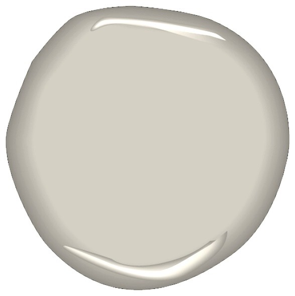
For a soothing combination with a bit of pop.  This is perfect for anyone looking a for that farmhouse look.  The ancient Marble is a great basic and the Hubbard Squash is a great accent for a furniture piece like a bookcase that you really want to highlight.
Sherwin Williams Ancient Marble paired with Sherwin Williams Hubbard Squash

 If you love a cooler green-gray palette in a contemporary space.  Try combining C2 Ice Fog and C2 Artichoke Heart.  They transition well together so one colour could easily be the dominant hue in the home and the other an accent.  And you can always add even more punch with some pops of orchid or tangerine or keep it cool with white.


Here's a hall, staircase and entry in C2 Artichoke Heart.  In this more traditional style home it works but it can also work in a contemporary space.

Classic -

If you look a classic look but still a bit on the bold side why not opt for a combination of black and white.  there are endless possibilities of how you can work this combination in your space.   Black can work well as an accent, or furniture pieces, drapery rod, accent chairs and more.  And you will always find art and textiles in this class combo.  Try BEHR White Truffle and BEHR Black Suede in your space.

 Yellow Color Family. Hubbard Squash Paint SW 0044 by Sherwin-Williams.


BEHR Black Suede Bathroom with white tile and fixtures give a dramatic yet classic look.


 BEHR White Truffle walls look so crisp and clean and with small black accents including the french door and accent chair (which is in BEHR Black Suede) you have a a classic and cool entry.

Chic - you can have colour on your walls without making the space feel closed in.  Colour can also add warmth to a space.  With the right furniture and accessories you can change your look from traditional to more contemporary or a hybrid of both.

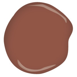
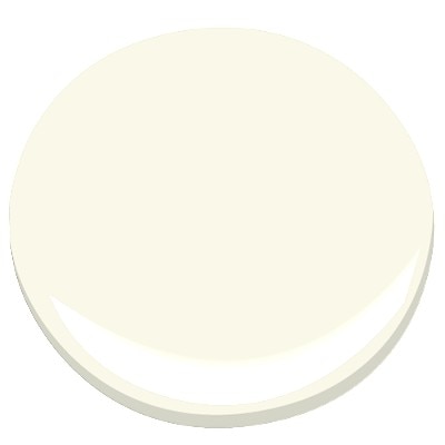
Benjamin Moore's Seersucker suit is a perfect dominant colour and it looks so chic with a clean white sofa and some cognac leather club chairs.  and if you want to add some more paint accents in the space try Benjamin Moore's Brownberry for furniture pieces or smaller areas like a powder room or entryway - although a darker colour it has a lot of warmth almost like a terra cota so it pairs beautiful with most other neutrals.


Labels: , , , , , , , , ,

Friday, October 25, 2013

Curb Appeal Combinations

A huge part of presenting your home for sale on the real estate market is curb appeal and if you are considering selling your home any time soon you really do need to spend some time thinking about how your home looks to passers by.  Of course we all know the expression "don't judge a book by it's cover" but in the real estate world that just does not apply.  If a home look unkempt and unruly on the outside, buyers just assume the inside will be the same and they just pass by.

Not sure where to start or what to do?

Start with basic maintenance: trim shrubs, weed gardens, cut the grass, rake the leaves, shovel the snow, and salt the walkways.  But also look at light bulbs, exterior house numbers, paint and windows - are they in good working condition and do they look good.
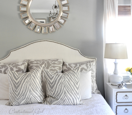
The exterior of a home and it's curb appeal is instant advertising.  Ever seen a home in your neighbourhood that you always thought was stunning from the streets and wondered what the interior was like? Well, buyers do that very thing.
If you want to do some exterior updates, here are some easy combinations for you.

If you have a coastal inspired home, this combinations are for you.
Exterior colours- siding: Pewter Mug by Behr ; Trim: Swan Wing by Behr; Shutters: Beluga by Behr and Front Door: Awning Red by Behr


Try a 15 windowpane French Door to let in plenty of natural light.

Try painted ceramic house numbers

Add a lamp post with a 3 panel lantern light post and a built-in cross bar to hang a potted plant or flower pot.


For gorgeous gardens, hostas are perfect for either side of the front steps.  they are easy to grown and come back bigger and bigger every year.  Add some ferns too for an even lusher look.  For hedges, consider tall and dense Skip Laurel Hedges can reach about 10 to 12 feet, they offer privacy and make a perfect back drop for plants and flowers.  Keep to a tight colour palette with your florals - pink New Guninea impatiens, blue hydrangea and pink astilbe add colour, texture and visual interest.


If your home is more English country side with a storybook feel this combination is for you:
Stucco: Standish white by Benjamin Moore; Trim: Rockport Gray by Benjamin Moore; Shutters and Door: Crimson by Benjamin Moore

Roof shingles: Get the look of cedar shingles without the expense and maintenance.  Try an asphalt option with mixed tones.  Stick with golden brown tones.

Hanging planters add warmth to a space, try a hanging planter in natural moss with some iron work accents to play into the storybook look.  Plant petunias and million bells in pinks and purples.  You can plant in the late spring and if you maintain them they will bloom up and into the fall.

Add some more colour to your garden with Japanese Maples - it's reddish purple leaves really standout in an all green yard


If you have a more nautical home with a contemporary flair, this combination is for you.

Siding and trim: Spanish white by Benjamin Moore; Shutters: Rodeo by Benjamin Moore; Front door: Northern Cliffs by Benjamin Moore


Look for a front door in a style with a raised molding and a window in a single panel.

A porch light in an aged bronze finish with clear glass panels.  It adds some more traditional element to the exterior.  Make sure to match the finish on all of the hardware like the mailbox, grip set and address numbers.

Clean and simple house numbers have a classic and timeless style especially against a white home.

For the garden, a great combination of terra cotta pots filled with ivy and spike plants and pops of colour from begonias look fresh especially against the white and gray exterior.


If you have a  more traditional Tudor style home with accents of brick, siding and stucco, try this combination.

Siding and stucco: Mega Greige by Sherwin-Williams; Trim: Warm Stone by Sherwin-Williams; Shutters: Take Five by Sherwin-Williams; Front Door: Tricorn Black by Sherwin-Williams


Planted urns on the front steps filled with purple geraniums, trailing margarita and pink begonias add a splash of colour. 

For lighting, try a lantern in forged iron with a pagoda shaped top

Labels: , , , , , , ,

<data:blog.pageTitle/>

This Page

has moved to a new address:

http://kikiinteriors.com

Sorry for the inconvenience…

Redirection provided by Blogger to WordPress Migration Service