Kiki Interiors - Decor and Staging

Wednesday, June 3, 2015

We Answer Wednesday - 12 Best Paint colours for Selling Your Home


“I’m looking to sell my home this summer, for the first time. I feel so overwhelmed with getting my home ready to sell that I don’t even know where to start. Our realtor recommended a fresh coat of paint, but what colour is best? Is there a colour that is a go to for selling?”


Getting your home ready to put up for sale is always a large task. Between hiring a realtor and getting your home looking its absolute best, you’re under a lot of stress … and we get that!!

 sherwin williams macadamia is one of the best beige or neutral paint colours for any room.

Choosing a paint colour when you’re selling your home is easier said than done. There are so many different companies, shades, finishes, colour options and decisions to make! Let us simplify the process for you – GO WITH NEUTRALS. I know you’re thinking, neutral? That’s so plain. You’re right, it is. But with neutrals, buyers are not locked into a colour. When their viewing your home, they can see that their personal items will work in the space, there are no limitations. Also, you may love eggplant on the walls, but the person who is looking at your home may not. They may want move in ready. Neutral is great because of its versatility. The main principle behind home staging is mass appeal - by painting your home in a neutral tone you are giving the buyers a blank canvas to put their personal 'stamp' in the home. Plus one light and bright neutral throughout the home makes it looks bigger and brighter.

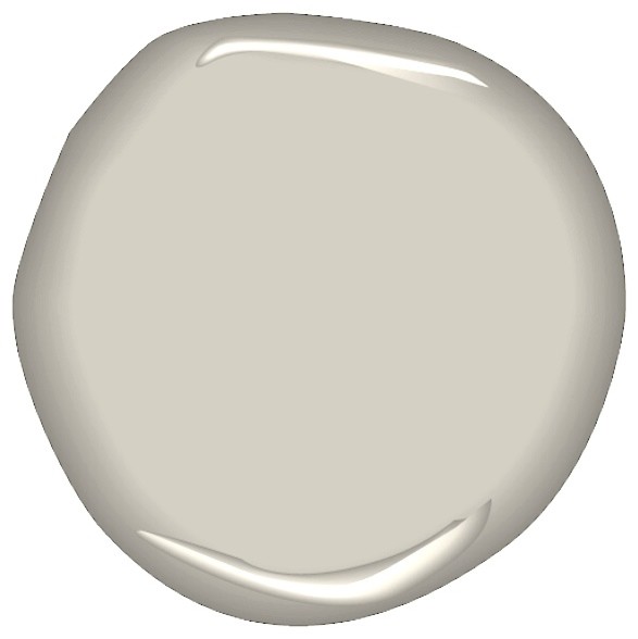
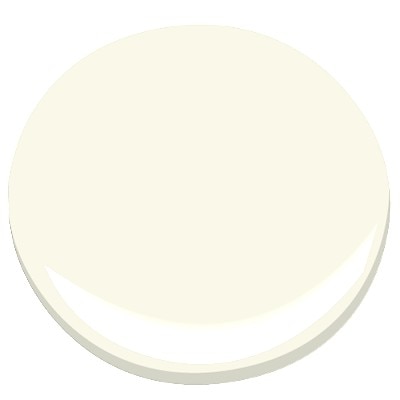
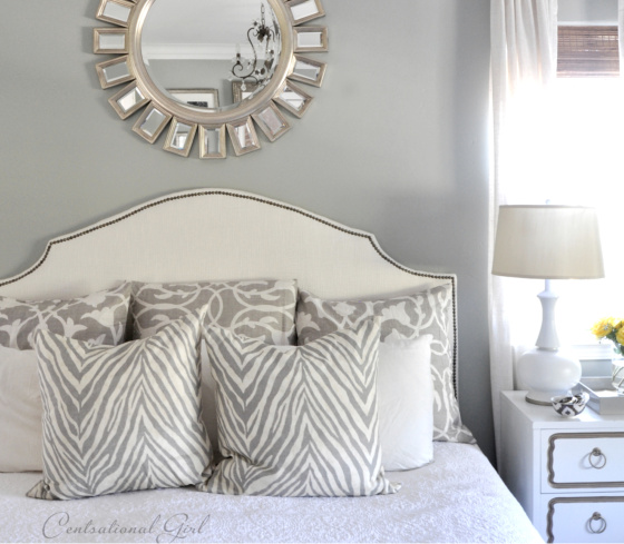
 I like these colors, not just for the bedroom but all over the house.  It is a lot like my house now, a nice warm neutral with fresh off white trim.  The Benjamin Moore colors are:  truffle, linen white and alabaster.


It’s also important to make sure if you have an open concept home, that you do the entire space. The money will be worth it in the end. Having brand new paint mixed with existing paint never looks as good. The older paint will be noticeably tired looking next to the fresh paint.. and it is okay to do the whole house in the same colour! Each room will have different natural light and architectural details, so the colour will look varied in each room.


The Living Room | This room is painted in Benjamin Moore's Ivory White, the go-to neutral paint color for Southern Living's former Editor in Chief Lindsay Bierman.


Here are some of our favorite paint colours from a few different paint companies….


Grey: A soft grey is beautiful on the walls, if your home is more modern/contemporary, perhaps using a light grey would be the best fit in your home.
Ice Cube Silver   2121-50  
Benjamin Moore


Benjamin Moore Iced Cube Silver: pale gray with evident blue undertones, can look baby blue in lots of light 

 Fresh Air   6Q3-2    Beautitone from Home Hardware


The Plaza    50 GY 72/012  CIL from Home Depot


Rhinestone   SW 7656   Sherwin Williams


 My {Current} Favorite Paint Color–Rhinestone by Sherwin Williams


Beige: This is a beautiful warm beige that is a fabulous option for every room of your home.

Butter Pecan    2165-70
    Benjamin Moore

 6. Define zones with a console table.Another option for sectioning off parts of a large living room is floating your sofa in the middle of the room and placing a console table behind it.
 
Ivory Tusk   513-2   Beautitone from Home Hardware 

Candle Wax   40YY 79/168   CIL from Home Depot

Paperwhite   SW7105   Sherwin Williams 

Soft Taupe Gender Neutral Nursery from @Joni Lay / Lay Baby Lay


Greige: A “greige” is a fantastic option if both grey tones and beige tones work in your home.. if you can’t decide on grey or beige, we recommend meeting in the middle with this colour.

Lacey Pearl    2108-70
  Benjamin Moore

BM lacey pearl 2108-70  As lustrous as its namesake, this light and likeable off-white is charming and timeless. This colour is part of our Candice Olson Designer Picks collection. (wall color in kitchen/den?) 

 Tea  6J3-3  Beautitone from Home Hardware

Wayside Inn   00YY  72/021   CIL from Home Depot 

Pediment  SW 7634   Sherwin Williams

 sherwin williams pediment 7634 - Google Search

Labels: , , , , , ,

Thursday, October 16, 2014

Perfect Paint Choices for Staging Your Home

Experts say that staged homes sell faster and for higher prices than those that are not, and paint color is a low-cost but effective way of showcasing your home. The following home staging tips and ideas will help in guiding your paint color choices.

 Neutralize
The colors potential buyers see when they enter your home should be neutral so that the buyers will not be distracted by someone else's style. They should see the walls of your home as a blank canvas on which to project their own preferences and style. But "neutral" doesn't necessarily mean white. Using subtle color can actually enhance the buyer's experience, so repaint walls that have strong colors with rich neutral hues.
Some suggestions: Benjamin Moore 'Barley 199', Benjamin Moore 'Stone House 1039' and Benjamin Moore 'Providence Olive HC-98'
Stage your home with Benjamin Moore's neutral paint colors: barley, 199; stone house 1039; and providence olive, HC-98.
If your wallpaper has a distracting design or is outdated, remove it and add a fresh coat of paint for a more current, updated look. A low-sheen product will help reduce the imperfections on walls and ceilings. You can also use color to highlight the architectural details and features of your home.
Some suggestions: Benjamin Moore 'Carrington beige HC-93' , Benjamin Moore 'Shaker Beige HC-45' and Benjamin Moore 'Nantucket Gray HC-111'
Refresh your home with paint colors from Benjamin Moore: carrington beige, HC-93; shaker beige, HC-45; and nantucket gray, HC-111.
Light, clean, organized spaces appear larger. So clean and declutter, and give your walls a fresh coat of paint in a light neutral color to bring the room to life and make it seem more expansive. One home staging idea that can help expand your space visually: paint the moldings the same color as the wall, which gives an illusion of higher walls.
Some suggestions: Benjamin Moore 'Manchester Tan HC-81', Benjamin Moore 'Monroe Bisque HC-26' or Benjamin Moore 'Camouflage 2143-40'
Stage your home with Benjamin Moore's paint colors that will maximize your space: manchester tan, HC-81; monroe bisque, HC-26; camouflage, 2143-40. 
First impressions are everything, so besides trimming your hedges and grass, be sure your front door and any fencing or mailbox posts are freshly painted. And because buyers love decks, porches, and patios, also make sure they're freshly painted or stained.

Great suggestions for front door: Benjamin Moore 'Dinner Party AF-300',  Benjamin Moore 'Yorktowne Green HC-133' and Benjamin Moore 'Tate Olive HC-112'
 

Labels: , , , , , , ,

Friday, March 14, 2014

Shades of Grey

I have been using a lot of different grey tones in my renovation projects lately.  Some of my clients are a bit hesitant at first but once they see the different options in the grey family they are pleasantly surprised with the results.

Greys can be dark or dull but there are warm options, soft options, but it really is an ideal neutral for the whole home.  try it is in bedrooms, kitchens, living, family and dining rooms even in children's rooms.  With the right accents and furniture you can transform your space into an look you want with a great backdrop. Here are my favourite shades of grey, so far...

Benjamin Moore Sea Salt is a calming and soothing grey.  I used it most recently in a family home.  they wanted an urban farmhouse look.  they paired the sea salt walls with a Mascarpone kitchen (we matched all of the trim and doors to the mascarpone paint) which added a lot of warmth to the space, with knob and cup chrome hardware with a charcoal glass subway tile back splash and a granite back splash with white, light grey and darker grey veins.  The flooring was natural oak (original to the home) to give it  country feel and we added 100 year old barn beam legs to the island that had storage and seating for 6.


Most recently, we staged a property that was in need of some updating.  The layout of the condo was great, with lots of natural light and over sized rooms with a white kitchen and bathroom.  We wanted to add a bit of drama on the walls but because this was a property that was going on the resale market we did not want to scare away buyers.  We choose a softer grey tone which is elegant and classic, Silver Satin by Benjamin Moore.  with the staging furniture - a white sofa, some traditional wood tones, blended with glass and some modern pop of Radiant Orchid - the space is coming together nicely and it will have broad appeal in the market.


Another favourite of mine is Ashley Grey by Benjamin Moore,  we used this shade a more traditional kitchen with pashmina colour cabinets and a quartz counter top to add some more modernness to the space.  We wanted to mix the traditional feel of this home which was built in the 1920s so we used the Ashley Grey from the Historic Collection but by pairing it with pashmina painted cabinets in a traditional style and quartz counter tops (which are more uniform) we had a beautiful blend of old and new.


benjamin moore ashley gray
If you are still hesitant to give grey a chance, try a warmer grey like Benjamin Moore's  Balboa Mist (which was featured recently in a spread 'Seize the Day' in Better Homes and Gardens February 2014).  The chip looks like a true grey but when paired with warmer wood tones and off whites, it looks more beige but in a more modern palette.


Labels: , , , , , , , , , , ,

Friday, August 3, 2012

Go BOLD at home

So neutral colours are always in style and always work but if you are looking to add some excitement to your space that's easy and inexpensive - look no further.  Colour is back and it's BOLD!


Colour can do so much for a space but be sure to choose wisely. 

You want to start with having all of your items for your room, FIRST.  So if you are thinking of adding colour to your bedroom walls be sure to have your bedding, rugs etc...first.  You will want to take inspiration from those items to make your paint selection, so that it all works together.  Putting in some crazy bright colour that has no connection with your other items will just look wacky!

Take inspiration from another somewhat colourful piece in your room.  So you may want to use your drapes, furniture or bedding to help select the paint colour. 
So looking at the above image, I'd probably do a bold brunt orange or mustard wall (the wall where the headboard is).  And then, the other three walls in a neutral cream, taupe, tan or khaki. 

How do you know if it is the right shade? Test it.  So start by looking at the bold shade against white (a plain sheet of typing paper is perfect).  You will want to stick with colour that seems to have some black or brown in the base - that will keep the room looking sophisticated and classic but still with colour.  The tones that don't have brown or black in the base look like candy (too child like).  Now maybe you have a few colours and can't decide - go to your paint store and get some small sample bottles.  Paint large (24"x24") patches on the wall and look at those colours against your items and look at the colour in the day and night light.  and you'll fall in love with a colour in no time.

Scared?? Try going bold in a space like a powder room or a guest room. 


In my current home I painted our powder room in a rich dark chocolate colour.  I added some neutral cream towels and candles, a bold and colourful art piece and a very streamlined mirror.  It looks very sophisticated and we get lots of compliments, too!

You can have so much fun with colour and painting is easy (with the right tools) and inexpensive too

Have fun with colour and have fun in your home with bold colour!!


Labels: , , , , , , , ,

<data:blog.pageTitle/>

This Page

has moved to a new address:

http://kikiinteriors.com

Sorry for the inconvenience…

Redirection provided by Blogger to WordPress Migration Service