Kiki Interiors - Decor and Staging

Wednesday, July 6, 2016

We Answer Wednesday - How to Decorate with Red

"I love red.  I have lots of red accents in my house like pillows and some art.  I want to add a new colour in the mix but still keep the red.  What works with red?"

Red is a bold colour and it can really make a statement on it's own but we agree with you adding in a secondary accent colour can really change up the look of your space.

Although red is big and punchy you do have options for a second accent colour.

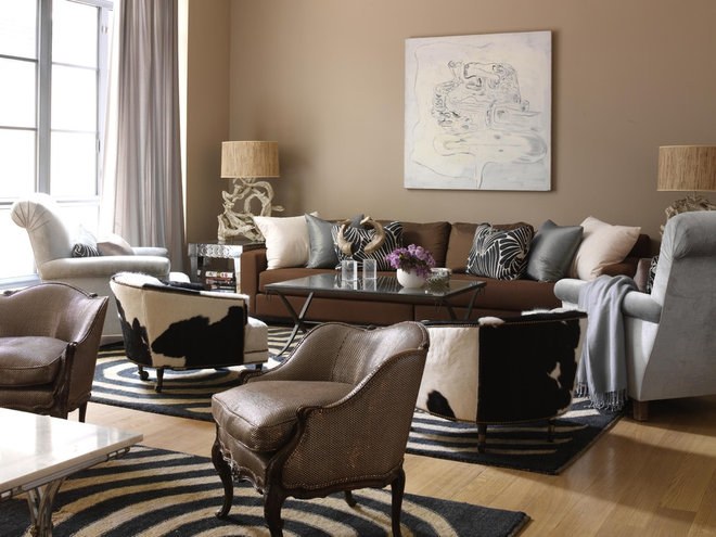
Red and charcoal grey. this is a great choice if your main furniture pieces are black or even a dark espresso or the opposite, white.  We also like mixing red and charcoal with a lighter grey sofa like the image below.

Seguir con la paleta..gris, negro, rojo, blanco...como el bañi:

Red and Aqua blue. If you like a bit of the unexpected this is a good option for you.  the aqua or turquoise combined with the red makes a bright and colourful statement - plus you can add some white for a clean almost beachy look or some golden yellows for even more pop! In a case like this a pattern piece like this pillows bring this unexpected colour combo together!

 Great room makeover with red and turquoise throw pillow as accent:

Red and White.  A classic combination and you can't go wrong with it! This can work with any style: country to modern - it just depends on the pieces.  Here we have an example of a country bedroom it is so fresh and inviting.  The distressed iron bed frame in red is just another way to add some colour into the room.

white bedroom with red metal bed frame and quilt at the foot of the bed:

Red and Pink.  We you can!!  Again another unexpected combination but it definitely makes a statement! Again if you like the idea of mixing these two bold hues look for a piece that brings them together like a patterned pillow, area rug or an art piece. Keep the supporting neutrals clean and crisp like in this image - the pure white bedding and the soft grey drapes and bench are a perfect back drop for these bright tones!


Ask color of guest bedroom walls and trim:

 Red and Navy Blue.  This look can be a bit nautical but that depends on a lot of the decor items you choose.  This is another classic combination and it is truly timeless. See the image below for some inspiration in this colour palette that is not nautical in theme. 

6th Street Design School | Kirsten Krason Interiors : How to Become a Better Designer:

Red and Dark Brown.  This is such a warmth combination and you can really add smaller accents to this look as well.  Take some inspiration from the image below. The mix of the dark brown wall and red furniture adds warmth and richness to the space.  The pattern rug and pillow add some golden tones into this mix as well.  This has a bit more of an eclectic feel but it is very chic.


Farm house living room. Gallery wall display, with art, mirror, and metal animal head. Over apothecary cabinet painted in a distressed red finish. Reserve At Old Fredericksburg Model Part 2, see the whole house at... Theraggedwren.blogspot.com:

 Red is so versatile in terms of both style and colour pairings.  Don't be afraid to try any combination!

Labels: , , , , , , ,

Wednesday, July 22, 2015

We Answer Wednesday - How To Style My Bedside Tables

"My bedroom is beautiful! I love the furniture and the bedding but my night stands are cluttered and it really makes my room look messy.  I need some help with my night stands - help me make them pretty, please!"

That's a common problem for most of us.  Our bedside tables become an area for clutter - books, hand lotion, tissues, magazines, note pads, lip balm and more ....We still need these items , they are a part of our bed time routine but we don't need (or want) clutter in a space that is supposed to be relaxing and serene.

So here are some of our tips for a stylish bed side. When it comes to styling a bedside table, we keep it simple with lighting, art and accessories like a plant/flower/decor piece and possibly books.  The combinations are really endless! Be sure to find items that are in proportion with the space.  A small room may need a small end table so don't add over sized lamps - look for something slimmer or opt for a wall sconce.  Using these basic pieces you can really achieve a number of different looks, be sure to put your personality into it, after all it is your space!

How to Style a Nightstand or Bedside Table

The night stand furniture piece - so this item is a key piece.  You need to find a piece that works in the space but also one that suits your needs.  A night stand without any storage is pretty much useless and is just inviting clutter into your space.  Look for a piece with at least a drawer, so you can tuck away a few items you don't want to display. Many night stands have a top drawer and then an open space below.  That open space can get crazy and cluttered very easily.  Consider using that space to stack books (or place them vertically) and if magazines are more your style - add a basket or box to keep them in, it looks so much better! In some cases, like if you are in a room that has very limited storage you may even want a small chest of drawers that will play double duty as clothing storage and a night stand surface. Even if you can only fit one small chest of drawers it might be more functional and practical that two small night stands.

Love the pattern on this pretty pink #headboard. I love the softness mixed with the reclaimed wood

Lighting - is a must! For reading and for ambiance.  You always want to layer your lighting in order to suit your mood but also fill the room with light (when you need it).  So think table lamps - depending on the size of the table you may be able to go big and bold and make a 'decor' statement in the room.

BAM

If you are low on space, try a wall sconce!  They attach right to the walls so the surface space on your  night stand is free for other items. Wall sconces have come a long way - there are so many styles on the market now and they really create a clean and streamlined look.


Art or Mirrors - You have a number of options but these items really add to the decor of your room.  We love creating a vignette with art or a mirror above a night stand, it really pulls it together.

i love the open and closed storage option.  the piece is less bulky, the white is light and airy and pairs nicely with the bed linens and headboard

So this image has a bold head board so art above the headboard was needed or necessary to make a 'splash' instead two pieces were hung above the end table.  This is a clean and classic look but with  the choice of prints and accessories this room feel easy and comfortable but looks stylish.

Bedside table colour

This room has a very clean palette.  The layering of the art piece and the mirror give it a cool and sophisticated look.  Simple but so chic.


 This image shows a sunburst mirror centered over the night stand.  In this white room, this golden burst really makes a splash.  You could also swap this mirror out for an art piece.

Virginia-based designer Dana Gibson has a flair for far-flung motifs and fresh, vibrant color.

Love the mini gallery wall look over this night stand.  Surround yourself with what you love! It could be art or beautiful photographs.  Look for pieces that preferably are calming and soothing.

Accessories -this is really where you get really personal.  You can add just about anything to your bedside table for decor.  One tip - if you have kids who like to hop into your bed maybe stay away from glass decor!

love the reflective surface on the lamp in a square shape, the art with oversized matting and the simple decor on the white table

In this image, the look is pretty clean.  A simple dish for jewelry, a clock and some framed photos.  The drawers could be filled with magazines, books and more but they are tucked away so it looks so neat and tidy!

For the book lovers - you can keep your favourite book at your side but try not to let your book take over the surface space.  It looks cluttered and messy.  Aim for a maximum of 3 books on your night stand.  Stack them up or even try a vertical arrangement.


Interior experts talk about their favourite bedrooms and share their top decorating tips...

Anytime we stack things it just looks neater.

We love some type of foliage - flowers, plants it doesn't matter but it adds life to the room!  Small works best in most rooms but you may be able to use something with some height.

 Use decorative storage boxes to keep small items organized on a nightstand. http://www.hgtv.com/bedrooms/tips-for-a-clutter-free-bedroom-nightstand/pictures/page-3.html?soc=pinterest

So once you have the items you want -start thinking about placement and arrangement.  It is a limited surface space so don't too many or items that are too large.  Start with your art and mirror first, ten add your light and from there play with the additional decor items.

Other additions to think about - candles, a small dish for eye glasses and/or jewelry, a decor item, photo frames or a small clock - are also great additions to a night stand.

When it comes to styling...
- choose items that suit your style and taste
- stick with odd numbers 3 or 5
- play around with arrangements and items and let your instincts kick in...

Labels: , , , , , , , ,

Saturday, July 19, 2014

How to make any room look Bigger

Smaller spaces tend to have a cozier feel about them and they are less intimidating plus you don't need to spend as much on furniture. But to fit in everything you need can be a big challenge and you definitely don't want to feel cramped, so what can you do?

There are some great tips and tricks out there beyond light and mirrors that can help.
And if you are thinking of putting your home or condo on the resale market, these ideas will really help you maximize the space for buyers to see.

1 - When space is at a premium, rooms should serve double duty. And nothing wastes space more than a living room that's used only for company. So go ahead — put a TV in there. Here a prominent wall arrangement steals focus away from the TV, so it doesn't dominate the space.


2 -  You can also hide the TV in a cabinet or piece of furniture. In this room the TV is sequestered behind a pair of doors over the fireplace — much nicer than looking at a big, black screen 24/7.

Cannot wait until we have a living room big enough to have 2 sofas facing one another.... one of them MUST be a chesterfield...:


3 -  When space is tight, always ask yourself: How can I use this room for two purposes instead of one? Here a dining room doubles as a library. It saves space, and nothing warms up a room like a wall of books. Plus it's is practical storage and to make it more decorative you can add some pieces in the bookcase


15 Lovely Libraries in Unexpected Places // dining room bookcase:


Labels: , , , , , , , , , ,

Friday, July 18, 2014

Furniture Distressing = No Stress at all!


Looking for a quick DIY to spice up your décor? So many times there are budget friendly jobs we can do ourselves at a low cost and with minimal work without even realizing it! Here is an EASY paint do-it-yourself project that will make a difference in any home. 

 
A very popular paint technique we are seeing a lot of these days in magazines and on home décor websites is “Distressed Edging”. This is a technique that creates an aged look using paint and glaze, without any sanding required. Talk about easy DIY! The glazing softens the colours producing an aged/distressed finish. Since no sanding is required, this means that there is no dust and no mess! There are many wooden surfaces in your home that could work with this technique such as a dining room table, kitchen cabinets, headboard, chairs or stools, coffee or end tables, doors and window trim, and that’s just naming a few!
There are only a couple basic tools you will need and no mess to clean up afterwards:
-Basecoat (only needed if you are starting from scratch and painting an entire piece of furniture.)
-Paint/Glaze for your “distressing” (the colour which would be showing through “underneath”)
-Flat Edge Foam Brush (for distressing the surface, this will be the only brush you need.)
-Plastic containers to hold paint & glaze mixtures.
-Soft cloths for wiping (in case of paint running or applying too much at a time.)
-Spray bottle with water for cloths
-Sealer or varnish for final protective coat once distressing is complete.


Here’s how it works: Paint the surface in the desired colour or use an already painted item or surface. Where you want the surface to look worn and distressed, paint another colour that would represent the colour underneath, this is where the paint and glaze comes into play. Make sure to use small amounts at once. The paint/glaze will likely be a fast drying product. It is much easier to apply less than you need than to try do it all at once, on the off chance you apply to much and cannot fix it. For example, you want to paint your kitchen cabinets yellow, you could chose a medium brown tone to “distress” with. This would look as though the original wood was beginning to show through the paint. This would give the illusion that the previous colour is coming through from normal wear and tear, when in actual fact, this colour is painted on top! Easy! Depending on the extent of the paint job you’re doing, you may want to seal or varnish the surface upon completion. Check with your local paint store for the product they would recommend.
Make sure you record your recipe. When the product is finished and your admiring the fabulous job you did – you want to be sure you remember how such perfection happened! 


Labels: , , , , , , ,

<data:blog.pageTitle/>

This Page

has moved to a new address:

http://kikiinteriors.com

Sorry for the inconvenience…

Redirection provided by Blogger to WordPress Migration Service