Kiki Interiors - Decor and Staging

Sunday, February 23, 2014

7 ways to update your home with paint!

Experts share their advice about painting different areas of the house

The trusty old friend that can update almost anything on virtually any budget, paint has always been there to help make things look a little better. Whether you’re finessing outdated furniture, giving greater impact to a front door, refinishing time-worn hardwood floors or attempting any of the many other makeovers paint can achieve, we’ve gone to the experts to get the techniques to do it right.

7-painting-tips-woodpanelling.jpg

Brick fireplace
Neutral palettes are trending this year, and texture is becoming all the more important. Brick provides visual interest in its rough surface, but if you dislike its bold, burnt colour, paint the brick to match your palette and let its texture make the statement.

Who: Nancy Bollefer, Canadian Marketing Manager, Behr at The Home Depot.

What to use: Behr Premium Concrete & Masonry Degreaser & Cleaner No. 990, Behr Premium Plus Interior Stain-Blocking Primer & Sealer No. 75,  Behr Self-Priming Interior Satin Enamel.

How to use it: Clean the brick substrate thoroughly by vacuuming up any dust or loose matter and applying diluted degreaser. Prime the surface with
a loaded roller before painting. Use a paintbrush to fill in mortar spots that the roller missed.


7-painting-tips-fireplace.jpg

 Ceramic tiles
If you want to renovate the bathroom, but retiling the wall isn’t in the budget, just paint over the tile! It’s the perfect solution for updating a tired tile colour on a tiny budget. Note: This project isn’t recommended for floors or surfaces that will come in contact with food.

Who: Andrew Fedele, Technical Services Manager, Para Paints.
What to use: General Paint X-Terminator 260-200, Para Ultra Melamine Latex 4300.

How to use it:
Ceramic is not porous at all, so sand the surface with 120- to 150-grit paper and clean before applying primer, then add two thin coats of paint. Wait 12 to 24 hours between coats and use a high-density foam roller.


7-painting-tips-tiles.jpg

 Front door
To help your home make its best first impression, the front door should set the stage for the style that unfolds inside. If your door is, for example, weathered while your home is sleek and modern on the inside, it’s due for an update.

Who: Sarah Cole, Marketing Director, Farrow & Ball.

What to use:
Farrow & Ball Exterior Wood Primer & Undercoat, Farrow & Ball Exterior Eggshell or Full Gloss.

How to use it: Remove the hardware and fill and sand any of the door’s imperfections before you start. Apply paint early in the day to allow enough drying time before any evening condensation arrives.

Trend watch:
Coordinate your home’s exterior palette with the interior by painting your front door just a few shades darker than your front entryway.


7-painting-tips-front-door.jpg

 5 Hardwood floors
Overhauling your hardwood floors with a fresh new colour makes a huge impact in any room, giving it a whole new look.

Who: Alison Goldman, Brand Manager, CIL Paints, cil.ca.

What to use: CIL Dimensions Interior/Exterior 100% Acrylic Porch & Floor. The higher the sheen, the more durable the finish, so semigloss is a great choice.

How to use it: Remove any loose paint with a wire brush or scraper and remove gloss with a deglosser or sander. Clean well and apply paint, but remember: Don’t paint yourself into a corner (literally). Whatever you do, make sure you work toward an exit.


7-painting-tips-hardwodfloors.jpg

 6 Pressure-treated deck
Refinishing a deck seems like a daunting task, as it usually involves extensive prep work, covering a large expanse and doing it all while exposed to the elements. But the after-effect – a porch that looks as good as new – is well worth the effort if you know what to do.

Who: Bev Bell, Creative Director, Beauti-Tone Paint.

What to use:
A solid acrylic stain that requires no primer and has a high tolerance for moisture from the elements.

How to use it:
Sand and wash your deck well to rid it of any dead cellulose or mill glaze. Start with the railings and work your way down to the deck surface so you can deal with any drips. Use a deck-pad applicator with an extension pole to get the job done quickly and easily.


7-painting-tips-deck.jpg

 7 Vintage metal furniture
The shabby-chic vintage look is still hot, and so too is the push toward upcycling old furniture and flea-market finds to stay on trend. All it takes is a simple can of spray paint to take a piece from unappealing to statement-making.

Who: Tracey Amadio, International Sales Manager, Valspar at Lowe’s.

What to use: Valspar Premium Spray Paint – it provides a durable anti-rust coating to protect metal from corrosion, if you plan to use it outside.

How to use it:
Remove dirt and grease, and scuff glossy surfaces by lightly sanding prior to painting. Apply two light coats rather than one heavy one. Choose a satin or flat sheen to hide dents and surface imperfections.

7-painting-tips-furniture.jpg

Labels: , , , , , ,

Friday, May 10, 2013

New Paint Colours From Benjamin Moore

There is a new line of paint colours from Benjamin Moore called 'Colour Stories' - 240 different colours of paint.  These colours are very saturated.  Most methods for mixing paint use 3 pigments in this line they use 5 to 7 pigments for each colour. 

I received my fan about a week ago and I must say I'm loving the rich and varied palette of neutrals.  Looking for the right shade of grey or taupe - this line will have it!

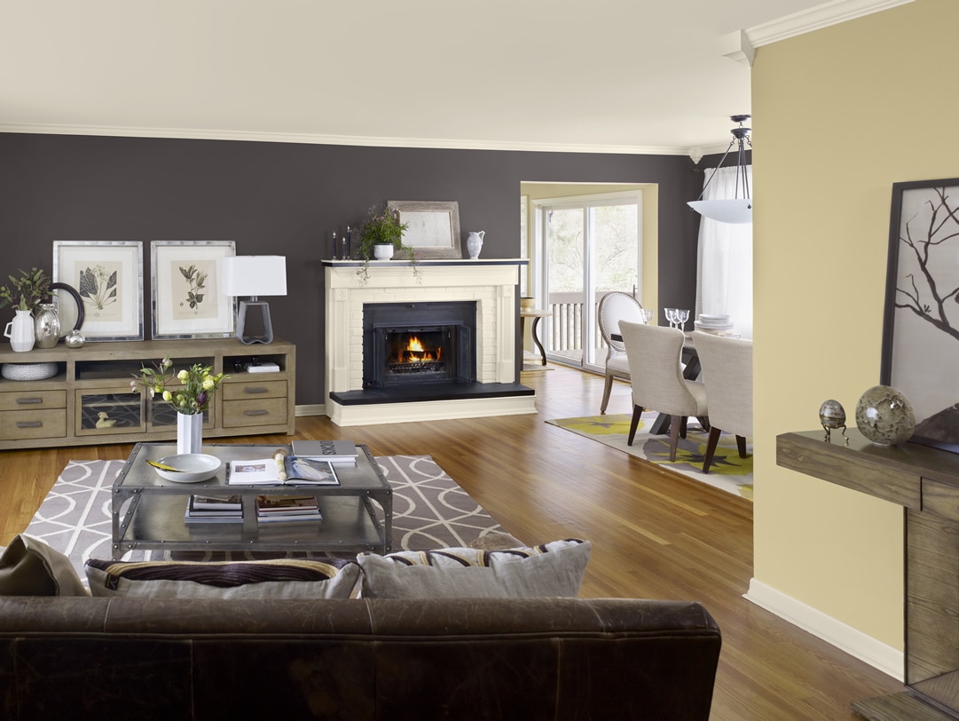
Benjamin Moore Color Trends 2013 Artisan buff living room 2

Some of my favourite neutrals: Soho loft CSP-10, Upper West Side CSP-70, Urban sophisticate CSP-160, Rocky Beach CSP-190, Wicker Basket CSP-225 Shitake Mushroom CSP-1040and Royal flask CSP-315


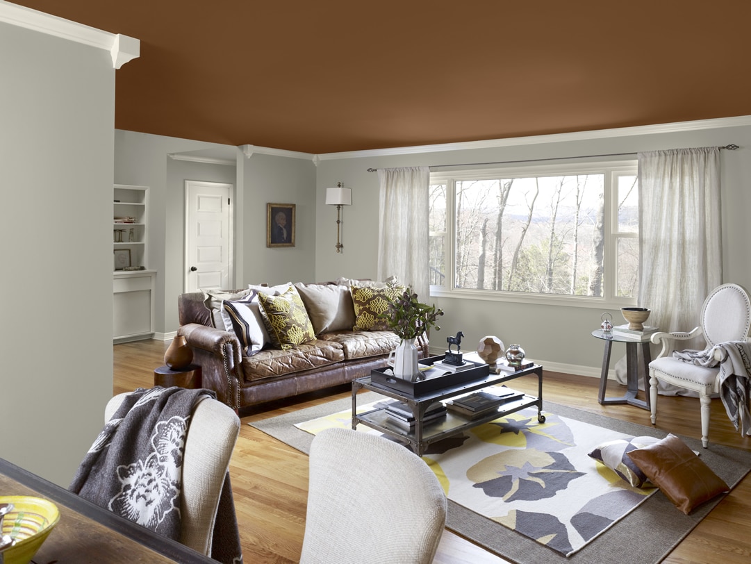
Benjamin Moore Color Trends 2013 Artisan gray living room 1

There's a paint colour for every place....

Perfect for a little girls' room: Kept Love Letters CSP-425

Perfect for a little boys' room: Dusty Cornflower CSP-605 or Cable Knit Sweater CSP-650

Beach cottage or seaside home: French Toile CSP-595 or Cool Breeze SP-665

Exterior Door : After Midnight CSP-630, Espresso Bean CSP-30 or Velvet Cloak CSP-480

Bold but Feminine Accent wall : Berry Fizz CSP-440 or Elderberry Wine CSP-470

Sexy Master bedroom: Evening Skyline CSP-505

Soothing and Serene Bathroom: Through the Looking Glass CSP-495


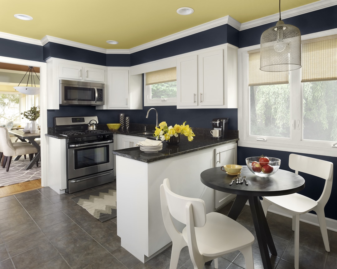
Benjamin Moore Color Trends 2013 Urbanite blue kitchen 1


Labels: , , , , , , ,

Wednesday, October 3, 2012

Top Fall Trends that Canadian Designers are loving this season

1 Corray Classen-Harapiak, Bliss Interiors, Winnipeg, MB.


“The one trend that has had me excited for a while now is wallpaper! Heading into the fall season, most of my designs will include wallpaper. Whether a bold, colourful print in the foyer to welcome guests or a more subtle print in the master bedroom, wallpaper instantly transforms a space and infuses personality without too much of a commitment.”

2 Victoria McKenney, Enviable Designs, Vancouver, BC.


“At the moment, we are really excited about the move towards using large prints on the floor, in the form of bold rugs and carpets. The huge range of colours and patterns allow us to really dictate what direction the aesthetic becomes. As well, wallpaper is always a big trend but we are seeing a much more subtle take - tone on tone palettes and textures which is different from the loud graphic patterns in the past. I think this will appeal to a wider range of homeowners. We hope to use these new wallpaper trends by bringing back natural textures and tones into the house. Moving into fall, we are looking to capture a little of the outdoors back inside with us, through the use of these new textures and soft palettes - bedrooms and living rooms would be perfect for this application.”


3 Jennifer Brouwer, Brouwer Design (Markham, ON)


“I am loving the additional embellishments you’re seeing in both fashion and home. Utilizing plain and textured fabrics, then enhancing them with pretty decor accents and details in a pattern or as an edge. YUM! A few key projects we are wrapping right now have several varying textures and embellishments.


When you work with a designer as part of your building and construction team, it generally means you strive for "unique" individualized characteristics that are not mainstream. We live to capture your lifestyle; therefore, the items and concepts we specify are individualized to you. We are in the midst of a wine room design, which includes a backsplash encased in glass. Each cork was part of a collection of wines, tasted with their family during travels abroad. We utilized a purpose or function, a memory, and a way to define a collection in a sensible, and stunning way. Stay tuned – it’s going to be a great one!”


4 Shelley Kirsch, Shelley Kirsch Interior Design and Decoration (Toronto, ON)


“The use of rough-hewn materials against more polished surfaces is a trend worth exploring. Different treatments of woods are gaining popularity, like cerused oak for furniture or smoked, wide-planked oak for flooring. Using heated stone or tile floors in lieu of hardwood or broadloom is gaining popularity. I am applying rough-hewn plaster on walls in a family room with modern Italian furniture and lighting. Honed limestone with stainless detailing will be used to face the fireplace juxtaposed with smoked and oiled, wide-planked oak flooring.”


5 Christine Labate, LUX Design Inc. (Toronto ON)

“Fall of 2012 promises some exciting design trends that can be used in any interior. Warm neutral palettes remain popular with the addition of bold pops of colour like stunning navy blues and emerald greens. Layered colour, pattern and texture are also big for the fall. We love creating an inspired material palette with several complimentary patterns, textures and colours all working together in a space to create visual interest.

Eclectic statement lighting is also an emerging trend we are very excited about – this fall is all about mixing lighting styles in the same room and finding that one perfect statement piece to create a focal point. Recently, one of our designers visited a home with a den that needed some updating. The existing space had outdated wood paneling on the walls and a large white washed millwork piece. The design plan for modernizing this space will include painting out the existing wall paneling in a soft grey/white, as well as the millwork unit in a variation of this colour. The interior inserts of the millwork piece will be painted out a bold navy blue colour to compliment the grey walls and create an interesting focal point. In the seating area, a warm grey sectional will be featured with navy blue, grey and red accent cushions. Careful attention will be paid to layering and mixing textures and patterns for the accent cushions and textiles for the sectional. The seating area will be grounded by a natural cowhide rug layered on top of a textured sisal chenille rug. Lighting will be a mix of eclectic wall sconces, floor and table lamps. Natural accessories such as birch logs around the fireplace will also be used as décor pieces.”

6 Joan Balsam-Clark, All About Interiors Inc. (Kingsville, ON)
“Anticipating the arrival of cooler fall days, "cozying up" a room by adding decor accessories really reflects the changing environment outside; such as adding throws and cushions in the still popular Pantone colour of the year, Tangerine, to the Minimalist/Simplicity Styles. Replacing the bright summer colours, yellows, golds, greys and various shades of brown also work very well together as fall colours.


Introducing bold or large geometric printed wallpaper or a textured wallpaper is also a popular trend seen in the fall. Adding a punch of colour, wallpaper or anything from the outdoors gives your home personality. After a summer of crashing waves washing driftwood up to the beaches it's always nice to bring summer memories into the house for the fall season. I've recently introduced drift wood centerpieces, which are also fun and easy DIY projects into homes as well as turned water-logged stumps into coffee tables, giving your home a bit of the outdoor character, which nicely compliments fall colours as well as being a great conversation starter.”


7 Elizabeth Metcalfe, Elizabeth Metcalfe Interiors & Design Inc. (Toronto, ON)

"Using colour with confidence is huge. It's not enough to use a strong colour as a trim or accent. Be courageous, be bold. We're working on a living room with deep teal walls, bookcases and a diamond tufted velvet sofa creating a luxurious colour-filled jewel box. Just remember it's important to add reflective surfaces and metals to give it a lift!"


8 Lucie Pitt, Versa Style Design (Montreal, QC)

"I love the 2012 colour trends such as chartreuse, deep purples and the rich tangerines because they transition so well into autumn. Typically in fall decorating we tend to lean towards cozy cocooning and want to feel hugged when we enter a room, so if you want to integrate purple, try to go with a deep eggplant instead of "Barney" purple. Sometimes just changing up those Kelly green throw cushions for Chartreuse ones will bring the mood from fresh and vibrant to warm and inviting. Because we have less natural light, go ahead and add a few deep orange candles to your coffee table or fireplace mantle and USE THEM!


Just remember to stick with your style when accessorizing! During the fall season, clients make the mistake of just buying because it looks good in the store display, but you have to ask yourself if a cottage-style berry wreath will look as great over your modern minimalist fireplace. If you have a sophisticated or paired back design, try to stick with glass, silver or chrome finishes. If you have a cottage, global or vintage style opt for basket weaves, knit cushions, and richly textured vases or lamps."


9 Laura Stein, Laura Stein Interiors (Toronto, ON)

“One of the places I like to look for cues on trends is the world of fashion. This fall we're seeing a lot of bright, vibrant colours, especially primaries, in striking geometric patterns and colour blocking. Usually colours tend to get darker and moodier in the fall, so seeing all the strong colours this year is exciting. I typically avoid the trendiest trends in favour of more enduring, timeless design, but fantastic colour always looks fabulous, as long as you don't go overboard. I'm working on a family room right now with a backdrop of neutral earth tones, but we're layering in an eclectic mix of pattern in azure blue, bright green and white. The strong colours contrast and patterns make the space feel fresh and energized.


I also love all the warm metals we're seeing just about everywhere. They started coming back as accents a year or two ago, but now they are being used for everything from furniture to plumbing fixtures. Gold is now the new silver. I'm crazy about the patina of antiqued brass. It has such a rich, sophisticated look and goes as well with contemporary pieces as it does with antiques. I'm using it in all sorts of projects, from light fixtures, to living room tables, to bathroom faucets. In one living room I'm using it as an accent on a contemporary acrylic table and in the bathroom I'm pairing it with gorgeous white marble and antique reproduction vanities.”


10 LeAnne Bunnell, Elle Design (Calgary, AB)

“The introduction of a softer version of brass brings warmth and new level of eclecticism to interiors that have been dominated by chrome and polished nickel. I'm in the midst of designing a home where we are using soft champagne brass plumbing fixtures and dark hardware on other fixed elements. We have some black metal light fixtures going in and I'm really excited to see the lack of rigidity and character this brings to the palette.


It's so nice not to have to talk clients into mixing patterns this season! From bold graphics to bright florals, we are seeing pattern on everything from wallpaper to lamps to large-scale furniture pieces. Use a little or use a lot… I love it. We are designing a client's living room and dining room using floral, chevron, trellis and Moroccan patterns. All in one room.


At Elle Design we always look for ways to make our clients' interiors special and unique. One way we do this, and we are seeing a lot more of, is custom touches to existing pieces. From recovering Grandma's chair in an unexpected fabric to using bold paint to reinvent a family heirloom cabinet for toy storage (rescued from a basement storage space), it's all in the name of making the old new, just for you.”


Labels: , , , , , , , , , ,

Friday, August 3, 2012

Go BOLD at home

So neutral colours are always in style and always work but if you are looking to add some excitement to your space that's easy and inexpensive - look no further.  Colour is back and it's BOLD!


Colour can do so much for a space but be sure to choose wisely. 

You want to start with having all of your items for your room, FIRST.  So if you are thinking of adding colour to your bedroom walls be sure to have your bedding, rugs etc...first.  You will want to take inspiration from those items to make your paint selection, so that it all works together.  Putting in some crazy bright colour that has no connection with your other items will just look wacky!

Take inspiration from another somewhat colourful piece in your room.  So you may want to use your drapes, furniture or bedding to help select the paint colour. 
So looking at the above image, I'd probably do a bold brunt orange or mustard wall (the wall where the headboard is).  And then, the other three walls in a neutral cream, taupe, tan or khaki. 

How do you know if it is the right shade? Test it.  So start by looking at the bold shade against white (a plain sheet of typing paper is perfect).  You will want to stick with colour that seems to have some black or brown in the base - that will keep the room looking sophisticated and classic but still with colour.  The tones that don't have brown or black in the base look like candy (too child like).  Now maybe you have a few colours and can't decide - go to your paint store and get some small sample bottles.  Paint large (24"x24") patches on the wall and look at those colours against your items and look at the colour in the day and night light.  and you'll fall in love with a colour in no time.

Scared?? Try going bold in a space like a powder room or a guest room. 


In my current home I painted our powder room in a rich dark chocolate colour.  I added some neutral cream towels and candles, a bold and colourful art piece and a very streamlined mirror.  It looks very sophisticated and we get lots of compliments, too!

You can have so much fun with colour and painting is easy (with the right tools) and inexpensive too

Have fun with colour and have fun in your home with bold colour!!


Labels: , , , , , , , ,

Friday, January 13, 2012

Hot Trends in Paint for 2012


Well, we already gave you a sneak peek at the hot new colour for 2012 - tangerine tango!


But what are the other hot trends that we will be seeing in 2012?


Paint colour:


Expect to see a wide range of hues this year. Such as earth tones, bright candy inspired colours and lots of blue! some of the favourites: Tea Dance by CIL (a blush, reddish and lively colour) fabulous for any room that needs some life and bounce. Perfect for a bedroom, craft room or office - any space that could use a jolt of energy.


Some calming blues to keep your eye on are by Benjamin Moore - wythe blue, nimbus grey, montpellier, and amethyst shadow, they are modern without being over the top and still classic in that they work beautifully with neutrals. Tired of the grey trend? Then check out these blues. Still cool but refreshing and not gloomy.


Check out Behr's Tea Party collection, inspired by Alice in Wonderland. These colours are playful and add whimsy to any space. This is perfect for a child's room or any space for the young a heart. Check out - queen's tart, minty frosting, violet water, sugar pool, and first peach.


If you are looking to redecorate your daughter's room and she loves that 'princess or ballerina' look, check out Beauti -Tone's 'Japanese blossom'. So elegant and soft, pink but not bubble gum. this would also be stunning in a bathroom, the reflection will make your complexion glow!


When you hear 'earth tones' chances are browns and greens come to mind, but Mother Nature has so much more to offer. Olympic paints and stains have really embraced nature this year and made natural tones feel vibrant and alive. For instance, Indiana Clay is a warm and spicy but soft orange tone that looks so chic and inviting when teamed up with shades of cream. Perfect for a study, family room or a living room.


Looking for something bolder? No problem. SICO has some really great options for you - that offer colour an contrast. They are really spearheading the colour blocking trend by using colours such as Inscrutable sky (think a bold and deep eggplant) and Marjoram (a very light celery tone) in the same room. They are calling this 'colour zones'. So try using the deeper colour to emphasize architecture in your home.


Not sure how to bring these colours into your rooms? Try colour blocking. Yes, just like in fashion, accent walls or accent ceilings or accent pieces in a bold, vibrant colour can be a way to add some real splash into any room. It's great to see colour again and in such an economical format. Paint is so inexpensive and easy to apply (I know we don't often want to under take the task, but the results can really change up your space). Colour your world and make it fabulous - your options are endless!

Labels: , , , , ,

<data:blog.pageTitle/>

This Page

has moved to a new address:

http://kikiinteriors.com

Sorry for the inconvenience…

Redirection provided by Blogger to WordPress Migration Service