Kiki Interiors - Decor and Staging

Monday, May 11, 2015

In Living Colour - Tips for Picking the Perfect Paint Colour

Livable Color: Choosing Hues You'll Love to Live With

What's the secret to choosing the right color? Sure, there are principles and guidelines, but the real secret is to choose colors you can live with and will love to come home to. Use these tips from designers and color experts to help you reach that goal.

 jvw home: Smokey Plum in My Master Bath (and other settings)

- "Think of places and spaces you love for inspiration.  For example, I love the cream-colour stucco walls I see in Italian churches, and I try to match that feeling."  Lulu DeKwiatkowski, TEXTILE DESIGNER

- "Warm colours like red, yellow and orange have an energizing effect.  Blue, green and grey are calming." Davi Bromstad, DESIGNER and HGTV STAR

-"Always sample paint colours. Paint a sample board so you can move it around a room." Diana Hathaway Timmons, DESIGNER

-"Look at paint colours in the morning and at night, and put them near your furniture." Emily Henderson, STYLIST

-"You can take just about anything to the paint store and ask the associate to mix a paint that's a perfect match using the store's colour reader." Danny Seo, LIFESTYLE EXPERT

-"What's more livable than the colours found right outside your back door? Look to earthy, natural colours - blues, greens, beige and taupe - when choosing colour for your rooms." Sehra Han, DESIGNER

 Design Seeds - love this beachy paint combination

-"When choosing wall colours, find versions of your favourite colours that are muted with grey." Erica Lugbill, DESIGNER

-"Choose the best paint you can afford.  Good paint has better pigments and a more livable finish." Courtney Price, DESIGNER

-"When you shop for paint, take along an existing pillow, a piece of drapery fabric or a photo of your space.  You'll make informed colour decisions." Alejandra Bernardez, DESIGNER

-"Play with intensity. I love monochromatic rooms that use a single hue in a variety of ways." Sarah Richardson, DESIGNER

-"Layer bold colours with midtones and neutrals to balance colour in a room." Khristian A. Howell, TEXTILE DESIGNER AND COLOUR EXPERT

 Beautiful Living Style: Colors For Staging Your Home For Sale

-"If you find a colour that you love but you are afraid it might be too dark, ask the person mixing the colour to do a 50 percent tint of the colour." Gail Wright, DESIGNER

-"Colours close together on the colour wheel are analogous and will make a calm room.  Colours that are farther apart are complementary and add drama." David Bromstad, DESIGNER and HGTV STAR

-"Choose colour based on the use of the room.  Morning rooms can be brighter; rooms used at night can go dark." Beth Kushnick, SET DECORATOR

 Designer Color Palettes from BHG:  Patrice Cowan Bevans' Rich Elegance (Deep). Can't you imagine that orange on the front door! Stunning!

-"Your home is made up of more than walls - ceilings, floors, stairs and doors are also great places to have fun with paint." Bob and Cortney Novogratz, DESIGNERS

-"Give yourself permission to use a bold colour.  You don't have to have it everywhere - one throw or pillow might be just enough." Nate Berkus, DESIGNER

-"When rooms open to one another, avoid choosing radically different colours, or the space will look choppy and small." Courtney Price, DESIGNER

- "Choose your favourite colour, but watch that it's not too bright." Maria Killam, COLOUR EXPERT

-"In the same way a bright shoe adds surprise and fun to a black outfit, an unexpected touch of trim along a curtain panel or in piping can add colour in a way that's easy to live with." Anna Lobell, DESIGNER

-"Start with colour you love. Even if it's not a trend at the moment, it will always be on trend in a space that resonates with you." Khristian A. Howell, TEXTILE DESIGNER and COLOUR EXPERT

-"For a cohesive look, flow two or three of the same colours in each room.  An accent wall in the family room is reflected in the master bedroom bedding, for example." Diana Hathaway Timmons, DESIGNER

-"Save strong wall colours for statement rooms that are smaller and visited less-a library, guest room or a powder room." Lulu DeKwiatkowski, TEXTILE DESIGNER

-"Blend in strong colours. A bold colour on the wall will feel jarring unless you consider the trim and ciling colour in your plans." Patrice Cowan Bevans, DESIGNER

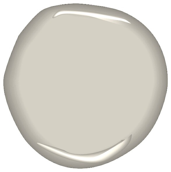
Warm Gray Paint Colors - Top left: Benjamin Moore Winter Gates AC-30; top right Ace Hardware Coastal Pleasure 5048; middle True Value Paint Promotion 10D3; bottom left Glidden Seal Gray GLN46; bottom right Behr Silver Drop 790C2.

Labels: , , , , , , , ,

Saturday, July 26, 2014

Update with Paint!

The smartest, quickest, and most convenient way to give any room a new look is through the use of color. The ‘right color’ can instantly revitalize an interior, camouflage cosmetic imperfections, and minimize architectural flaws. Paint can dramatically change the ambiance of a room, create harmony within a décor, build illusion, and accent an interior with personal taste.
In this week’s blog post, we would like to share our 16 favorite Benjamin Moore paint colors. From the best whites, grey, taupes, yellows, reds and more!
Now, why Benjamin Moore? Some of you may like other brands that are affordable but we personally prefer BM paints. It’s what we normally use for our clients and believes that they are a good investment.
Here are our top picks:

#1 Chantily Lace

chantilly lace ben moore Top 16 Benjamin Moore Paint Colors  
image source: homebunch.com
This white has a light hint of grey. It is crisp, clean and bright. It looks fresh against grey and is perfect for trim and cabinets.

# 2 White Dove

white dove Top 16 Benjamin Moore Paint Colors  
image source: theinspiredroom.net
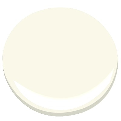
White dove has a faint yellow undertone and works so well with traditional furniture and gives off a beautiful gloss for trim. The warm and soft color is perfect for the bedroom, living room, kitchen and bath.

#3 Linen White

linen white Top 16 Benjamin Moore Paint Colors  
image source: thewriterandresidence.com
Linen white can make a room feel so clean yet cozy. It has a bit of warmness to it and not overly crisp. So classic!

#4 Edgecomb Gray

image source: postcardsfromtheridge.com
This soft, barely there type of grey is perfect for any room with lots of natural light. It compliments everything and works well with almost any color.

#5 Coventry Grey

coventry gray Top 16 Benjamin Moore Paint Colors   
image source: www.houzz.com

Coventry Gray can be used as a shy neutral or for a pop of color. It has blue undertones and the atmosphere it creates is incredibly relaxing. It is so modern and fresh.
Must read: Make Use of Creative Color Schemes

#6 Yarmouth Blue

yarmouth blue Top 16 Benjamin Moore Paint Colors   
image source: amidesign.com
Yarmouth blue is one of the best light blues out there. Paint your bathroom with it for that extra calming effect.

#7 Mannequin Cream

mannequin cream Top 16 Benjamin Moore Paint Colors   
image source: myoldcountryhouse.com
This light, creamy yellow is ideal for spring. It’s not too yellow nor too pale to our liking. It feels so inviting and comforting.

#8 Mesquite

mesquite Top 16 Benjamin Moore Paint Colors  
image source: housebeautiful.com
Mesquite is a gray green color that works well in a country bedroom or modern when paired with darker shades of green or gray.

Check out: Should You Paint Your Wood Kitchen Cabinets?

#9 Narragansett Green

narragansett green Top 16 Benjamin Moore Paint Colors

 image source: housebeautiful.com
This is a color we are so in love with. Look how beautiful that cottage is! Nothing is more perfect than Narragansett Green for that lakeside cottage.

#10 Clay Beige

clay beige Top 16 Benjamin Moore Paint Colors

image source: houzz.com
This neutral beige has green and red undertones to it. Clay Beige looks perfect with browns and blues.

#11 Greenbrier Beige

greenbrier beige Top 16 Benjamin Moore Paint Colors

image source: janelockhart.com
If you want to work on a room with dark, wooden floor, try Greenbrier beige. We just love the warmth and gorgeousness it creates.

#12 Soft Marigold

soft marigold Top 16 Benjamin Moore Paint Colors
image source: spicerandbank.blogspot.com

Orange doesn’t have to be ‘popsicle orange’. Soft Marigold is that type of orange that can make any room looks romantic and sexy.

#13 Exotic Red

exotic red Top 16 Benjamin Moore Paint Colors

image source: homebunch.com
This is a deep, saturated red. Paint your kitchen chairs and cabinet with it for a playful vibe.

#14 Million Dollar Red


million dollar red e1403083826662 Top 16 Benjamin Moore Paint Colors
  image source: restylinghomebykellyblog.com
Another rich red variant that we adore is Million Dollar Red. It brings a sharp, sophisticated look and exudes a bold and a million-dollar-look to any room, hence the name.

#15 Razzle Dazzle

razzle dazzle Top 16 Benjamin Moore Paint Colors

image source:  jbidny.com
Oh, we love pink! And Razzle Dazzle is a show stopper. It can make any room fabulous, flirty and feminine.

#16 Blushing Bride

blushing pink Top 16 Benjamin Moore Paint Colors
image source:  decorpad.com
This Ben Moore pink, on the other hand, is so subtle and so soft on the eyes. Perfect for your crafts room, home office or nursery.
Disclaimer: This is not an advertorial for Benjamin Moore paint products.
If you wish to learn more about Benjamin Moore paints, visit www.benjaminmoore.com.

Labels: , , , , , , , , , ,

Friday, March 14, 2014

Shades of Grey

I have been using a lot of different grey tones in my renovation projects lately.  Some of my clients are a bit hesitant at first but once they see the different options in the grey family they are pleasantly surprised with the results.

Greys can be dark or dull but there are warm options, soft options, but it really is an ideal neutral for the whole home.  try it is in bedrooms, kitchens, living, family and dining rooms even in children's rooms.  With the right accents and furniture you can transform your space into an look you want with a great backdrop. Here are my favourite shades of grey, so far...

Benjamin Moore Sea Salt is a calming and soothing grey.  I used it most recently in a family home.  they wanted an urban farmhouse look.  they paired the sea salt walls with a Mascarpone kitchen (we matched all of the trim and doors to the mascarpone paint) which added a lot of warmth to the space, with knob and cup chrome hardware with a charcoal glass subway tile back splash and a granite back splash with white, light grey and darker grey veins.  The flooring was natural oak (original to the home) to give it  country feel and we added 100 year old barn beam legs to the island that had storage and seating for 6.


Most recently, we staged a property that was in need of some updating.  The layout of the condo was great, with lots of natural light and over sized rooms with a white kitchen and bathroom.  We wanted to add a bit of drama on the walls but because this was a property that was going on the resale market we did not want to scare away buyers.  We choose a softer grey tone which is elegant and classic, Silver Satin by Benjamin Moore.  with the staging furniture - a white sofa, some traditional wood tones, blended with glass and some modern pop of Radiant Orchid - the space is coming together nicely and it will have broad appeal in the market.


Another favourite of mine is Ashley Grey by Benjamin Moore,  we used this shade a more traditional kitchen with pashmina colour cabinets and a quartz counter top to add some more modernness to the space.  We wanted to mix the traditional feel of this home which was built in the 1920s so we used the Ashley Grey from the Historic Collection but by pairing it with pashmina painted cabinets in a traditional style and quartz counter tops (which are more uniform) we had a beautiful blend of old and new.


benjamin moore ashley gray
If you are still hesitant to give grey a chance, try a warmer grey like Benjamin Moore's  Balboa Mist (which was featured recently in a spread 'Seize the Day' in Better Homes and Gardens February 2014).  The chip looks like a true grey but when paired with warmer wood tones and off whites, it looks more beige but in a more modern palette.


Labels: , , , , , , , , , , ,

Tuesday, April 2, 2013

Bathroom Renovation: Why not go Grey?

A bathroom renovation is a big job in a very important space.  We use our bathroom at the start an finish of everyday, so it should have the look and feel of a calming and refreshing space.  If you are looking at renovating your bathroom in the near future and don't know what colour scheme to start with, think about going grey! 

Neutral tones are always best for a space that you won't be updating often due to the level of work and the cost plus it is easy to blend in new accessories into an already neutral space. 

Grey getting a bit of a bad rep many people think it is too cool and unnatural but the colour grey is actually seen in many of nature's rocks and stones.  And, if used correctly you can have a very warm and nature inspired bathroom using shades of grey.  Grey can be very peaceful and calming, it can also work with some many styles ranging from modern to classic. 

Recommended palette of grey Benjamin Moore Paints from interview on Design Crisis

Grey is a great choice if you like colours or really anything that is a mid-tone.  Grey is a great neutral to work with because you can mix other neutrals with it (I love grey with white and navy blue)  but you can also add some great pop colour with grey (like orange for a sporty look or eggplant for a more dramatic look)

So how can grey be used in a bathroom?  It can be used in so many ways like cabinetry
Grey bathroom cabinets

or stone counterops
marble


or tile

grey subway with calcutta marble, wood tone vanity


or paint

light fixture


Grey has a range of tones and possibilities.  So for your next renovation why not go grey and create a soothing and tranquil space for you to enjoy for now and for years to come....

Labels: , , , , , , , ,

<data:blog.pageTitle/>

This Page

has moved to a new address:

http://kikiinteriors.com

Sorry for the inconvenience…

Redirection provided by Blogger to WordPress Migration Service