Kiki Interiors - Decor and Staging

Wednesday, July 29, 2015

We Answer Wednesday - Best Kitchen Table Ideas

I love my kitchen but the breakfast area is very small. I would love to have a table in this space but I don’t want something intrusive. What are my best options for a small breakfast nook?”
Great question! This is a reality for so many people, especially condo living. Many homes have an area in the kitchen that’s great for a table for breakfast or kids doing homework etc. but don’t know how to use the square footage properly. There are functional and stylish options for every home – sometimes we have to be inventive and creative!
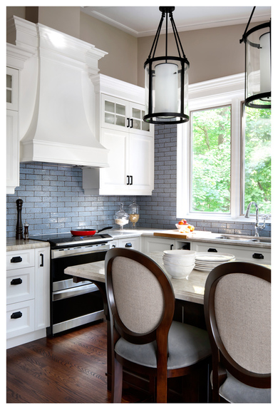
Its important to be realistic about how your going to use this space. If your not going to use this table with other people, is having 6 chairs a necessity? Probably not. If you are using this as your only dining space, maybe so. In that case, here are some suggestions for the best tables for your small kitchen. If this is your only dining space and you want it to look more formal you can still keep the size and scale proportional but look for some chairs that have a more elegant style and add a beautiful dining light fixture above the table
Those are cool chairs!  Totally *not* kid-friendly, but I like the two-tone effect.  Also, that light fixture is sweet.

For small spaces, our first recommendation is always glass. The great thing about glass is that it is clear (I mean duh, right?) but because of that, it is non-intrusive. Because it is clear, it almost camouflages to a space. The transparency is truly a great option for making a space seem larger than it is.
white cabinets with back painted glass backsplash and marble countertop
Round tables are definitely most ideal for small kitchen spaces because they promote conversation and can accommodate more seats than a rectangular table. Square tables are also a good option. There are only four sides to this so having 6 seats will be challenging. Depending how you will be using the table – 4 seats may be more than you even need anyways. Also if building in a bench (with piano hinge for additional storage) is possible it's a great space saver if you have a Bay window.  It's casual and comfy seating and it looks great with a round table.
Take a tour of this charming beach cottage with a built-in breakfast nook with bay window.
Often a smaller base is easier to cram people around, it seems more spacious than having four legs. A single pedestal is much less intrusive. Depending how large the legs are and the shape of the table will determine its functionality in terms of seating. Be mindful of that.
Pub tables are a great option for a small space. Depending on how you use this table, having a higher pub table sometimes makes a space seem larger. Having additional height often makes the room seems larger, instead of having more seating width wise, we’ve added height.
Pub table made from metal and wood for the basement from BHG Walmart.  Tips on decorating a kitchen in the basement! Light and bright for a basement.

Positioning of your table is also something that can really impact your space. Let’s face it, sometimes there just isn’t a lot of space. In a perfect world, our kitchens would have a beautiful space for a breakfast nook with a bay window and built in bench. That’s not always a reality. Sometimes your furniture placement is limited. Don’t be afraid to push the table against the wall. Or the kitchen cabinets. As long as there is a decent traffic pattern(2 feet is ideal) than use your space in a functional way.

I also like this one

Labels: , , , , , , ,

Wednesday, May 13, 2015

We Answer Wednesday - Kitchen Backsplash

I moved into my townhouse a year ago.  I love my kitchen!  it's white with light grey counter top and grey tile floor.  This summer I want to add a back splash but I'm not sure what to choose.  Any advice?

A white kitchen is classic and a great choice for a smaller space.  It's light and bright and in terms of resale, it has mass appeal. Adding a backsplash is a simple update that isn't disruptive to your life at home. A backsplash in a kitchen is like adding jewelry to an outfit - it really pulls it all together.  This year in tile it was all about shape, the colours were all neutral but the shapes were the focus.

For a back splash, you have lots of options.

open shelving in the kitchen. Gray glass tile. lovely! I have open shelving... unfortunately all apartments are sorta already made. So I brought my shelving outside the kitchen :)

Subway tile - this is a classic and you cannot go wrong with this option.  Seen here in a brick or staggered formation it mimics the look of brick.  A typical subway tile is 3" x 6" but there are variations in size.  In terms of colour - a soft grey is a good neutral option as is white but you could also go with a charcoal for a more dramatic look.  If you are thinking you might sell in about 3-5 years choose something with some longevity like a neutral tone.

Cheap Remodeling Ideas That Add Elegance | Remodeling on a Budget

Stainless Steel Tile - this has a bit more of an industrial edge.  This material works well in a kitchen as it's easy to clean and maintain.  You will also have a lot of shapes and sizes to choose from.  This also looks great in a kitchen that has stainless steel appliances

inspiring makeover: painted cabinets in gray & white with new glass tile backsplash

Glass mosaic tile - this option was super popular a few years ago.  This is still seen today but more tone on tone like the image here.  Various shades of grey and a mix of clear and frosted glass.  Again, a soft look with a bit of texture and shine - ideal for a smaller kitchen.

 x in the glass

Marble tile - Marble is so classic and elegant but we have been seeing it in more modern and contemporary spaces, too.  It is a material that requires a lot of maintenance when installed as a counter top but as a back splash not to so much.  The natural variation and veins make it visually interesting and it look amazing when paired with grey and white.

It’s easy to replace old countertops with these budget-friendly countertop options: http://www.bhg.com/kitchen/countertop/budget-friendly-countertop-options/?socsrc=bhgpin011514countertops

Hexagon tile - a popular shape in 2015 for backsplashes and floors.  Try this in a neutral tone and it will give even the most 'tired' kitchen a fresh look.  The shape is interesting  but not over the top.  Hexagon tiles also look incredible in bathrooms too, in a shower as an accent or on the shower floor. 

Our 40 Favorite White Kitchens | Kitchen Ideas & Design with Cabinets, Islands, Backsplashes | HGTV

Herringbone formation - still looking for something a bit different but not totally off the wall? Try a herringbone formation.  Using a subway tile, instead of staggering the tile you lay it in a 'zig zag' format.  Herringbone is a pattern we often see in menswear but we are seeing it in tiles.  Stick with a neutral colour palette and a grout that is a few shades lighter (or darker) than the tile so that the pattern shows.  This also looks great on a floor with a 12 x 24 tile.

Adding open shelving with baskets creates a nice contrast and interest to a white kitchen

Arabesque tile - this is a shape that's recently popular.  It adds an elegant touch to a kitchen.  Again, use a grout with some pigmentation so that the shape is evident.  It's lovely in white and soft grey.

Labels: , , , , , , , , , , ,

Saturday, April 18, 2015

What to do with that awkward space above the kitchen cabinets.....

In some kitchens you will notice that there is an awkward open space between the ceiling and the top of the kitchen cabinets. Other than building in a bulkhead to meet the top of the cabinets - what can you do?

Depending on your style or your situation this can be usable space.  It can be used for storage or decor, ideally both. 

If you are selling, we strongly suggest not displaying it as cluttered storage packed with various things like large Tupperware, platters and small appliances -as that sends out a message to buyers - this kitchen doesn't have enough storage (which is a negative)!!

If you are selling and staging, try painting that open space.  We recommend the same tone as the cabinets (or at least something light that works with the palette or the same wall colour as you have in the kitchen already)  That will keep an open feel in the kitchen- a bright or dark paint tone will draw attention to the awkward space and give an odd striped effect

Ideas if you are staging:

...The key is to choose a color that pops against the color of the cabinetry, the ceiling and the backsplash, for maximum impact.
Design by Laura Stein Interiors; Photography by Brandon Barre via Dering Hall

This kitchen shows a lighter tone that works with the colour palette

Ten Ways to Add Farmhouse Style to a Suburban Home by The Everyday Home
 This image shows a kitchen where the gap is painted in the same tone as the cabinets you can see how the awkward gap just disappears.

 Lots of houses have it — that awkward space between the top of the kitchen cabinets and the ceiling. In my house it's a favored cat hangout (no lie, my roommate's cat is quite the climber), but in most homes it just collects dust. Here are seven ideas for what to do with that awkward gap.

 Clean and uniform storage....wicker baskets are a great way to add some natural material to your space - this looks great in a rustic or country style kitchen plus these baskets hide items that maybe are not suitable for display like cooking magazines. This would work for staging as it is clean looking and practical not cluttered and junky.

Decor for your everyday living there are some easy and interesting display ideas....

Try adding some cute and fun messages like Eat, Laugh, Family.....

Looking to bring in a touch of pattern in an unexpected way? Check out The Handmade Home's tutorial on making these fabric-topped letters and create your own decor to spell out your choice of message (we prefer the cheerful "enjoy" to the timeworn "EAT"...but ultimately, whatever makes you happiest.)
Photo via The Handmade Home

Layer some decorative pieces but keep to a tight colour palette  - seen here there is a mix or shiny metallic and white - that gives a streamlined look


Displaying one tabletop collection? Fine, yes. But two, together, is twice as nice (and far more original.) This is an especially good trick for making use of a deep overhead space.
Design by Craig Schumacher; Photography by Nathan Schroder via House Beautiful

 What about wall paper? This works is you have some wall space covered in the same wall paper...

Another of our favorite twofer solutions: Wallpaper is an obvious choice for the space, but increase the oomph substantially with a similar-hued collection (and you know you can't lose with ginger jars and Ming vases.)
Design by Christina Rottman; Photography by Mikkel Vang via House Beautiful

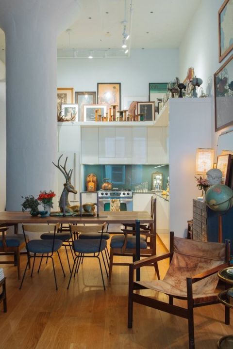
 Take advantage of high ceilings by using the space to display bold pieces of art

Gallery walls are nice, sure, but let's go ahead and coin this the "gallery loft" and start coveting it now. If your kitchen, like this one, has such an expansive space to fill, we especially love this solution. Dealing with a shorter gap? It can still work! Just make sure to copy the best part here: The two rows in different heights.
Design by Jeffrey Grew; Photography by Pablo Enriquez via Apartment Therapy

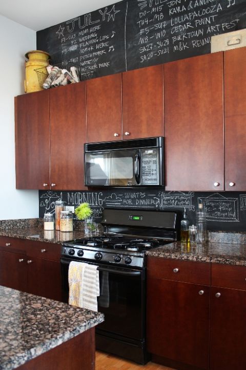
Love that cafe look and feel? Bring it home with chalkboard paint and some fun messages, inspiring quotes, recipes and more....


The only method that easily gives you flowers one week and your calendar the next — chalkboard paint turns the awkward spot into a blank canvas in the best possible way.
Design by Shaleah Soliven via Design Mom

 Are you a collector or cookbooks? This could work for some great book storage but make sure to style the space so it doesn't look cluttered

Why should cookbooks take up precious space in your living room bookshelves when they can enjoy a designated spot in the room you actually need them. Note: This one only works if you have a step ladder so you can access them easily!
Design by Trudy Gould and Seamus McCartney; Photography by Eve Wilson via The Design Files

Get a little retro with some wire baskets that can hold practical items that will also add some pops of colour


Uniform wire baskets, that is, elegantly displayed with necessities inside. Who knew those extra coffee grounds could look stylish? 
Design by Elsie Larson; Photography by Janae Hardy via A Beautiful Mess

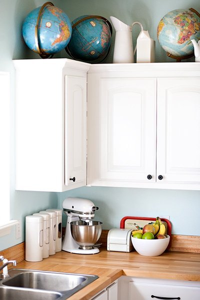
 Be unique - display a cool collection that symbolizes your passions - love to travel? Try this interesting yet simple display....

There's no better way to bring this much color and conversation to the kitchen with only a single, repeated, object. Long live globes — new, vintage, whatever! As long as you love 'em.
Design and photography by Ashley Ann Photography via Apartment Therapy


 But no matter what you have up there be sure to dust it regularly as it can collect a lot of dust over time.

Labels: , , , , , , , ,

Wednesday, February 18, 2015

We Answer Wednesday - Kitchen accessories


“I’m looking to add more colour to my kitchen without breaking the bank? What do you suggest??”


Great Question! There are so many accessory options and various forms of décor that can make a world of difference in a space. Sometimes a fresh colour palette is all your home needs!


Adding a pop of colour is a fantastic idea.. make sure when choosing that pop of colour it is something that flows nicely with your current décor and colour -scheme. Small colourful updates are a fantastic facelift but look best when they complement the existing décor. If you have a very neutral palette your options are endless! If you are locked into a certain colour, I suggest finding a colour that balances your room. If you are having trouble with that, typically a dark kitchen could use some lighter pieces and vice versa. If you have a kitchen that has lots of colour in the cabinetry, or countertop, choose a great neutral accent to tone down the existing colour palette. 


1. STOVE: Add a pop of colour by adding a new teapot/ kettle to your stove. This is a budget friendly find that you can buy in ANY colour. Plus that adds some interest to your stove. Adding new hand towels in various colours and patterns is an instant refresh. 


2. Add cookbooks in a corner in a stacked pile to add variety. Choose something with an interesting title, or a nice cover that balances your style.


 Image result for cookbooks

3. ColourfulUtensils: a yellow spatula? Red spoon? Update the jar that you keep the tools in. These are inexpensive updates that will make big difference. 


4. Stools: This one is a larger ticket item, but if you shop around, finding a new stool set is a great update to modernize a space or even add a new texture such as wood or leather.


5. Add a few beautiful accessories such as candles, small sculptures, soap dispensers, any small item that is ‘new’ to your space will make a difference. Jars for sugar, coffee etc are small items that are easy to add as well.

Beautiful items, or else buy a set of 4 glasses, plates and bowls to use as ‘art’ for your cabinets.


6. Greenery is a nice addition to a kitchen, fresh flowers brighten a space without committing to a colour. If you’re undecided on what palette you’d like to incorporate, start by adding colourful fresh flowers to see how the colours are accent your kitchen. Putting them in a nice vase doesn’t hurt either.


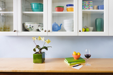
7. If you have a glass cabinet, try updating a few glasses or plates. If all your cabinets are glass, I don’t suggest doing this necessarily, but if there is one that you can emphasize, use this as a display cabinet and showcase your most show-worthy pieces.


Labels: , , , , , ,

<data:blog.pageTitle/>

This Page

has moved to a new address:

http://kikiinteriors.com

Sorry for the inconvenience…

Redirection provided by Blogger to WordPress Migration Service