Kiki Interiors - Decor and Staging

Wednesday, January 13, 2016

We answer Wednesday - Masculine Glamour

"I have heard the term 'masculine glamour' used recently to describe a decorating style.  What is 'masculine glamour ?"

Masculine Glamour is a term that we are starting to hear a bit more in home design and decor.  When we hear about men and home decor many of us think of man caves or lay-z boy sofas (there's nothing really wrong with either of those things - if that's what makes you happy - go for it!!) But 'masculine glamour' is the new term used to describe a man's abode that has style.  It is chic, classy, streamlined with a masculine edge.  The glamour part usually refers to metallic accents and shine.

Just like fashion, men are starting to take notice of themselves and their space.  Men are starting to put time, energy and effort into their personal style and that also includes their surroundings.  But this look 'masculine glamour' is pretty clean and timeless so it may not be a passing phase or trend. Plus  should you be involved with a man with a /masculine glamour' decorated space it would be so easy for you to move in with a touch of your style, it is very transitional (hint, hint) ;)

Here are a few examples of Masculine glamour.

"masculine glamour" small living room oversized everything. mirror glass candles green as an accent in a white grey and black living room:

So note the use of layering neutrals (no real pop of colour), a decent amount of dark tones and streamlined pieces.  Again we see some shine in the coffee table and accessories - this adds a feminine touch without being overt.


 Masculine living room designed by Ron Marvin. Via Lonny Magazine June/July 2012.:

Here's the same room just at a different angle.  We see symmetry in the end tables, lamps and even the pillows - this is very masculine.  The over sized art is also free of colour and layers various shades of grey.

Dark colored living room:

What do we notice here.   The dark tones on the wall and in the furniture.  We don't see any colour or bold art, everything is very tone-on-tone. We also don't see also of different textures - we have upholstery and a glass coffee table - so very simple and free of fuss.  The shine from the table and the accessories as a touch of glam and the beautiful orchid arrangement adds some femininity but the orchid is still a very structural flower, so again not too feminine.

 Monagrams, Antique Mirrors. and Black Leather Headboard with Nailheads:

When it comes to masculine glamour it is about keeping the typical masculine elements we see in design and decor like simplicity, dark tones like navy or charcoal, very little colour, very little pattern and some texture.  The glamour only comes from shine and some metallic accents.  The look is cool, streamlined, modern and says this is a man's residence but is still designed and decorated. 

Labels: , , , , , , , ,

Thursday, November 27, 2014

Deisgner Predictions: Colour and Trends for 2015

2012 was Tangerine tango, 2013 was Emerald Green and 2014 was Radiant Orchid....What did 11 designers predict the 2015 Colour of the Year will be?   Which trends can we expect to see in the new year? Pattern? High gloss? Bold? Bright? Deep? Dark? Which is your favourite?

Greek Blue

"The blue of the Mediterranean, and the tops of the churches in Santorini—or Papers and Paints' TC32. It's so rich and fabulous, perfect when paired with a grey or pink"
-Sara Story
As seen here in the dining area of designer Robert Passal's Miami Beach apartment.


60s Shades
"I saw palette of 60s colors on the 2015 runways that was exciting—shades like olive and orange are being given new life."
-Alexandra Kaehler
As seen here in a Manhattan apartment designed by Miles Redd.


Sour Green With Blue
"We thought a lot about color trends as we were designing our Duralee fabric line and we love a little sour green mixed in with anything—here, vibrant versions of classic blue and green have a fresh, bold look."
-Anne Maxwell Foster and Suysel dePedro Cunningham of Tilton Fenwick
As seen here in Tilton Fenwick Prints for Duralee fabric.


Pastel Palettes
“I’ll be looking back to the pastel palette of LA in the 80s—optimistic color combinations of orange and purple sunsets, green palm trees, aqua pools, and pink flamingos. It’s a muted palette with shocks of neon—Monet meets Molly Ringwald."
-Christos Prevezanos
As seen here in a New York living room by designer Fawn Galli.


Neutral Gray
Gray is definitely the hottest neutral these days—it sets the perfect backdrop. I love combining soft gray walls with dark charcoal doors and a pale, grayish-white ceiling. One of my favorite paint colors is “Repose Gray” by Sherwin Williams."
-Jeff Andrews
As seen here in a family room by designer Betsy Burnham.


Renaissance-Inspired
“The combinations of greens, plums, cerulean blue, beiges and whites- and the mixing of patterns and textures, as seen in many Renaissance paintings.
-Alessandra Branca
As seen here in The Arnolfini Portrait by Jan van Eyck.


Olive Green
"Olive greens will be popular in 2015—I just did a kitchen with olive cabinets and it looks wonderful. The shade is warm, organic, and neutral for almost any other color you pair with it."
-Capella Kincheloe
As seen here in Kristin Hein and Philip Cozzi's Provincetown, Massachusetts kitchen.


Bold Color Mixing
"I love mixing colors, like pinks, purples, and vivid green with aqua and turquoise. Here, I'm using purple Ikat from Madelihttps://www.blogger.com/blogger.g?blogID=8406936427421090250#editor/target=post;postID=1557887669000487863ne Weinrib, Aqua wallpaper from China Seas, Matouk's vivid pinks for bedding, and a citrusy green to keep things fresh."
-Grant K. Gibson
As seen here in a palette by Gibson.


Warm Tones
“I'm seeing warmer, muddy colors start to come back into vogue. I can't get enough of rust, olive, dusty mint, and aubergine—and I still like a splash of bright color thrown on top though, just to keep things exciting!”
-Jenny Komenda
As seen here in a Greenwich Village apartment by designer Fawn Galli.


Dynamic Parings
"For 2015, pair the classics with unexpected accents to make the scheme dynamic and vibrant—I love black, grey and white with splashes of red, and brown, blue, and green with orange citrus tones."
-Malcolm James Kutner
As seen here in the master bedroom of a California house by designer Stephen Shubel.


Glossy Blue
“I'm seeing a lot of deep rich blues with a glossy finish—often paired with white for a surprisingly modern twist on a classic.”
-Susanna Salk
As seen here in a Los Angeles dining room by designer Mary McDonald.


Labels: , , , , , , , , , , ,

Sunday, November 9, 2014

11 Expensive Design Mistakes You Don't Want To Make

We’ve all made mistakes when it comes to purchases. The sweater that was too itchy. The expensive wine that no one cared for, the list goes on.... Unfortunately, when it comes to your home, the stakes (and price tags) can be significantly higher. Of course, smaller purchases can be returned, but often the most impactful design choices require installation (and associated labour costs) that will have to be undone and redone if there’s been an error in judgment along the way. The point is not to frighten you away from changing anything, ever, or to steer you toward only neutrals, but rather a reminder that you can save a small bundle if you avoid these big blunders.

1-- TV or artwork installed too close above a gas fireplace
“This one is so common: Installing a TV or coveted piece of artwork over a gas fireplace,” says Crispin Butterfield, senior designer at Urban Theory Interior Design in Brandon, Manitoba. “From an aesthetic point of view, a 24-inch minimum distance, for example, between fireplace and the bottom of your object might not look proportionate, but trust me when I say following building codes and manufacturer installation instructions is crucial: the heat a gas fireplace gives off can and will melt your electronics and finishes if mounted too close to the output source,” she says.


2 -- Shutters in the wrong windows
Plantation shutters, also called California shutters, look so tidy, and they block the sun like nobody’s business. They also usually come with a hefty bill for a custom treatment, even at a big box store. Shutters, however, can be a mistake, not aesthetically but practically speaking. If you don’t have privacy concerns and you love the sunshine streaming in, you might be better off with a simple treatment of sheers and elegant drapes, Roman blinds or even thick-slatted horizontal blinds that pull all the way up. Roman blinds, instead of shutters are a great choice when you don’t need privacy.


3 --  Picking the wrong paint colour
“It’s only paint” is a term Brett Walther, Home & Garden director at Canadian Living loathes. “It’s often used by a patronizing expert who is describing painting your walls as a ‘low-commitment’ approach to colour,” he writes in his blog. “As if patching holes, sanding, laying dropcloth, priming, painting and then painting again is the equivalent of casually throwing a new toss cushion on a sofa.” Painting, when done by pros, can run into the thousands of dollars, so be sure to pick the colour by testing it, by painting samples on the walls first instead of relying on a small paint chip. 


4 -- Wallpaper in a high humidity room
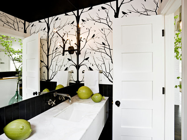
 Adding expensive wallcoverings in areas with high humidity/moisture, like an ensuite or main bathroom is a potentially expensive design mistake, Crispin says. “Ensure ventilation and airflow are adequate before sinking money into gorgeous products that could potentially bubble and peel from the walls,” she says. Humidity-friendly vinyl grasscloth and good ventilation in the bathroom pictured here, ensure the wallcoverings will not bubble.


5 -- Choosing lighting for looks alone
Stylish chandeliers, sexy sconces, pretty pendants … yes, please! Be sure that they not only look good but that they will deliver the kind and amount of light you need by either hiring a lighting consultant or at the very least, having an in-depth conversation with a knowledgeable salesperson. Otherwise, you will have to find ways to supplement your lighting, such as with lamps. You don’t want to call the electrician over a second or third time to change fixtures or add pot lights or dimmers because your new lighting makes the space too bright or dim. 

https://s-media-cache-ak0.pinimg.com/736x/1b/db/a5/1bdba545caacfeb8f2adb55ba3605baf.jpg

6 --Gutting everything in a renovation
 Not every room needs to be gutted “down to the studs,” as they say. One could argue that the character and much of the beauty of many old homes has been taken away by overeager renovations. Heed your interior designer’s advice when he or she suggests keeping or refurbishing something you already own, like flooring or cabinetry. She obviously thinks it’s worthy of staying in your home and is just trying to save you money, and possibly headaches. 


7 -- Bringing in the wrong furniture for your lifestyle
 The issue with buying the wrong furniture for how you actually live is that you won’t know it’s wrong until you’ve had it long enough not to be able to return it. We all have an idealized design style, but it has to mesh with our day-to-day lives. Cream-colour velvet anything is not great for red wine lovers. A midnight blue sofa will drive you batty if you have white cats who shed hair on it. No sense investing in a beautiful antique bedroom dresser if everything inside will be a jumbled mess-- better to stick to using your closet. Be honest about your lifestyle and cleaning habits before you buy. White cat? Consider a white or cream-colour sofa to camouflage pet hair in between vacuuming sessions.


8 -- Measuring incorrectly
Ouch!  This one can really hurt if you’re buying a big ticket item or commissioning furniture to be built by hand. Contractors and designers alike agree that mis-measurements add up to big problems. A carpenter’s proverb is to “Measure Twice. Cut Once.” For you, dear layperson who does not take measurements for a living, the rule of thumb is always to measure three times. 


9 -- Acquiring something because you "always wanted it"
 Just because you “always wanted” something doesn’t mean you should buy it or install it in your home. You may have always wanted a pony. That’s not a good reason to buy one. Avoid the pricey interior design pitfall of buying only from your heart and not your head. It’s fine to go this route if you’re replacing broken servingware with the fine silver you’ve always dreamed of. On the other hand, a finished basement with a home movie theatre might be something you always wanted, but it is an expensive mistake if what you really need is a playroom for the kids. So what we say is: If you’ve always wanted a home movie theatre but need a playroom, go with the playroom.


10 -- Relying on Photos to make a big decision
Visit a showroom where possible when renovating a kitchen or bathroom, says Crispin. “Pictures in magazines are wonderful inspiration sources, but a professional in a showroom will be able to walk you through the reality of where your budget should sit to attain the space of your dreams,” she says. “They will also sort through all of the options involved, and help determine what works best for you and your home.” For instance, kitchen tile is high-commitment and should be picked in person before committing.


11 -- Too many custom pieces in an accent colour
 “Using several accent colours in a space and having everything from pillows, to drapes, to custom upholstered chairs done up to match is an expensive and totally avoidable design mistake,” Crispin says. “The rule of thumb to follow is the 80:20 ratio. Eighty per cent of your space is dedicated to symbiotic neutrals, and 20 per cent can go towards one or two fun accent colours,” she says. 


Labels: , , , , , , ,

Saturday, May 2, 2009

Feng Shui Your World


Feng shui is an ancient Chinese system of aesthetics believed to utilize the laws of both Heaven and Earth to help one improve life by receiving positive life force or energy.
Feng shui is not a superstition or a set of dos and don'ts. It is the art and science of understanding the forces of nature in order to design houses and workplaces that blend with the environment instead of clashing with it. It aims to help us live in harmony with the world by promoting the flow of positive energy and neutralizing or avoiding negative or destructive energy.

The practice of feng shui is one related to nature. Nature, being composed of living things or those that breathe, also breathes. It gives out a universal and spiritual energy called "qi" (pronounced chi) whose direction is dependent on two vital elements – wind and water. Wind carries energy and thus symbolizes nature’s change and transformation. It also signifies action, fervor and enthusiasm. Water, meanwhile, holds energy and thus symbolizes stability as well as internal strength, meditation and psychological power.
Feng shui has quickly evolved from a new age trend to a decorating phenomenon widely practiced by professional decorators and amateurs alike. Decorating and feng shui principles work well together. A room does not have to be decorated with flutes and bamboo in order to use feng shui. Decorating with feng shui principles involves the movement of energy and moving blocked areas so energy moves at a balanced pace around the entire home. Feng shui practitioners will use all types of tools to move this energy. This could involve decorating with mirrors, water, plants, color, sound, scent, and more.
Colours and Feng shui

Black or blue, associated with water energy, support inner work, helping us to concentrate, contemplate, mediate and handle creative endeavors. Blue can slow the heart and breathing rates and lower blood pressure. It can be used to increase coolness, to calm and to create privacy.

Green is associated with wood energy, that of growth, decisiveness and action. It can motivate internal change.

Red is associated with fire, which supports life energy. It’s the color of blood, and can increase heart rate, respiration and blood pressure. It also can promote activity and alleviate depression. It’s clearly the color of passion and love.

Yellow is associated with earth energy, representing Mother Earth. It can cheer, infuse with hope, clarify and elevate mental activity. It also creates a sense of stability and nurturing. Yellow is often used for children with dyslexia to help improve focus.

White and metallic colors are associated with metal energy. They can support carefulness and focus, as well as purity.

Combination Colors
Mixing colors also mixes the feng shui energies related to them.

Salmon, a combo of yellow/orange and red/orange, is a unique balance of earth and fire elements that’s quite harmonious. Use salmon to call attention to the heart of a space, create a sense of abundance and encourage conversation.

Turquoise, a blue-green combo, evokes the qualities of wood and water. It has both the contemplative qualities of blue and the life of green, making it a great choice for spaces that allow movement and growth.

Lavender, a mix of the qualities of blue and purple, can evoke a sense of calm, spirituality, contemplation and quiet. Use lavender to minimize high activity, calm a stressful situation or create a special spiritual space. Lavender is best not used in spaces where conversation or high activity is encouraged.

The influence of color is an important aspect to decorating through feng shui eyes. We respond to colors subjectively. In China, decorating with the color red brings good luck. Red is frequently on the front door. Decorating with red is not the only color of good fortune. Yellow and purple are very auspicious to have in the decor. In Feng shui, yellow has been considered an Imperial color that many Feng Shui masters find it more beneficial than red. Decorating with green is a color of freshness, peace and growth. Darker decorative colors can either be relaxing or depressing, light colors can be uplifting or annoying, and extreme colors can be exhilarating or aggravating. If there is a certain room in the home that an argument always occurs, check out the color and the way it is decorated. Does the room have aggressive decorative objects? Is the color irritating? If you feel good in the home of a friend that is decorated with colors and objects you love, remember that when deciding how to decorating your own home or apartment. For some reason, the decorating scheme works with your sensibilities. Begin to "feel" the room with Feng shui in mind.

Some basic Feng shui ideas for decorating and designing rooms and houses include: avoiding floor plans with small cramped rooms, keep the design free flowing. Avoid long hallways because the energy moves too quickly down the hall. Avoid excessive overhead lighting. Choose warm full spectrum lighting instead. While decorating with Feng shui, keep sharp corners to a minimum. Place healthy plants in a decorative manner throughout the home. Arrange couches and chairs in a way that allows people to see the door and for easy conversation. Be careful of too many knick-knacks. This can mean decorative clutter and it can quickly get out of control. Decorating through Feng Shui principles is not hard, just feel the space and follow a few good Feng shui ideas to decorate a home that’s great to live in.

Labels: , , , ,

<data:blog.pageTitle/>

This Page

has moved to a new address:

http://kikiinteriors.com

Sorry for the inconvenience…

Redirection provided by Blogger to WordPress Migration Service