11 Expensive Design Mistakes You Don't Want To Make
We’ve all made mistakes when it comes to purchases. The sweater that was too itchy. The expensive wine that no one cared for, the list goes on.... Unfortunately, when it comes to your home, the stakes (and price tags) can be significantly higher. Of course, smaller purchases can be returned, but often the most impactful design choices require installation (and associated labour costs) that will have to be undone and redone if there’s been an error in judgment along the way. The point is not to frighten you away from changing anything, ever, or to steer you toward only neutrals, but rather a reminder that you can save a small bundle if you avoid these big blunders.
1-- TV or artwork installed too close above a gas fireplace
“This one is
so common: Installing a TV or coveted piece of artwork over a gas
fireplace,” says Crispin Butterfield, senior designer at Urban Theory Interior Design in Brandon, Manitoba. “From an aesthetic point of view, a 24-inch minimum distance, for example, between fireplace
and the bottom of your object might not look proportionate, but trust
me when I say following building codes and manufacturer installation
instructions is crucial: the heat a gas fireplace gives off can and will
melt your electronics and finishes if mounted too close to the output
source,” she says.

2 -- Shutters in the wrong windows
Plantation
shutters, also called California shutters, look so tidy, and they block
the sun like nobody’s business. They also usually come with a hefty bill
for a custom treatment, even at a big box store. Shutters,
however, can be a mistake, not aesthetically but practically speaking.
If you don’t have privacy concerns and you love the sunshine streaming
in, you might be better off with a simple treatment of sheers and
elegant drapes, Roman blinds or even thick-slatted horizontal blinds that pull all the way up. Roman blinds, instead of shutters are a great choice when you don’t need privacy.

3 -- Picking the wrong paint colour
“It’s only
paint” is a term Brett Walther, Home & Garden director at Canadian
Living loathes. “It’s often used by a patronizing expert who is
describing painting your walls as a ‘low-commitment’ approach to
colour,” he writes in his blog.
“As if patching holes, sanding, laying dropcloth, priming, painting and
then painting again is the equivalent of casually throwing a new toss cushion on a sofa.” Painting, when done by pros, can run into the thousands of
dollars, so be sure to pick the colour by testing it, by painting
samples on the walls first instead of relying on a small paint chip.

4 -- Wallpaper in a high humidity room
Adding expensive wallcoverings in areas with high humidity/moisture,
like an ensuite or main bathroom is a potentially expensive design
mistake, Crispin says. “Ensure ventilation and airflow are adequate
before sinking money into gorgeous products that could potentially
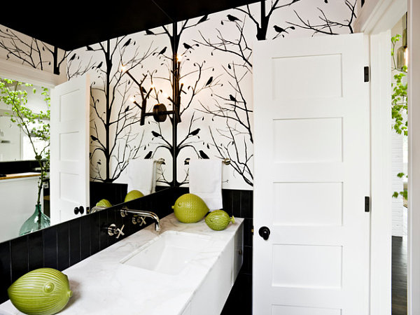
bubble and peel from the walls,” she says. Humidity-friendly vinyl grasscloth and good ventilation in the bathroom pictured here, ensure the wallcoverings will not bubble.

5 -- Choosing lighting for looks alone
Stylish chandeliers,
sexy sconces, pretty pendants … yes, please! Be sure that they not only
look good but that they will deliver the kind and amount of light you
need by either hiring a lighting consultant or at the very least, having
an in-depth conversation with a knowledgeable salesperson. Otherwise,
you will have to find ways to supplement your lighting, such as with lamps.
You don’t want to call the electrician over a second or third time to
change fixtures or add pot lights or dimmers because your new lighting
makes the space too bright or dim.

6 --Gutting everything in a renovation
Not every room needs to be gutted “down to the studs,” as they say. One
could argue that the character and much of the beauty of many old homes
has been taken away by overeager renovations. Heed your interior
designer’s advice when he or she suggests keeping or refurbishing
something you already own, like flooring or cabinetry.
She obviously thinks it’s worthy of staying in your home and is just
trying to save you money, and possibly headaches.

7 -- Bringing in the wrong furniture for your lifestyle
The issue with buying the wrong furniture for how you actually live is
that you won’t know it’s wrong until you’ve had it long enough not to be
able to return it. We all have an idealized design style, but it has to
mesh with our day-to-day lives. Cream-colour velvet anything is not
great for red wine lovers. A midnight blue sofa will drive you batty if
you have white cats who shed hair on it. No sense investing in a
beautiful antique
bedroom dresser if everything inside will be a jumbled mess-- better to
stick to using your closet. Be honest about your lifestyle and cleaning
habits before you buy. White cat? Consider a white or cream-colour sofa
to camouflage pet hair in between vacuuming sessions.

8 -- Measuring incorrectly
Ouch! This one can really hurt if you’re buying a big ticket item or
commissioning furniture to be built by hand. Contractors and designers
alike agree that mis-measurements add up to big problems. A carpenter’s
proverb is to “Measure Twice. Cut Once.” For you, dear layperson who
does not take measurements for a living, the rule of thumb is always to
measure three times.

9 -- Acquiring something because you "always wanted it"
Just because
you “always wanted” something doesn’t mean you should buy it or install
it in your home. You may have always wanted a pony. That’s not a good
reason to buy one. Avoid the pricey interior design pitfall of buying
only from your heart and not your head. It’s fine to go this route if
you’re replacing broken servingware with the fine silver you’ve always
dreamed of. On the other hand, a finished basement
with a home movie theatre might be something you always wanted, but it
is an expensive mistake if what you really need is a playroom for the
kids. So what we say is: If you’ve always wanted a home movie theatre
but need a playroom, go with the playroom.

10 -- Relying on Photos to make a big decision
Visit a showroom where possible when renovating a kitchen or bathroom,
says Crispin. “Pictures in magazines are wonderful inspiration sources,
but a professional in a showroom will be able to walk you through the
reality of where your budget should sit to attain the space of your
dreams,” she says. “They will also sort through all of the options
involved, and help determine what works best for you and your home.” For
instance, kitchen tile is high-commitment and should be picked in
person before committing.
11 -- Too many custom pieces in an accent colour
“Using several accent colours in a space and having everything from
pillows, to drapes, to custom upholstered chairs done up to match is an
expensive and totally avoidable design mistake,” Crispin says. “The rule
of thumb to follow is the 80:20 ratio. Eighty per cent of your space is
dedicated to symbiotic neutrals, and 20 per cent can go towards one or
two fun accent colours,” she says.

Labels: design mistakes o avoid, expensive reno mistakes, home design, home renovations, home updates, kiki interiors, reno ideas, reno mistakes
posted by Unknown @ 9:45 PM
![]()

0 Comments:
Post a Comment
Subscribe to Post Comments [Atom]
<< Home