Kiki Interiors - Decor and Staging

Friday, December 9, 2016

2017 Colour of the Year: Greenery

So it was just announced  by Pantone that the Colour of the Year for 2017 is Greenery. 

Pantone describes this shade as "greenery is a fresh and zesty yellow-green shade that evokes the first days of spring when nature’s greens revive, restore and renew. Illustrative of flourishing foliage and the lushness of the great outdoors, the fortifying attributes of Greenery signals consumers to take a deep breath, oxygenate and reinvigorate."

 Pantone's 2017 Spring Colors are kale, hazelnut, lapis blue, niagara, primrose yellow, greenery, flame, island paradise, pink yarrow, and pale dogwood.

This colour definitely makes us think of spring and really brings us in tune with nature.

We knew that 2017 trends would definitely have a real connection with nature with the resurgence of wood and wood grain and a real draw towards warmer and natural textures this colour fits right in with that scene.

 This colour is on the bolder side with a lot of energy but you can bring it into your space with ease....

1. Shades of Green - when it comes to decorating with the colour of the year (any year) make that colour fit into your style so that might means finding a shade that is less saturated and one that is softer (or the opposite) and then bringing that into your space.  Don't worry so much about taking the trend literally.

How to Combine Home Accessories | Home Decor Accessories & Furniture Ideas for Every Room | HGTV:
 Photo from HGTV

2. Quantity - at first, be sure to add a small amount just to test the waters and keep it simple with accessories like decor pieces, florals, pillows - things that aren't big budget breakers but will give the room a fresh look.  if you like what you see you can always add more but small changes can give you big results!


White and Green Interiors. Green Interior Ideas. White bookcase with green decor. #GreenInteriors #GreenInteriorIdeas. Evars and Anderson Interior Design.:
 Photo from Home Bunch

3.  Mix it in with your current scheme - you might think that this colour isn't overly versatile but that's not true! It really works well with so many other colours - it pairs beautifully with neutrals like grey, navy, white, chocolate brown and more plus it plays well with other colourful options like yellow, pink, cobalt blue....

 Google Afbeeldingen resultaat voor http://thebuzz.dianejameshome.com/wp-content/uploads/2012/06/6-11-energized.jpg:
Photo from adore home

4. Add life to any room - the wonderful part about this colour is that it is true to mother nature and it gives every single space a fresh new burst of life! Try adding a floral arrangement, a bowl of apples (or even limes) or a plant in any room and you won't believe what a change it makes.

Stylish home: Ginger jars and other ceramics:
Photo from mylusciouslife.com


5. Play with pattern - adding a splash of the trendy colour into a mix of different patterns will really give your space a designer look and feel.  we love this combination of the softer greenery colour paired with white and this denim and navy blue.

Mixed patterns. They all work together! Fabrics, Window Treatments, Furniture, Bedding, Fabric by the Yard, Custom Decorating, Calico Corners � Calico Home.:
 Photo from calicocorners.com

6. Works with any style - some colours don't translate well with certain styles of decor but greenery really works with any style.  If you love a Country look it works with florals and gingham, like a more traditional style? Try adding some greenery in a toile print or in some botanical art.  If you are more modern and streamlined - greenery is a great splash in art or pillows even a great accent chair.  If your style is more vintage or retro - the possibilities are endless!

In the airy breakfast nook of a Toronto home designed by Anne Hepfer, a whimsical Oly Studio pendant light hangs above a Van Rossum dining table. Hepfer chose apple-green chairs to help brighten the space and bring the outdoors in. | archdigest.com:
Photo from Architectural Digest

7. Make it interesting and a little unexpected - this might not for everyone but if you are someone who really likes this colour (or any colour) and you aren't afraid to show it - use it where one might not expect to see it!  Areas like lighting - a colourful pendant in a kitchen can make a big and bold statement. Furniture pieces like a sofa or bar stools.  Wall paper accent walls in a front entry. Paint a piece of furniture that needs a bit of a makeover.

lime green industrial barn light, pantone greenery, spring green, apple green, lime green, bright green:
Photo from concepts & Colorways

You can absolutely 'take a risk' with greenery and bring it into your space.  Even just the smallest addition of this beautiful colour will do wonders for your space!

Labels: , , , , , , , , , ,

Thursday, December 4, 2014

Marsala - 2015 Colour of the Year

It's official the 2015 Colour of the Year is 'Marsala'


The authorities have spoken. Marsala, a gorgeous terracotta red shade, has been named the official color of the year by the biggest experts in the field. You may not have heard of Pantone, but the color authorities have been used as an industry resource for decades. After announcing the color of the millennium in 1999 there was so much public interest that Pantone decided to name a color every year based on their extensive research. 


 “This earthy red has wine and a very warm brown underneath, which gives the feeling of groundedness, strength, and confidence,” says Leatrice Eisman, Executive Director of Pantone Color Institute. “It has a richness that lends sophistication. When you wear it’s it is a self-fulfilling prophecy—you’ll find you get positive reactions form others and it builds up your confidence.” Eisman explains that we’ve seen glimpses of marsala in the late ‘60s into the ‘70s and a touch in the ‘80s, but it’s a very modern hue that totally suits the times.


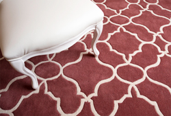
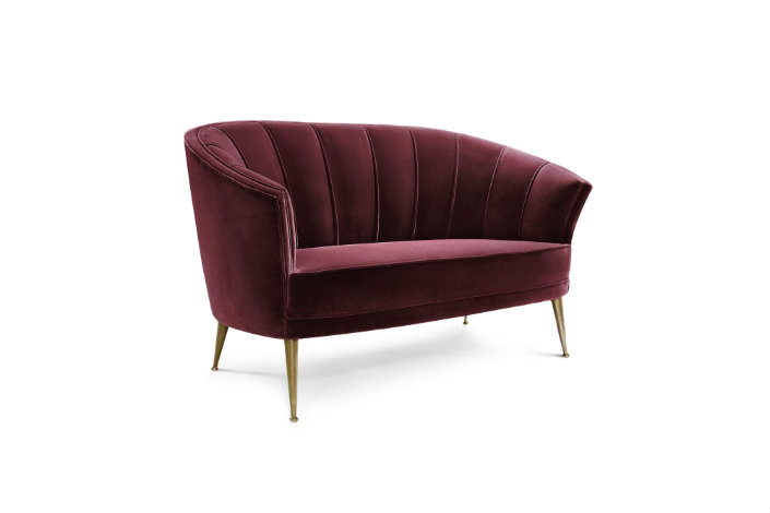
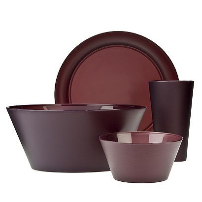
 The color of the year has arrived! And it's a bold choice: Marsala. Named after the deep dessert wine, this cranberry-red-meets-burgundy-brown hue has the Internet buzzing. Reviews for the color pick are mixed, but we think it's the perfect accent for the home — when used sparingly

 
 Nearly-neutral Marsala offers just enough color to pump up a color scheme without overpowering it, which is why it’s so great for layering. Touches of Marsala on the lamp, rug, and pillows comfortably combine with indigo, cream, and wood tones in this living room.


 If you’re not ready to fully commit to Marsala, start with an accent piece. This white and wood foyer gets a pop of color thanks to the simple addition of a wine-red chair.


 Marsala has the potential to be a new classic since it is deep and rich in tone and works very well with neutrals.

Labels: , , , , , ,

Thursday, November 27, 2014

Deisgner Predictions: Colour and Trends for 2015

2012 was Tangerine tango, 2013 was Emerald Green and 2014 was Radiant Orchid....What did 11 designers predict the 2015 Colour of the Year will be?   Which trends can we expect to see in the new year? Pattern? High gloss? Bold? Bright? Deep? Dark? Which is your favourite?

Greek Blue

"The blue of the Mediterranean, and the tops of the churches in Santorini—or Papers and Paints' TC32. It's so rich and fabulous, perfect when paired with a grey or pink"
-Sara Story
As seen here in the dining area of designer Robert Passal's Miami Beach apartment.


60s Shades
"I saw palette of 60s colors on the 2015 runways that was exciting—shades like olive and orange are being given new life."
-Alexandra Kaehler
As seen here in a Manhattan apartment designed by Miles Redd.


Sour Green With Blue
"We thought a lot about color trends as we were designing our Duralee fabric line and we love a little sour green mixed in with anything—here, vibrant versions of classic blue and green have a fresh, bold look."
-Anne Maxwell Foster and Suysel dePedro Cunningham of Tilton Fenwick
As seen here in Tilton Fenwick Prints for Duralee fabric.


Pastel Palettes
“I’ll be looking back to the pastel palette of LA in the 80s—optimistic color combinations of orange and purple sunsets, green palm trees, aqua pools, and pink flamingos. It’s a muted palette with shocks of neon—Monet meets Molly Ringwald."
-Christos Prevezanos
As seen here in a New York living room by designer Fawn Galli.


Neutral Gray
Gray is definitely the hottest neutral these days—it sets the perfect backdrop. I love combining soft gray walls with dark charcoal doors and a pale, grayish-white ceiling. One of my favorite paint colors is “Repose Gray” by Sherwin Williams."
-Jeff Andrews
As seen here in a family room by designer Betsy Burnham.


Renaissance-Inspired
“The combinations of greens, plums, cerulean blue, beiges and whites- and the mixing of patterns and textures, as seen in many Renaissance paintings.
-Alessandra Branca
As seen here in The Arnolfini Portrait by Jan van Eyck.


Olive Green
"Olive greens will be popular in 2015—I just did a kitchen with olive cabinets and it looks wonderful. The shade is warm, organic, and neutral for almost any other color you pair with it."
-Capella Kincheloe
As seen here in Kristin Hein and Philip Cozzi's Provincetown, Massachusetts kitchen.


Bold Color Mixing
"I love mixing colors, like pinks, purples, and vivid green with aqua and turquoise. Here, I'm using purple Ikat from Madelihttps://www.blogger.com/blogger.g?blogID=8406936427421090250#editor/target=post;postID=1557887669000487863ne Weinrib, Aqua wallpaper from China Seas, Matouk's vivid pinks for bedding, and a citrusy green to keep things fresh."
-Grant K. Gibson
As seen here in a palette by Gibson.


Warm Tones
“I'm seeing warmer, muddy colors start to come back into vogue. I can't get enough of rust, olive, dusty mint, and aubergine—and I still like a splash of bright color thrown on top though, just to keep things exciting!”
-Jenny Komenda
As seen here in a Greenwich Village apartment by designer Fawn Galli.


Dynamic Parings
"For 2015, pair the classics with unexpected accents to make the scheme dynamic and vibrant—I love black, grey and white with splashes of red, and brown, blue, and green with orange citrus tones."
-Malcolm James Kutner
As seen here in the master bedroom of a California house by designer Stephen Shubel.


Glossy Blue
“I'm seeing a lot of deep rich blues with a glossy finish—often paired with white for a surprisingly modern twist on a classic.”
-Susanna Salk
As seen here in a Los Angeles dining room by designer Mary McDonald.


Labels: , , , , , , , , , , ,

Wednesday, January 29, 2014

Colours of Years Past


So you've probably heard already that the official colour of  2014 is Radiant Orchid.  Some of you might be asking yourselves - There is a colour of the year?  Who decides what this year's colour will be?  What were the colour of years past? When did this all happen?

The color of the year selection requires careful consideration and, to arrive at the selection, Pantone quite literally combs the world looking for color influences. This can include the entertainment industry and films that are in production, traveling art collections, hot new artists, popular travel destinations and other socio-economic conditions. Influences may also stem from technology, availability of new textures and effects that impact color, and even upcoming sports events that capture worldwide attention

Looking back on colour of years past you will see that blue has been incredibly popular in various tints of course.  We have also seen a fair share of reds and pinks.  This year's radiant orchid is a blend of those popular choices. 

For more than a decade, Pantone’s Color of the Year has influenced product development and purchasing decisions in multiple industries, including fashion, home and industrial design, as well as product packaging and graphic design. Past colors include:


Labels: , , , , , , , , ,

<data:blog.pageTitle/>

This Page

has moved to a new address:

http://kikiinteriors.com

Sorry for the inconvenience…

Redirection provided by Blogger to WordPress Migration Service