Kiki Interiors - Decor and Staging

Sunday, February 23, 2014

7 ways to update your home with paint!

Experts share their advice about painting different areas of the house

The trusty old friend that can update almost anything on virtually any budget, paint has always been there to help make things look a little better. Whether you’re finessing outdated furniture, giving greater impact to a front door, refinishing time-worn hardwood floors or attempting any of the many other makeovers paint can achieve, we’ve gone to the experts to get the techniques to do it right.

7-painting-tips-woodpanelling.jpg

Brick fireplace
Neutral palettes are trending this year, and texture is becoming all the more important. Brick provides visual interest in its rough surface, but if you dislike its bold, burnt colour, paint the brick to match your palette and let its texture make the statement.

Who: Nancy Bollefer, Canadian Marketing Manager, Behr at The Home Depot.

What to use: Behr Premium Concrete & Masonry Degreaser & Cleaner No. 990, Behr Premium Plus Interior Stain-Blocking Primer & Sealer No. 75,  Behr Self-Priming Interior Satin Enamel.

How to use it: Clean the brick substrate thoroughly by vacuuming up any dust or loose matter and applying diluted degreaser. Prime the surface with
a loaded roller before painting. Use a paintbrush to fill in mortar spots that the roller missed.


7-painting-tips-fireplace.jpg

 Ceramic tiles
If you want to renovate the bathroom, but retiling the wall isn’t in the budget, just paint over the tile! It’s the perfect solution for updating a tired tile colour on a tiny budget. Note: This project isn’t recommended for floors or surfaces that will come in contact with food.

Who: Andrew Fedele, Technical Services Manager, Para Paints.
What to use: General Paint X-Terminator 260-200, Para Ultra Melamine Latex 4300.

How to use it:
Ceramic is not porous at all, so sand the surface with 120- to 150-grit paper and clean before applying primer, then add two thin coats of paint. Wait 12 to 24 hours between coats and use a high-density foam roller.


7-painting-tips-tiles.jpg

 Front door
To help your home make its best first impression, the front door should set the stage for the style that unfolds inside. If your door is, for example, weathered while your home is sleek and modern on the inside, it’s due for an update.

Who: Sarah Cole, Marketing Director, Farrow & Ball.

What to use:
Farrow & Ball Exterior Wood Primer & Undercoat, Farrow & Ball Exterior Eggshell or Full Gloss.

How to use it: Remove the hardware and fill and sand any of the door’s imperfections before you start. Apply paint early in the day to allow enough drying time before any evening condensation arrives.

Trend watch:
Coordinate your home’s exterior palette with the interior by painting your front door just a few shades darker than your front entryway.


7-painting-tips-front-door.jpg

 5 Hardwood floors
Overhauling your hardwood floors with a fresh new colour makes a huge impact in any room, giving it a whole new look.

Who: Alison Goldman, Brand Manager, CIL Paints, cil.ca.

What to use: CIL Dimensions Interior/Exterior 100% Acrylic Porch & Floor. The higher the sheen, the more durable the finish, so semigloss is a great choice.

How to use it: Remove any loose paint with a wire brush or scraper and remove gloss with a deglosser or sander. Clean well and apply paint, but remember: Don’t paint yourself into a corner (literally). Whatever you do, make sure you work toward an exit.


7-painting-tips-hardwodfloors.jpg

 6 Pressure-treated deck
Refinishing a deck seems like a daunting task, as it usually involves extensive prep work, covering a large expanse and doing it all while exposed to the elements. But the after-effect – a porch that looks as good as new – is well worth the effort if you know what to do.

Who: Bev Bell, Creative Director, Beauti-Tone Paint.

What to use:
A solid acrylic stain that requires no primer and has a high tolerance for moisture from the elements.

How to use it:
Sand and wash your deck well to rid it of any dead cellulose or mill glaze. Start with the railings and work your way down to the deck surface so you can deal with any drips. Use a deck-pad applicator with an extension pole to get the job done quickly and easily.


7-painting-tips-deck.jpg

 7 Vintage metal furniture
The shabby-chic vintage look is still hot, and so too is the push toward upcycling old furniture and flea-market finds to stay on trend. All it takes is a simple can of spray paint to take a piece from unappealing to statement-making.

Who: Tracey Amadio, International Sales Manager, Valspar at Lowe’s.

What to use: Valspar Premium Spray Paint – it provides a durable anti-rust coating to protect metal from corrosion, if you plan to use it outside.

How to use it:
Remove dirt and grease, and scuff glossy surfaces by lightly sanding prior to painting. Apply two light coats rather than one heavy one. Choose a satin or flat sheen to hide dents and surface imperfections.

7-painting-tips-furniture.jpg

Labels: , , , , , ,

Wednesday, February 19, 2014

Mellow Yellow

With the spring season slowly approaching...it might be time for you to consider bringing a little sunshine inside of your home!  Try introducing some of these shades of yellow into your current decor style. 

Yellow can work with any style - country, traditional, contemporary and more....and it can be used in many different ways.....

Paint:

For a splash of yellow in your space try SUNBEAM A12-3 by Olympic - it mimics the rays of sun but without being overwhelming.  Pair it with other nature inspired tones like sky blue or grass green or go more contemporary with greys. This is a yellow tone but a neutral colour with some warmth


For a bit more of a glow in your bathroom or breakfast room, try OPTIMISTIC YELLOW SW6900 by Sherwin Williams.  this colour will definitely banish those winter blues.


Go Gold with Ace Hardware's GOLDEN PATH A23-7 this is a great golden yellow that would work beautifully in a more traditional space or for wood furniture that is in need of a pop.


A classic yellow tone that works well with other neutrals like grey and brown BUTTERY 14-5 by Pratt and Lambert is for someone looking to brighten up their space with a perfect yellow.


Other ways to bring some yellow in to your space.....

Try some simple accessories like a vase, pillows and other decor items like....


Miko Collection - Yellow

This great set of dishes available at Urban barn


This bedding collection available at West elm is a stunning colour combination with grey and off white and the pop of yellow adds some warmth

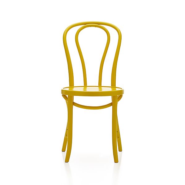
Vienna Yellow Side Chair

This cafe style chair available at Crate and Barrel is a fun pop for any kitchen, paired with a glass table, white table, grey or a reclaimed wood table.

STOCKHOLM Cushion cover IKEA Cotton sateen has a soft, smooth finish with a subtle sheen. The zipper makes the cover easy to remove.

This stripe pillow available at IKEA  is a perfect pop of colour but I love how there are other colours and neutrals in this stripe fabric.  It would look great with any neutral and you can bring in some other accent colours too.

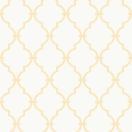
Trellis Wallpaper

Wallpaper!  Why not?  A bit of a traditional look but if you apply it in an unexpected spot like the back of a bookcase or as an accent wall it has a more current look.  The white and yellow trellis  pattern is bright and fresh available at Joss & Main

Art is an easy way and affordable way to add colour to your space.  Art.com is super easy, affordable and they have an enormous selection for all styles and tastes.

Add caption


Labels: , , , , , , , ,

Tuesday, February 18, 2014

Knock on wood - wood accents for the home

I love the look and feel of wood.  It adds warmth and character to any space.  Wood doesn't have to look country or rustic, you can certainly use wood in a more modern space.  Here are some of my favourite wood pieces....

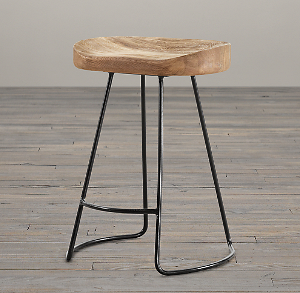
This 1950s Tractor Stool from Restoration Hardware adds some warmth but sculptural feel to a kitchen.  It would look great in a light or dark kitchen adding texture, visual interest and some personality

1950s Tractor Dining Stool

This cube/stool is so versatile and it's reclaimed!  It could easily be used as an end table or even in multiples as a coffee table.  It has a rustic feel because of the strong grain and texture but the simplicity it has a modern twist. And it is made in Canada


This table is a marriage of modern and rustic.  The simple lines, the grain and the metal legs make this table shine in any space.  Pair it with a more modern chair in a metal, upholstered or a plastic material.


I love this chair and it also comes in black.  It's a perfect captain's chair in a dining room when paired with a modern glass or metal table but it also looks great in a smaller bedroom or a workspace.  The material has a rustic feel but the lines make it contemporary and cool.

DENMARK


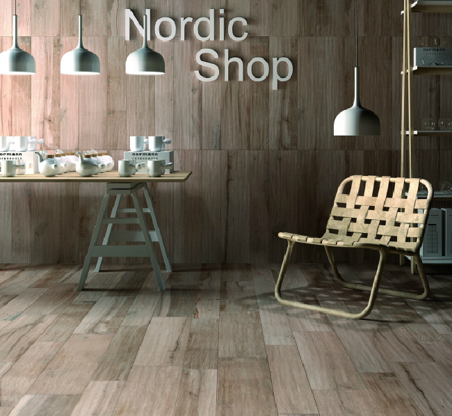
If you love the look of hardwood and want it everywhere including wet spaces, check out these tiles that look and feel like wood.  I was concerned that they might come across as cheap but they look amazing installed and really add that warmth to the room that you expect from hardwood. And like hardwood there are different 'stains', sizes and levels of grain.  I love this tile as it gives a bathroom a true Nature Spa look and feel...


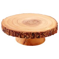
I love wood accents that are also practical not just beautiful!  look for great kitchen accessories in wood and not just wooden spoons.  Look for stunning fruit bowls, salad bowls, trays and more....


Acacia Wood Pedestal – Medium


If these wood pieces are too rustic for your taste and you want some nature in your home but you want a sleeker look - why not display it as art on your walls?
I love these Birch Prints from West Elm.


Labels: , , , , , , ,

Friday, February 14, 2014

Easy ideas to spruce up a Teenage Boys' Bedroom

If you have a teenage boy at home, I'm sure an improvement would be just picking up the clothes off of the floor and maybe getting rid of the smells.....but there are some great ideas out there to really show off and highlight his personality and interests in his bedroom.

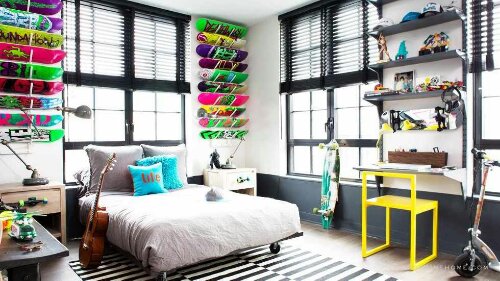
1 - If your son loves sports use the equipment as decor.  So install shelves or other hanging equipment and display skateboards, footballs, soccer balls and more.


2 - Don't be afraid of colour.  For boys try some pops of yellow, orange, red or lime green - they are fun and sporty.  these colours could be in furniture like a great chair or bean bag seat; or bedding or drapes - would be the easiest ways since in a few years they can be replaced without any major work.  Keep the walls neutral, and allow the additional items in the room to pop.  But if you really want to get some colour on the walls, paint is an easy and inexpensive fix.

Tween Boy Bedroom Design Ideas, Pictures, Remodel, and Decor - page 20:


3 -  Get creative.  Make the space truly his by turning some of his old t-shirts (think favourite sports, characters, colours) into pillows for his bed, chair or window seat. 


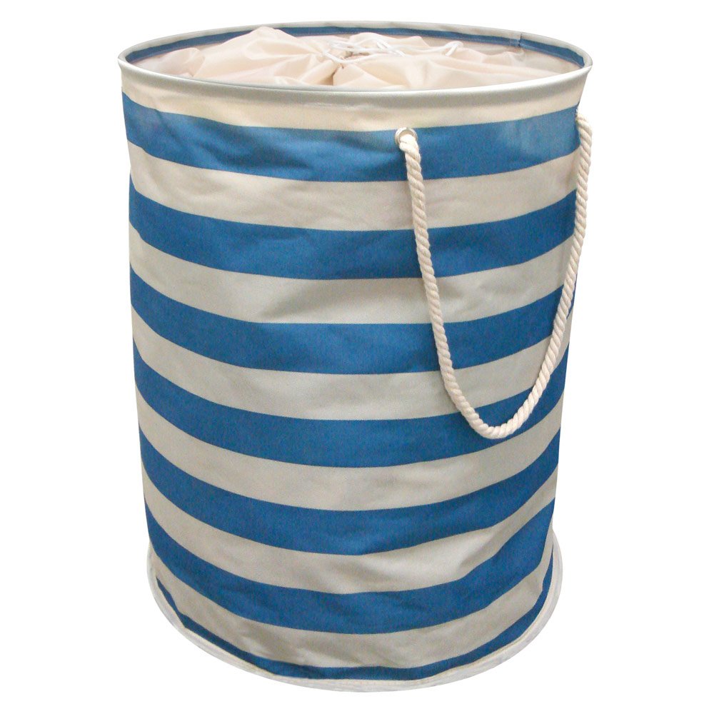
4 - Think about easy storage.   Tired of seeing his laundry on the floor?  Get an extra large laundry basket.  I'm sure he won't separate lights and darks but with a large basket, maybe he will at least keep the floor clear.  Don't forget about hooks and shelving - if it is easy to access, they are more likely to use it.


5 -  Posters, posters everywhere!  Posters are really affordable and easy plus they really show of the personality of your child but they can look ratty after a while or mark up your walls.  So why not paint a wall with magnetic paint?  Your son can easily update that wall space with big and small posters and change them up whenever he wants.  And for an added bonus you could paint chalk board paint (there are so many colours other than black and green) over the magnetic paint and he will have a wall where he can get totally creative.  when it's time to sell the property or just update you just paint over. And this is a great idea for a little boy too


Teen Bedroom Decorating • 5 Quick Tricks!:


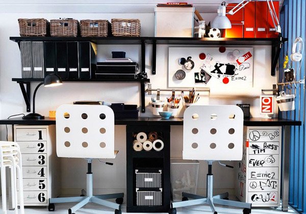
6 - Don't forget about a workspace.   A corner or a spot in the room for homework is important.  So be sure to think about lighting, surface space, shelving and storage.  you don't have to spend a lot on a desk to get what you need.  I like open shelving above the desk which is a great spot for containers of supplies, books.  a calendar and/or cork board are great too to keep them organized.  I also like a desk with some closed storage.  You can get a separate storage unit or a desk that comes with one.  Plus a comfortable chair, it doesn't have to be a 'desk' chair.  If you have 2 children in the same bedroom be sure to have a workspace for each of them.


 Don't forget to let them get involved in the process.  With new space all for them that they played a part in chances are they will care for it more

Labels: , , , ,

Friday, February 7, 2014

Model transformation: Kristi Blok's redesign on a budget turns contemporary condo into funky, industrial loft

Model transformation: Kristi Blok's redesign on a budget turns contemporary condo into funky, industrial loft

BEFORE: Living room, Qualicum Woods Crossing model suite

 AFTER
Model transformation: Kristi Blok's redesign on a budget turns contemporary condo into funky, industrial loft

AFTER: Living room, Qualicum Woods Crossing model suite

OTTAWA — The challenge: Bring new life to a one-bedroom condo apartment model to appeal to both first-timers and downsizers, showing how both could make it fit their lifestyle and furnishings.The location: Qualicum Woods Crossing model suite at 2781 Baseline Rd.
The restrictions: Very little time and a tiny budget of $6,000.
The result: A funky, industrial loft look that effectively melds multiple styles in what broker Marnie Bennett calls “design on a dime in only 28 days.” Decorator Kristi Blok of Kiki Interiors explains how she did it.
The living room
Loft look: The biggest change was adding a recycled brick wall to create a warehouse feel. It’s the bold statement that the room is built around and is accented with neutrals inspired by the greys in the kitchen to keep things from competing. “When you live in an open space, flow is really key. If we had introduced a whole new colour palette in here, even though there’s no walls, it would feel choppy.”
Marrying styles: Yes, first-timers can make a collection of hand-me-downs work. Same goes for downsizers paring down and finding a few key pieces to fit a smaller space. The existing contemporary sofa, for example, is paired with a warehouse-style chair (Structube); they don’t match, but they go together. Shying away from adding lots of bold colour and taking proportion and scale into consideration helps link the styles. “That warehouse look, it’s a mix of all sorts of different things and there isn’t necessarily a pattern to it; a lot of it is based on function.”
Balance: The masculine chair is tempered by the more feminine sheepskin throw (IKEA), while the same effect is created with the lamps. The one by the chair “just screamed warehouse” with its vintage-look Edison light bulbs and industrial open cage, yet it works well with the classically shaped end table lamps (all from lampsplus.com).
Pattern plus: You can mix them, but one should be the star while the others play a supporting role. The pillows (HomeSense) play into the layers of grey. Adding a throw sets the scene for those who might be living here.
Breaking rules: An area rug that made the space feel cramped was replaced by one from Structube to spread out the room. It has no definite pattern but is visually interesting without taking over and adds to the room’s random mosaic. It does break the design rule of tucking rug edges under the front feet of furniture, but with a larger rug “you’d almost be building a wall right there at the edge of the sofa.”
California dreamin’: A funky Gus coffee table in the shape of California (fab.com) is fun, functional and fits, being narrow enough to keep from blocking flow while still offering great surface area. The white laminate top and streamlined wood legs lighten the room and provide a link between the heavy wood TV cabinet (new, from Zone) and the existing modern glass end tables. “Personal style is more about putting things together and co-ordinating them and mixing pattern and texture and colour instead of everything just being exactly the same.”
Multi-purpose: Smaller space means things must serve double or triple duty. The reclaimed wood TV cabinet offers storage, can be a serving area or be used for seating in a pinch. “When you live in a smaller space, the pieces that you have in there are going to have to take on multiple personalities, so don’t be afraid to do that.”
Scale: The painting (etsy.com) is large but understated to show off the brick wall. It’s clean and simple since there is already a lot of furniture in the room. The vignette of the sofa, end tables and painting is symmetrical, to which people are naturally drawn.


The kitchen

BEFORE

BEFORE: Kitchen, Qualicum Woods Crossing model suite

 AFTER


AFTER: Kitchen, Qualicum Woods Crossing model suite

New style: It’s the same size, but most of it is new to give it a more commercial feel, yet it’s warmer to bring in the warehouse element.
Adding depth: A charcoal backsplash (Olympia) in an oversized subway tile is laid in a brick pattern to mimic the brick wall in the living room. It creates depth against the light cream walls.
Toned down: Contemporary high-gloss cabinets with no hardware were replaced with shorter ones in a light texture finish and tube stainless-steel hardware fitted horizontally.
Exposure: Open shelving (IKEA) means everything is at your fingertips, adding to the commercial look.
Hot seat: The island chairs (Zone) are paired with a bench in reclaimed pine (minam.com) that tucks away for more work space. Adding warmth and contrast with its retro aqua blue paint, it can be pulled out for extra living room seating and makes a great conversation piece. “It looks like a piece that somebody’s had for a really long time and it was really loved and passed down.”
Visual pop: Oversized industrial chic pendants (Zone) add visual interest while tying together the kitchen’s new look and providing much needed task lighting.
The unexpected: A white faux lion (whitefauxtaxidermy.com) is both subtle and bold. “If you’re going to put something on your walls it should mean something to you ... and maybe it’s just, ‘This is weird and I love it.’ ”


The den

BEFORE


BEFORE: Den, Qualicum Woods Crossing model suite

AFTER


AFTER: Den, Qualicum Woods Crossing model suite

Split personality: A condo den often plays multiple roles — spare bedroom, office, entertainment area. The Murphy bed and work space, which were already there, help show this, but the space needed a lighter touch against all the dark wood. Accessories such as the ampersand bookends, handcrafted horses and oversized wristwatch clock (HomeSense and IKEA) add personality and some light to the space.
Who are you? A mounted trumpet (HomeSense) aims to “show off the personality of the person who might live here.”
Art that works: A gallery wall shows how you can keep and display some of your art collection. The art (HomeSense) can be a mix of different pieces or styles. Here, the gallery wall replaces one big piece of art to balance the space.


The bedroom

 BEFORE

 BEFORE: Bedroom, Qualicum Woods Crossing model suite

AFTER


AFTER: Bedroom, Qualicum Woods Crossing model suite

Toning it down: Pops of red were replaced with calmer, more soothing colours for a more gender-neutral look.
Opening it up: Something as simple as folding up the charcoal bedspread and keeping it at the edge of the bed lets more white show, making the room lighter, cleaner and less formal.
Come on in: Playing around with the pillows (HomeSense) creates a more relaxing space. The blue ties in with undertones in the kitchen greys, while mixing Greek key and cable-knit styles introduces texture and pattern.
Oversized is OK: Ineffective lamps were replaced with larger ones that give off good light, are gender neutral and work well with the drum ceiling fixture already there. Although oversized, if you make everything in a smaller space small “you might start to feel like a munchkin (and) it’s still clutter.”
Seat shift: The bench was moved so that it wasn’t centred under the window. Added pillows (IKEA and HomeSense) suggest a great spot for girlfriends to hang out while you’re getting ready for a night out.
Tips
  • 80-20 rule: Have 70 to 80 per cent of your space in one style. The other 20 per cent can be a mix of whatever you want.
  • Lighting: Same goes for lighting. Upwards of 80 per cent should be recessed with the rest a mix of floor lamps, pendants, table lamps, even candlelight.
  • Your style: Downsizing into a condo doesn’t mean you need all new stuff that’s modern. You may not be able to keep your big dining room table, but maybe you’ll keep some of the chairs and pair them with a slick tulip or glass table for “a really neat balance and combination of traditional and contemporary.”
  • Must-haves: You can’t keep everything if you’re downsizing. Pick the top five pieces you cannot live without, but keep in mind they may find a new purpose in a condo.
  • Common thread: Open-concept spaces need a common thread, theme or colour palette, something that’s going to bring the whole space together. Introducing new themes in each room makes it look choppy.
  • First-timers: Get creative with hand-me-downs. Put your personality into dining chairs by changing the fabric; create a common thread by painting furniture pieces the same colour or adding new hardware.
  • Area rugs: They define spaces in an open plan by bringing furniture pieces together without building walls. The key is picking the right size; in most cases a bit bigger is better than picking too small. If you have lots of neutrals and want to introduce colour, an area rug can do that; if you already have lots of colour, choose a rug that’s neutral, maybe with a bit of texture.

Labels: , , , , , , ,

<data:blog.pageTitle/>

This Page

has moved to a new address:

http://kikiinteriors.com

Sorry for the inconvenience…

Redirection provided by Blogger to WordPress Migration Service