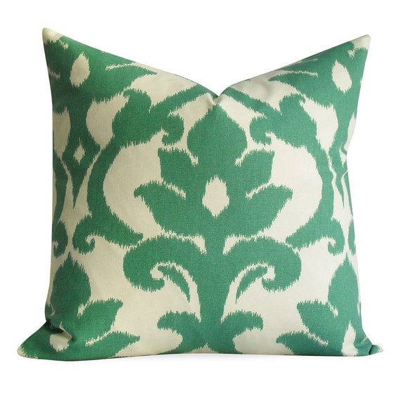
Emerald, meet Orchid
Emerald, meet Orchid
by Kirstin Endemann
Apr 8, 2014 in Homes
Pantone’s
2014 colour of the year, radiant orchid, a sort of
fuchsia-cum-purple-via-powder-pink, has elicited mixed reactions from
decorators who embraced the emerald of 2013
(Above, left) Designer Jason
Bellaire picked “Ribbons” by Michael Black, a mixed-media painting from Koyman
Galleries ($1,000). (Right) Designer Kristi Blok picked Birds leaf trail
wallpaper from Seabrook Wallcoverings.

Hovering somewhere between pastel
and rich, the hue may be a bit too feminine to be widely accepted in interiors,
despite its proliferation in men’s fashion.
Whatever your initial reactions,
Pantone’s colour of the year will soon invade your consciousness and in six
months, you will be considering recovering the sofa in it. The good news, for
those who bought into the ubiquitous emerald, is that radiant orchid is its
perfect complement and, better still, it can freshen up the classic formality
of last year’s colour without veering into the über-girly. And it’s just in
time for spring.

sallywheatinteriors.com, photo by
Laurie Perez
Kristi Blok of Kiki Interiors
and Jason Bellaire of StyleHaus agree that radiant orchid is best as a
gentle accent in a room with neutral staples. “Though it is great for the walls
of a girl’s room because it will grow with her, it is a challenging colour in
large amounts,” says Blok. “But it also brings a bit of softness.”
She suggests making judicious
choices about Pantone’s colours: “Veer a little to the rose or violet, hunter
or sage,” Blok says. “It will still read as a fresh combination.”
Both recommend finding a unifying
piece featuring emerald and radiant orchid, be it a rug, linens or wallpaper.
Or go with colour-blocking. An
emerald green sofa and radiant orchid pillows, or a bold, standalone radiant
orchid armchair paired with a dark green throw would work for the adventurous
decorator. But Bellaire recommends adding yellow accents, “to create a little
delight in the room.”
Still stuck as to how to inject a
little of the colour into your space? Buy an orchid. “Radiant orchid and
emerald contrast so much, but they are complementary,” Bellaire says. “The
proof is nature — structure and beauty in one.”
Connect with Kirstin Endemann |Google+|@keendemann|kendemann@ottawacitizen.com
- See more at:
http://www.ottawacitizenstyle.com/category/homes/emerald-meet-orchid/#sthash.7dspHb1i.dpuf
Pantone’s
2014 colour of the year, radiant orchid, a sort of
fuchsia-cum-purple-via-powder-pink, has elicited mixed reactions from
decorators who embraced the emerald of 2013 - See more at:
http://www.ottawacitizenstyle.com/category/homes/emerald-meet-orchid/#sthash.7dspHb1i.dpuf
Emerald, meet Orchid
Pantone’s 2014 colour of the year, radiant orchid, a sort of fuchsia-cum-purple-via-powder-pink, has elicited mixed reactions from decorators who embraced the emerald of 2013
(Above,
left) Designer Jason Bellaire picked “Ribbons” by Michael Black, a
mixed-media painting from Koyman Galleries ($1,000). (Right) Designer
Kristi Blok picked Birds leaf trail wallpaper from Seabrook
Wallcoverings.
Whatever your initial reactions, Pantone’s colour of the year will soon invade your consciousness and in six months, you will be considering recovering the sofa in it. The good news, for those who bought into the ubiquitous emerald, is that radiant orchid is its perfect complement and, better still, it can freshen up the classic formality of last year’s colour without veering into the über-girly. And it’s just in time for spring.
sallywheatinteriors.com, photo by Laurie Perez
She suggests making judicious choices about Pantone’s colours: “Veer a little to the rose or violet, hunter or sage,” Blok says. “It will still read as a fresh combination.”
Both recommend finding a unifying piece featuring emerald and radiant orchid, be it a rug, linens or wallpaper.
Or go with colour-blocking. An emerald green sofa and radiant orchid pillows, or a bold, standalone radiant orchid armchair paired with a dark green throw would work for the adventurous decorator. But Bellaire recommends adding yellow accents, “to create a little delight in the room.”
Still stuck as to how to inject a little of the colour into your space? Buy an orchid. “Radiant orchid and emerald contrast so much, but they are complementary,” Bellaire says. “The proof is nature — structure and beauty in one.”
- See more at: http://www.ottawacitizenstyle.com/category/homes/emerald-meet-orchid/#sthash.7dspHb1i.dpuf
Labels: colour of the year 2014, emerald green, kiki interiors, ottawa citizen style, radiant orchid
posted by Unknown @ 1:57 PM
0 Comments